Rocky Coast
What Rocky Coast Actually Looks Like
Rocky Coast sits in that murky middle ground between gray and blue, the color of wet stone on an overcast morning. It reads as a deep, slate gray most of the time, but the blue in it surfaces when the light hits it right. Think weathered granite with a marine quality. This is not a flat, industrial gray. There's depth here.
In north-facing rooms, the cool, watery side of this color takes over and it can lean noticeably blue. South-facing light warms it up and pulls it back toward a true neutral gray. Under warm incandescent bulbs at night, the blue softens and you get something almost charcoal. The shift is real, so you'll want to test it on your actual walls before committing.
What makes Rocky Coast distinctive is its saturation. It's deep enough to feel intentional and grounding, but it never tips into black or navy. You get drama without losing the room to darkness.
Rocky Coast Undertones
The dominant undertone is blue, with a gray base that keeps it from feeling like a true blue paint. There's a faint green-gray quality in certain lights too, which is what gives it that coastal, sea-glass feeling. Knowing this matters because Rocky Coast will fight with anything that carries strong warm undertones, like beige carpet or yellow-toned wood.
Lean into the cool undertone rather than against it. Pair it with crisp whites and cooler woods, and the whole scheme clicks into place. Pair it with golden oak and warm cream, and you'll get a subtle clash that's hard to name but easy to feel.
Where Rocky Coast Works Best
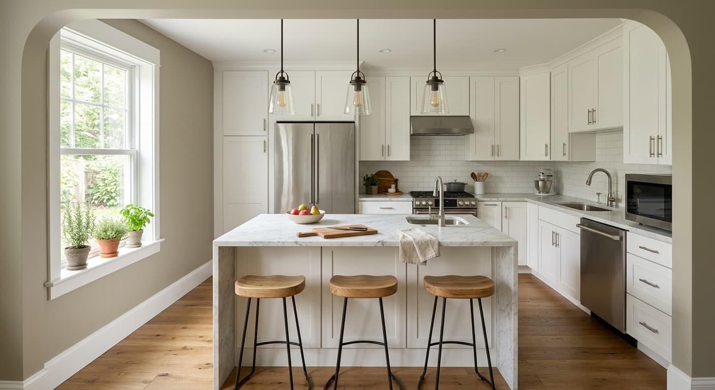
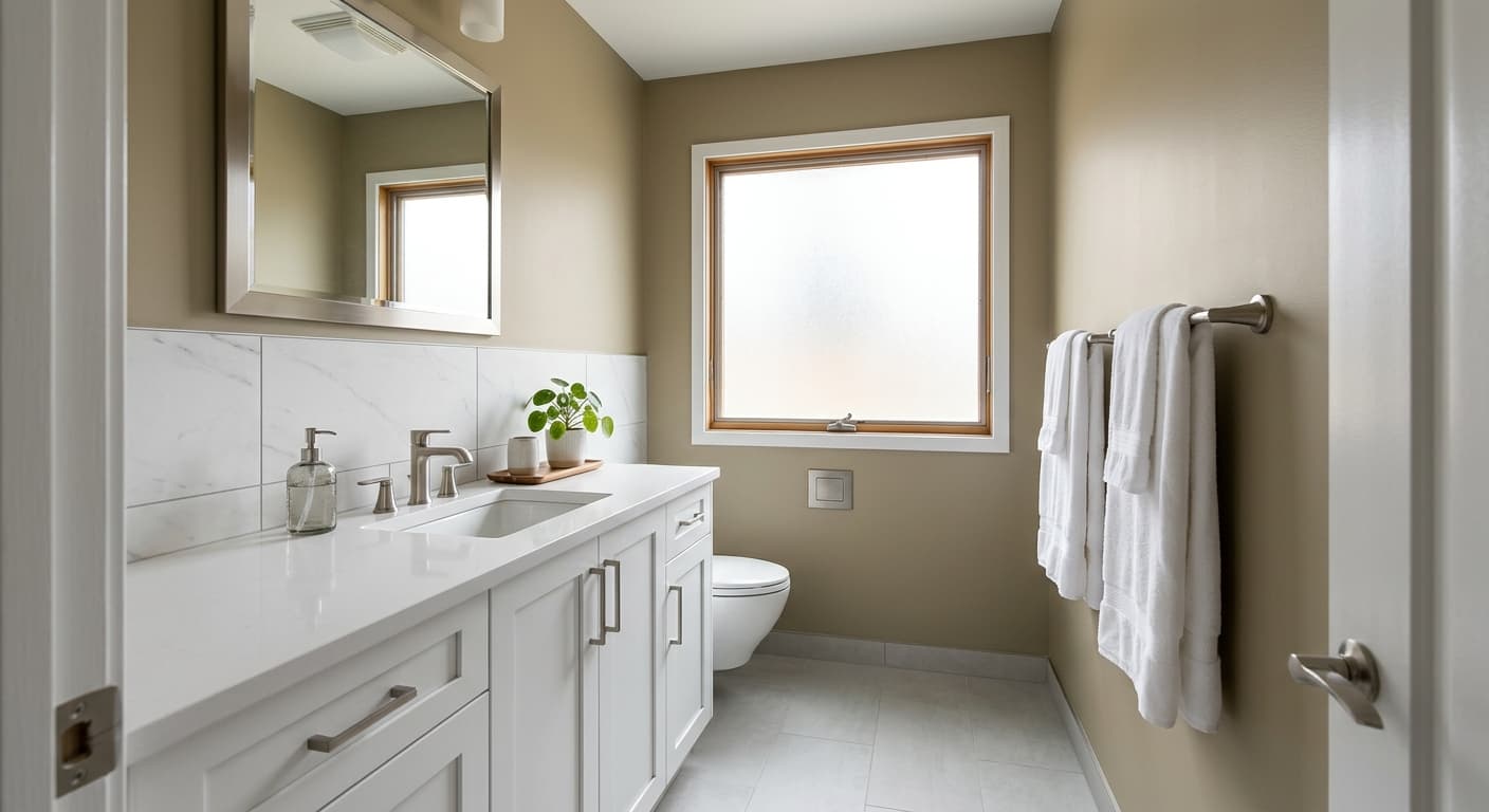
This color earns its keep in spaces where you want atmosphere. Studies, dining rooms, bedrooms, and powder rooms all work beautifully because the depth creates a cocooning, enveloping effect. It's a strong choice for cabinetry too, especially kitchen islands and built-ins where you want contrast against lighter walls.
South and west-facing rooms get the most flattering result because the warmth balances the cool undertone. North-facing rooms can handle it if you embrace the moodiness and add warm lighting and textiles. In small rooms, Rocky Coast wraps the space rather than shrinking it, which makes it a smart pick for a powder room that already feels like a jewel box. In large, bright rooms, it holds its own without going flat.
What to Pair With Rocky Coast
For trim, reach for a clean, slightly cool white like Benjamin Moore Chantilly Lace or Simply White. These keep the contrast sharp and let Rocky Coast stay the star. If you want something softer, a warm white can work, but test it first because too much warmth muddies the look.
For adjacent walls, consider Benjamin Moore Gray Owl or Stonington Gray as lighter cousins that share the same cool family. White oak flooring with a natural or whitewashed finish complements the blue undertone, while brass and matte black hardware both pop against the depth. For furnishings, lean into linen, natural wool, and pale woods. A camel leather chair adds warmth without disrupting the palette.
Colors That Clash With Rocky Coast
Skip the warm beiges, golden woods, and yellow-based creams. They turn Rocky Coast murky and make the undertone read as a mistake rather than a choice. Avoid pairing it with too many other deep, saturated colors in one space, since it needs lighter elements to breathe. And don't use it in a windowless room without a serious lighting plan, because without enough light, that satisfying depth becomes a dim cave.