River Reflections
What River Reflections Actually Looks Like
River Reflections is a deep, muted blue-gray that reads more gray in some rooms and more blue in others. It sits in that moody middle territory where you can't quite call it navy and you can't quite call it slate. Think of the color of a river under a cloudy sky, which is presumably where the name comes from. There's real depth here without going pitch dark.
In daylight, especially in a north-facing room, you'll see the cooler, grayer side come forward. The blue holds back and the whole thing feels calm and a little serious. Push it into warm afternoon light or a south-facing space, and the blue wakes up. Under incandescent or warm LED bulbs at night, it deepens and softens, leaning almost charcoal in the corners.
What makes it distinctive is its restraint. A lot of blue-grays go either chalky or aggressively teal. This one stays grounded. It has enough pigment to feel substantial on a wall but enough gray to keep it from shouting.
River Reflections Undertones
The dominant undertone is blue, but there's a quiet green-gray pulling underneath that shows up most in flat finishes and lower light. This matters because it changes what plays nicely next to it. A trim with a yellow or cream base can make River Reflections look slightly muddy, while a clean white keeps it crisp.
Pay attention to that green-gray shift when you're choosing furnishings. A warm camel leather or oak floor will balance the coolness, but a cold steel-toned rug can tip the whole room into something clinical. Test your samples against the actual fabrics and finishes you plan to use, not just the wall.
Where River Reflections Works Best
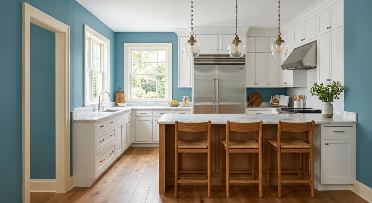
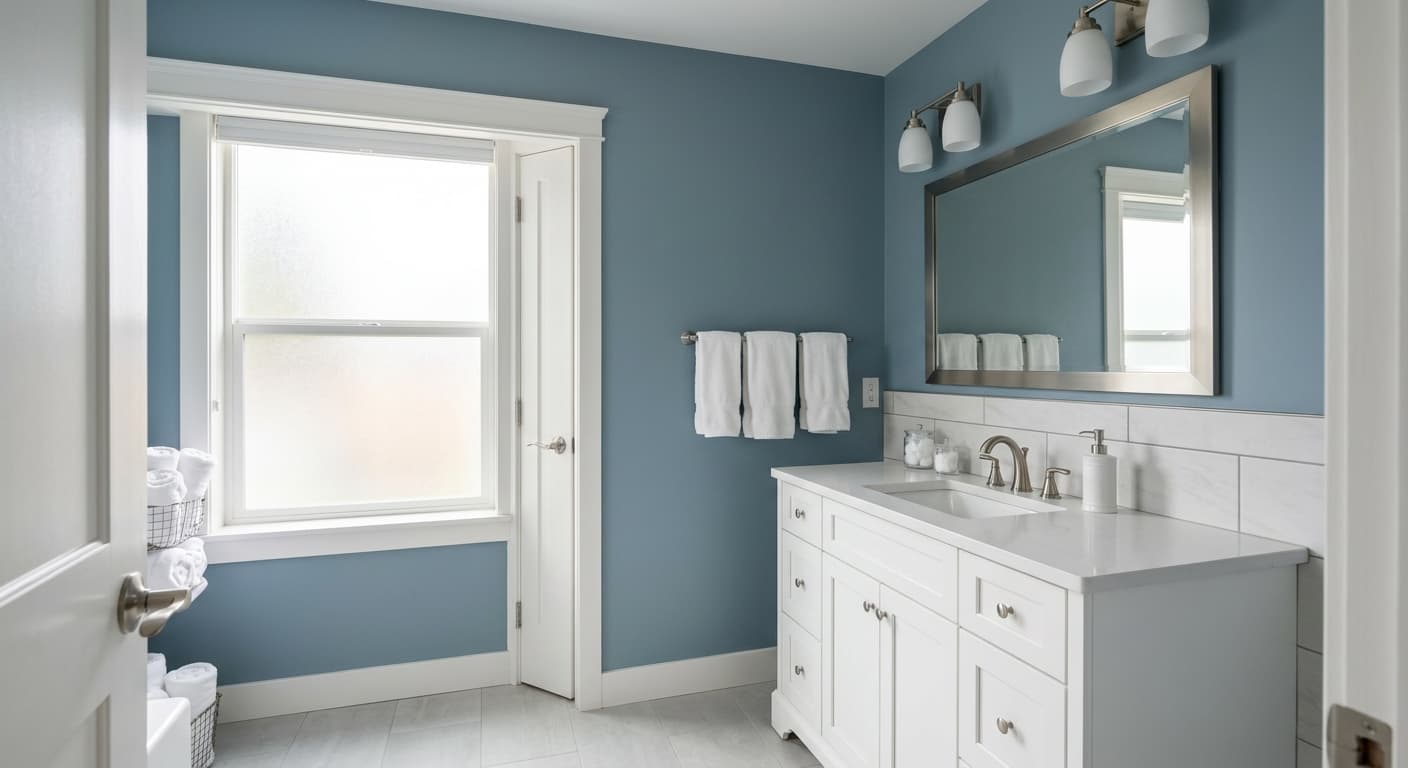
This color earns its keep in bedrooms, studies, and dining rooms where you want atmosphere rather than brightness. It's a strong choice for cabinetry too, whether that's a kitchen island, a built-in, or a bathroom vanity. North-facing rooms will read cooler and more contemplative, which suits a home office or a bedroom meant for winding down.
In south or west-facing spaces, you'll get the warmer, bluer version, which works well in living areas. Small rooms can absolutely handle it. Don't believe the myth that dark colors shrink a space. In a small powder room or a cozy den, River Reflections wraps the walls and makes the room feel intentional and enveloping.
What to Pair With River Reflections
For trim, reach for a clean, slightly cool white like Benjamin Moore Chantilly Lace or Decorator's White. Both keep the edges sharp without introducing a competing undertone. If you want a softer contrast, Simply White works but watch that it doesn't read too creamy against the blue.
Flooring in medium-toned oak or walnut grounds the cool wall and adds warmth underfoot. Brass and aged bronze hardware look excellent against this depth of blue-gray. For complementary wall colors in adjacent rooms, consider Pale Oak or Classic Gray for a calm transition, or go bolder with a warm terracotta or rust in accent textiles. Black accents, like an iron light fixture or window frame, sharpen the whole scheme.
Colors That Clash With River Reflections
Skip pairing it with cream or ivory trim, which dulls the blue and brings out the muddy green undertone. Avoid loading the room with other cool grays and cold metals, or you'll end up with a space that feels flat and chilly rather than restful. And resist using it in a dark, north-facing room with no natural light source. Without some warmth in the lighting or furnishings, it can go heavy and lifeless.