Opal
What Opal Actually Looks Like
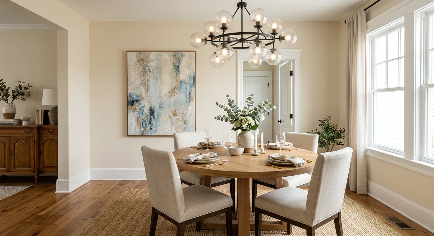
Opal is one of those off-whites that refuses to read as plain white. In most rooms it lands as a soft, cool white with a quiet whisper of green-gray sitting underneath. You won't notice the color so much as you'll feel it. The walls look calm and slightly hushed, never stark.
Light changes everything here. In bright midday sun, Opal cleans up and reads almost like a true white, fresh and crisp. Come evening, or under warm bulbs, that green-gray base steps forward and the color softens into something closer to a pale sage-tinted mist. North light pulls it cooler and can edge it toward gray. South light warms it and quiets the cool cast.
What makes Opal distinctive is its restraint. Plenty of white paints try too hard, going chalky or overly creamy. This one sits in a comfortable middle. It feels organic and a little weathered, like sea glass that has lost its shine.
Opal Undertones
The undertone is green-gray, and it matters more than the average buyer expects. Against a bright white trim, Opal's green softness becomes obvious and you'll see the contrast clearly. Against a creamy or yellow-based white, those two undertones can clash and make Opal look slightly muddy. Test it next to your actual trim before committing.
Undertones also dictate your furnishings. Opal sits beautifully with natural materials, linen, oak, stone. It can fight with anything that has a strong pink or peach cast nearby, since the green base will exaggerate the warmth in those tones and throw the whole palette off balance.
Where Opal Works Best
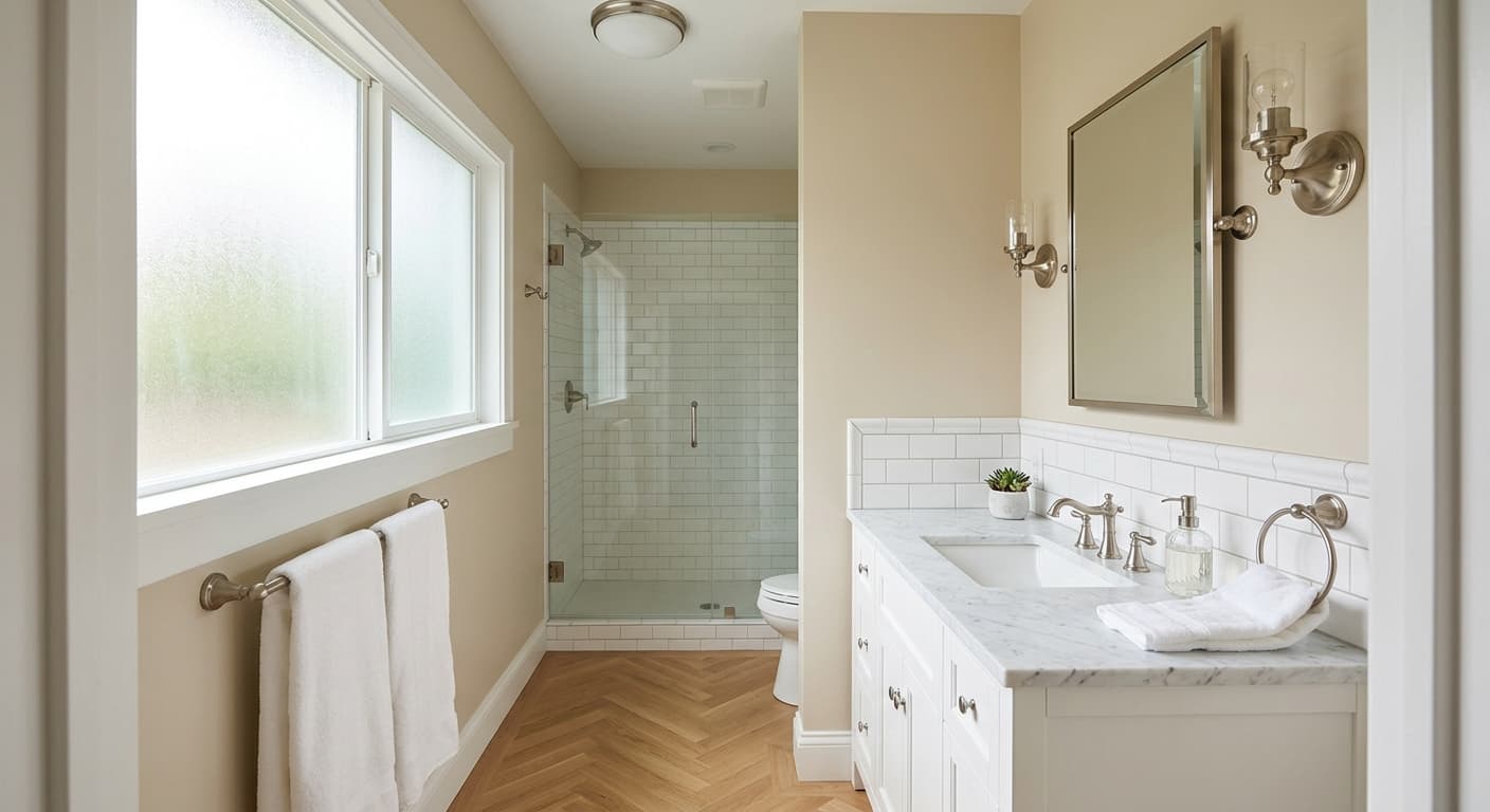
Opal earns its keep in rooms with decent natural light, where its subtle color has room to shift through the day. South and east-facing spaces flatter it most. In a north-facing room, go in with eyes open, because the cool light can drain the warmth and leave it feeling a touch clinical. If you love that crisp, gallery-quiet effect, that's a feature, not a flaw.
It works in spaces large and small. In a small room, it reads light enough to keep things open and airy. In a larger living area or kitchen, the green-gray gives it enough presence to avoid looking flat across big expanses of wall. Bedrooms, bathrooms, and hallways all suit it well.
What to Pair With Opal
For trim, reach for a clean white that won't compete. Benjamin Moore Chantilly Lace gives you crisp contrast and lets Opal's softness register. If you want a gentler, more blended look, Simply White works without going too creamy. Avoid pairing it with a heavily yellow-based trim.
For deeper accents, Opal loves earthy and grounded companions. Think Gray Owl or Stonington Gray for a tonal step up, or a richer green like Mountain Olive if you want to lean into its botanical side. Floor-wise, white oak and pale to medium wood tones look natural beside it. For furnishings, lean into linen, rattan, aged brass, and unpolished stone. Cool grays and soft blacks ground the palette without fighting the undertone.
Colors That Clash With Opal
Skip warm, yellow-heavy whites for trim, since they'll make Opal look dull and slightly dirty by comparison. Be cautious putting it next to anything peach, terracotta, or pink, because the green base amplifies those warm tones and the room starts to feel off. And don't expect it to behave like a true white in a dim, north-facing room. Without enough light, it can drift gray and cold, which surprises people who picked it expecting a soft, warm neutral.