Opal
What Opal Actually Looks Like
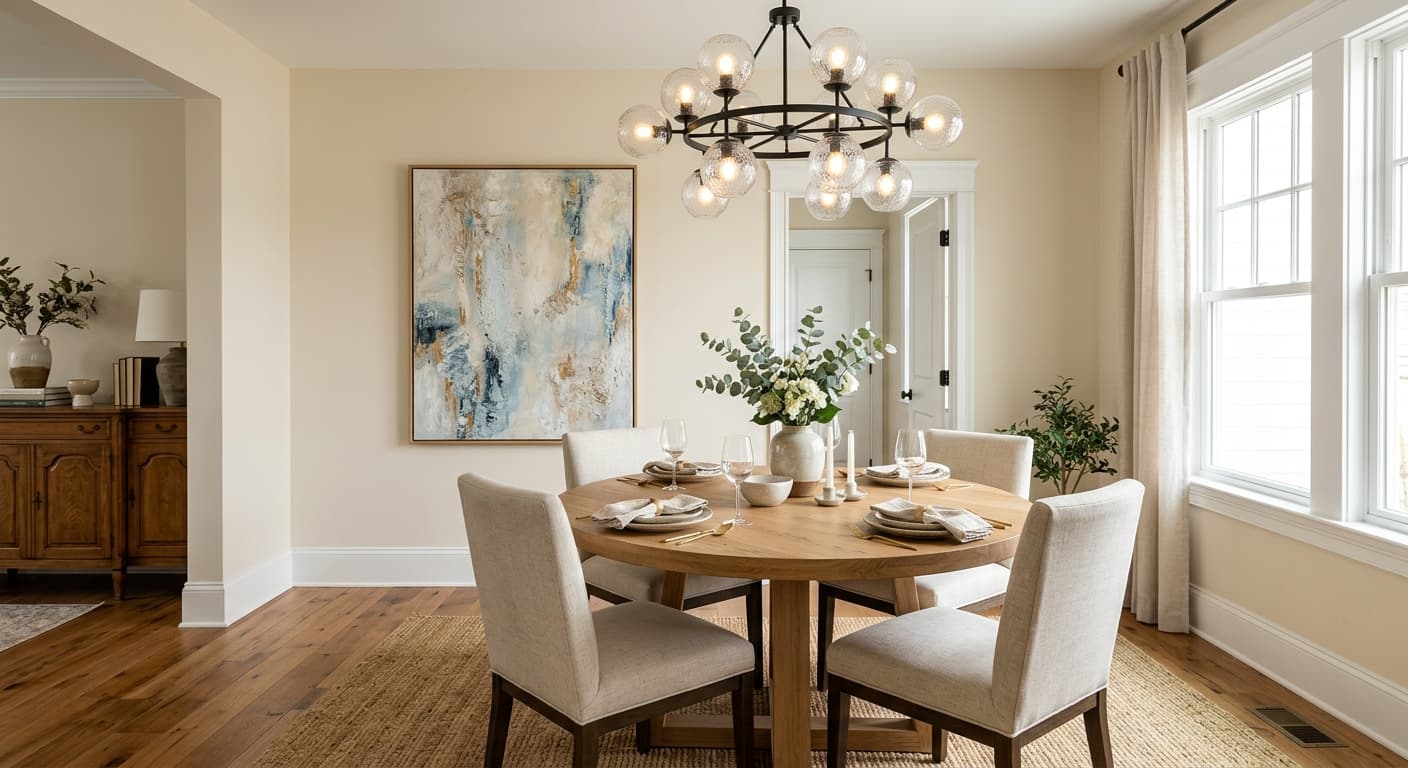
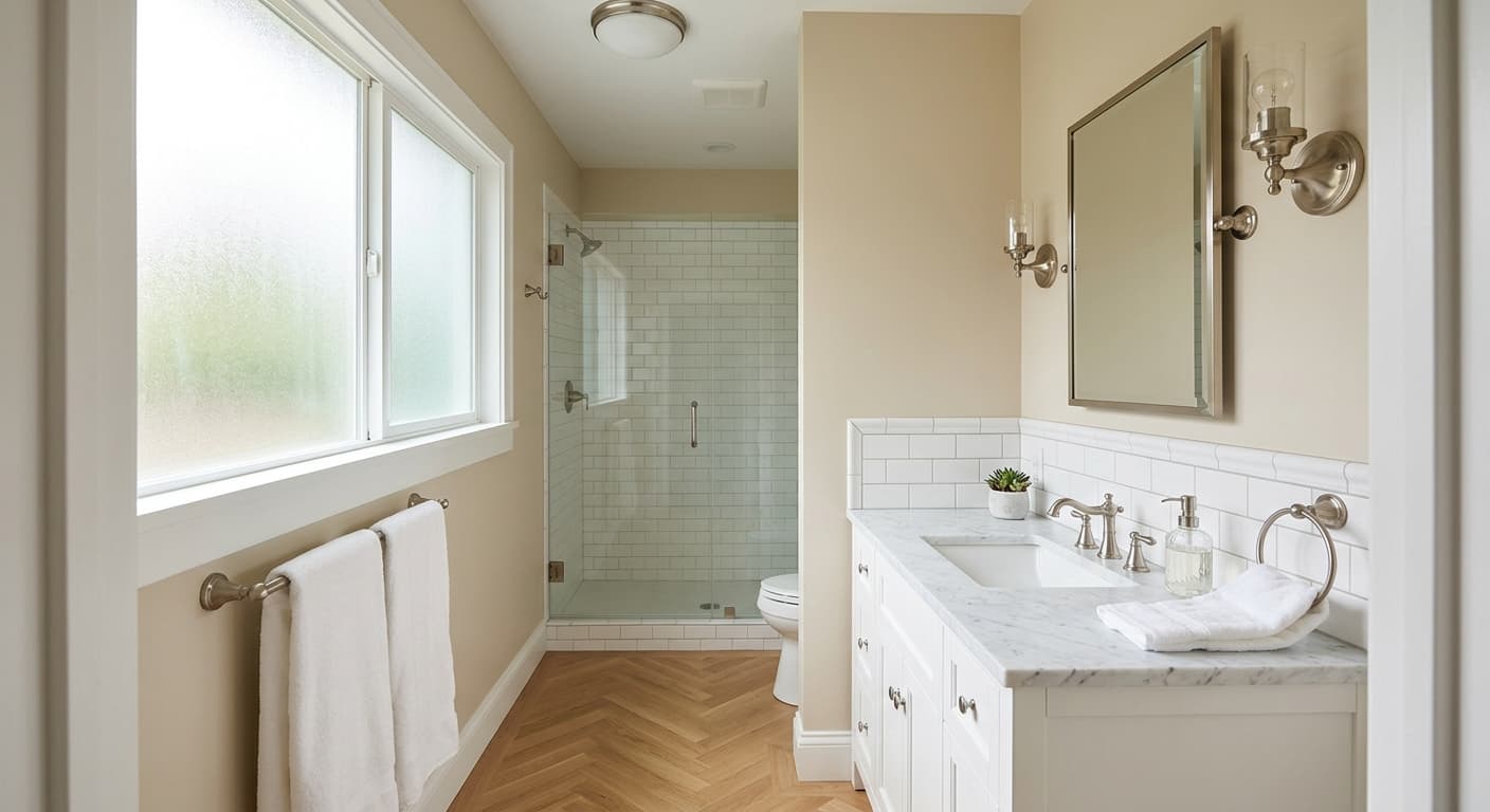
Opal OC-73 sits in that quiet zone between a true white and a creamy off-white. It is light without being stark, and it carries just enough color to feel deliberate rather than default. On the wall it reads as a soft, airy neutral that leans warm in incandescent light and pulls slightly cooler and greener in daylight or north-facing rooms.
Opal Undertones
The color facts list green and gray as the primary undertones, and that combination is what keeps Opal from reading as a straightforward cream or a simple warm white. In bright natural light the gray comes forward and the color can feel almost silvery. In warmer artificial light the green recedes and the overall effect is gentler and more neutral. Neither undertone is aggressive, but in a room with a lot of cool-toned furnishings or blue-gray flooring, the green can become more visible.
Where Opal Works Best
Opal is tagged for living rooms, bedrooms, and whole-house use, and that range makes sense. It is light enough to open up smaller rooms and subtle enough to flow through connected spaces without the color feeling different from room to room. Traditional and transitional interiors suit it well because its softness supports classic millwork and warmer wood tones. It is not a bold choice, but that is the point.
Where to put Opal
In a living room Opal works as a whole-wall color that recedes and lets furniture and art carry the room. Pair it with warm wood tones or natural linen upholstery to keep the green-gray undertone from reading cold. In a south or west-facing room with afternoon sun it will feel genuinely warm and inviting.
Opal is a natural fit for a bedroom because its lightness keeps the space feeling open while its soft undertones avoid the clinical feel of a pure white. Use warmer bedding and wood furniture to balance the gray-green pull, especially if the room faces north or east.
As a whole-house color, Opal travels well because it is neutral enough to work in varied lighting conditions across different rooms. Use Chantilly Lace (OC-65) consistently on trim throughout the house to give each room a clean, unified boundary without sharpening Opal's undertones.
What to Pair With Opal
Benjamin Moore pairs Opal OC-73 with Pink Damask (OC-72) and Chantilly Lace (OC-65) as coordinating colors. Pink Damask adds a gentle rosy warmth that plays against Opal's cooler green-gray without competing with it. Chantilly Lace is a clean, bright white that works well for trim, ceilings, and woodwork when you want crisp contrast against Opal's softer body.
Colors that clash with Opal
Opal's green-gray undertone can amplify in a room with cool blue or gray flooring, making the walls feel distinctly green rather than neutral.
A very cold bright white on trim can make Opal's green undertone look unintentional by contrast, as if the wall color is simply a failed white.
In low north light Opal can read noticeably cooler and slightly green, losing the soft neutral quality that makes it appealing.
Common questions
Opal OC-73 has an LRV of 84.33, which places it firmly in the light category. It reflects a high percentage of light, so it will keep rooms feeling open and airy rather than heavy.
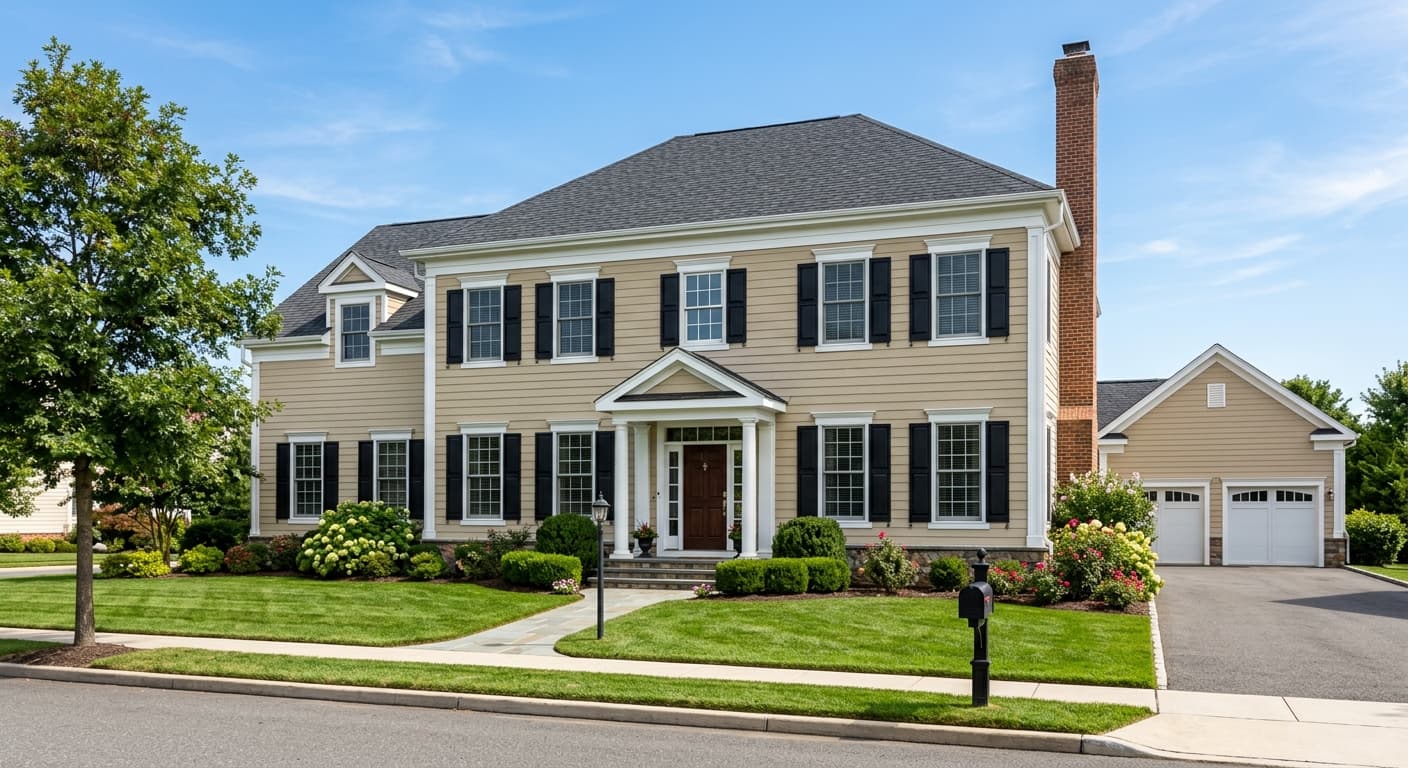
Yes, Opal OC-73 is available in both interior and exterior formulas, which makes it a practical choice if you want to extend the same color from inside to an exterior element like a porch ceiling or trim detail.
For living rooms and bedrooms, an eggshell finish is the most practical choice because it is easy to clean and does not amplify the color's undertones the way a flat finish can flatten them. Flat or matte works well on ceilings. Avoid high-gloss on large wall surfaces, as it will intensify the green-gray undertone under direct light.
Chantilly Lace is a much cleaner, brighter white with very little undertone, while Opal carries clear green and gray undertones that give it more depth. Chantilly Lace reads as crisp and fresh, Opal reads as soft and quiet. They work well together precisely because of that difference.