Iron Mountain
What Iron Mountain Actually Looks Like
Iron Mountain is a deep, complex gray that reads almost like a soft black in low light. Walk into a room painted in it on an overcast afternoon and you'll see a brooding, smoky charcoal. Then the sun comes out and the whole thing softens. Suddenly there's warmth in it, a hint of greenish-brown that keeps it from feeling cold or industrial.
That shifting quality is what makes this color worth your attention. It's not a flat, one-note gray. Under warm artificial light it leans earthy. Under cool daylight it can pull slightly slate. The depth gives walls a sense of weight without tipping into the heaviness you get from a true black.
You'll notice it photographs darker than it lives. In person, Iron Mountain has more nuance and movement than any swatch or screen suggests. Paint a large sample board and move it around the room across a full day before you commit. This is a color that rewards that patience.
Iron Mountain Undertones
The dominant undertone here is a muted green, with a touch of brown underneath. That green is subtle, but it changes how everything around the color behaves. Put it next to a gray with blue undertones and Iron Mountain will look warmer and slightly murkier by comparison. Put it next to warm beige and the green steps forward.
This matters most when you're choosing trim, flooring, and furnishings. The greenish base plays beautifully with natural materials like wood and stone, but it can clash with cooler grays and stark blue-whites. Test adjacent colors directly against it before deciding. The undertone is quiet, but it has opinions.
Where Iron Mountain Works Best
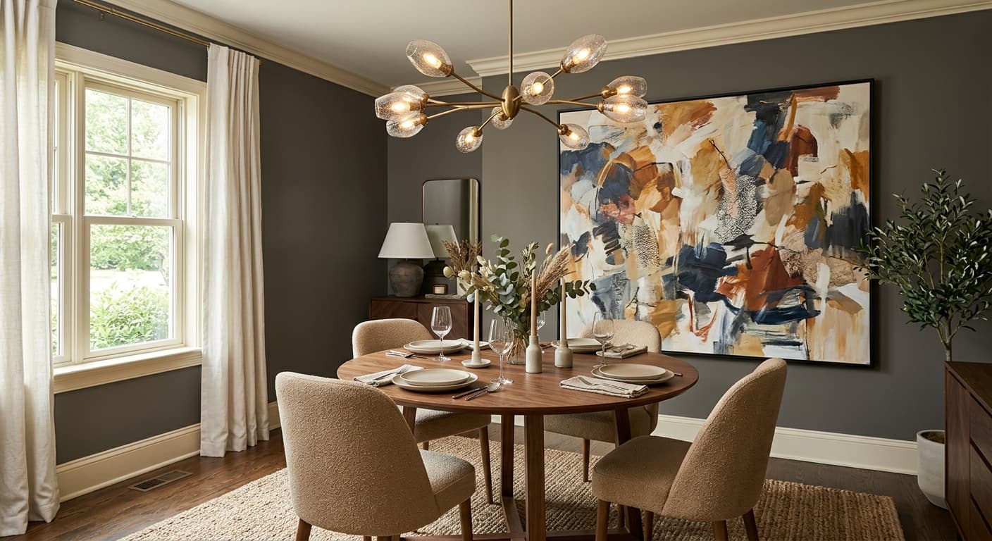
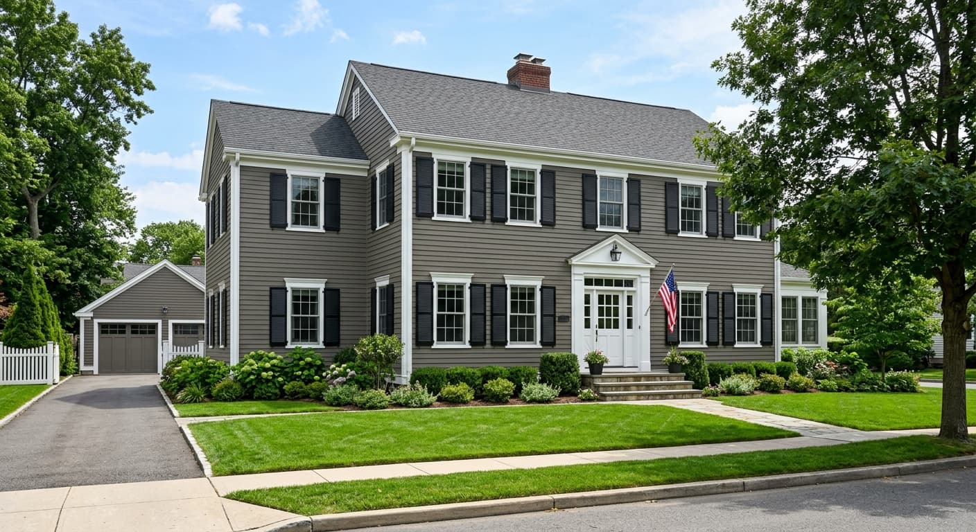
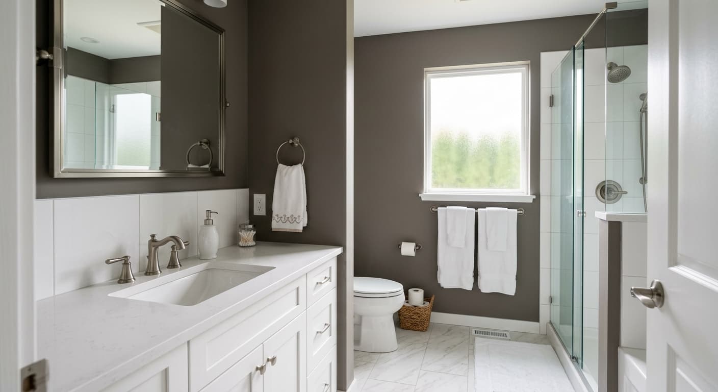
Iron Mountain thrives in rooms where you want depth and a little drama. Think dining rooms, studies, powder rooms, and accent walls behind a bed. It's a favorite for cabinetry and built-ins, where the saturation feels intentional and grounded. Exteriors love it too, especially on doors and shutters.
Orientation makes a real difference. In a south-facing room with strong natural light, you'll get the full range of the color's warmth and movement. North-facing rooms will pull it darker and cooler, which can be moody and cocooning if that's your goal, or oppressive if the space is already short on light. In small rooms, lean into the drama rather than fighting it. Iron Mountain doesn't try to make a space feel bigger, so use it where intimacy is the point.
What to Pair With Iron Mountain
For trim, a crisp warm white like White Dove (OC-17) or Simply White (OC-117) gives you clean contrast without going icy. If you want something quieter, Edgecomb Gray (HC-173) softens the transition. Natural wood flooring, especially mid-toned oak or walnut, picks up the earthy undertone and makes the whole room feel cohesive.
For furnishings, lean into warm leather, brass hardware, and textured linens in cream or oatmeal. Brass in particular sings against this depth of gray. If you want a coordinating wall color in an adjacent space, look at Revere Pewter (HC-172) or Stonington Gray (HC-170) for a lighter companion that shares the same restrained, livable quality.
Colors That Clash With Iron Mountain
Don't pair Iron Mountain with cool, blue-based whites or stark grays. The undertone clash makes both colors look slightly off, like neither one quite belongs. Avoid using it in a dark, north-facing room with minimal lighting unless you genuinely want a cave-like effect. And resist the urge to use it everywhere. This is a color with presence, and it works best when it has lighter elements to push against. Drowning a space in it removes all the contrast that makes it interesting.