Imperial Gray
What Imperial Gray Actually Looks Like
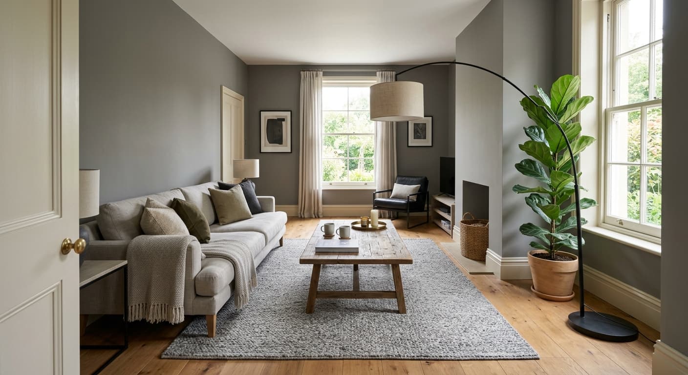
Imperial Gray is a mid-tone gray with a serious blue streak running through it. It reads as a true gray in some lights and shifts toward slate or even soft denim in others. This is not a beige-leaning greige or a warm gray. It sits firmly on the cool side of the spectrum, and you'll feel that the moment it's on the wall.
In north-facing rooms, the blue comes forward and the color can look almost steely. Add overcast daylight and it deepens into something moody and quiet. South-facing light warms it up just enough to soften that edge, letting the gray dominate over the blue. Under warm incandescent or 2700K LED bulbs at night, it relaxes and settles into a comfortable, dusky gray.
What makes it distinctive is that depth. At an LRV in the high 20s, Imperial Gray has enough pigment to feel substantial without tipping into charcoal. It holds a room. You'll notice it looks more saturated on large walls than it does on the chip, which is normal for any color this deep.
Imperial Gray Undertones
The undertone here is blue, with a faint cool gray base underneath. That blue is the thing to plan around. It will pull other blues in the room toward it and it can clash with anything that leans warm or yellow. If your trim, flooring, or furniture has a golden or red cast, the contrast can feel jarring rather than intentional.
Understanding the undertone matters because it dictates everything you place beside it. Cool whites stay crisp against Imperial Gray. Warm creams can look slightly dingy. Test your pairings in the actual room before committing, since the blue shifts noticeably with the light you have.
Where Imperial Gray Works Best
This color shines in rooms where you want atmosphere over brightness. Think studies, dining rooms, powder rooms, and bedrooms meant for rest. It's a strong choice for an accent wall behind a bed or in a hallway that needs a little gravity. South and west-facing rooms handle it best because the warmer light balances the cool depth.
In smaller spaces, Imperial Gray can feel intimate and intentional, especially in a powder room where you want drama in a low-stakes spot. In larger, well-lit rooms it works as a full wall color without closing things in. Avoid using it as your only color in a dark north-facing room with minimal natural light, since it can read flat and gloomy there.
What to Pair With Imperial Gray
For trim, reach for a clean cool white. Benjamin Moore Chantilly Lace or Decorator's White both keep that crisp contrast without introducing warmth that fights the blue. If you want softer separation, Simply White works but watch it under warm bulbs.
For flooring, mid to dark wood tones with neutral or cool undertones look natural beside it. Gray-washed oak is a safe bet. On furniture, lean into materials like brass, black metal, natural linen, and deep walnut. For complementary wall colors in adjacent rooms, try Pale Oak for a warmer neutral handoff or White Dove for something soft. If you want to build a tonal scheme, pair it with a lighter blue-gray like Stonington Gray.
Colors That Clash With Imperial Gray
Steer clear of warm-toned woods like honey oak or anything orange-leaning, since the contrast looks accidental rather than designed. Skip creamy yellow-based whites for trim. They make the gray look muddy. Don't pair it with competing warm neutrals like tan or camel on large surfaces, and avoid using it in a room that already struggles for light. The blue undertone needs decent illumination to look rich instead of cold.