Graytint
What Graytint Actually Looks Like
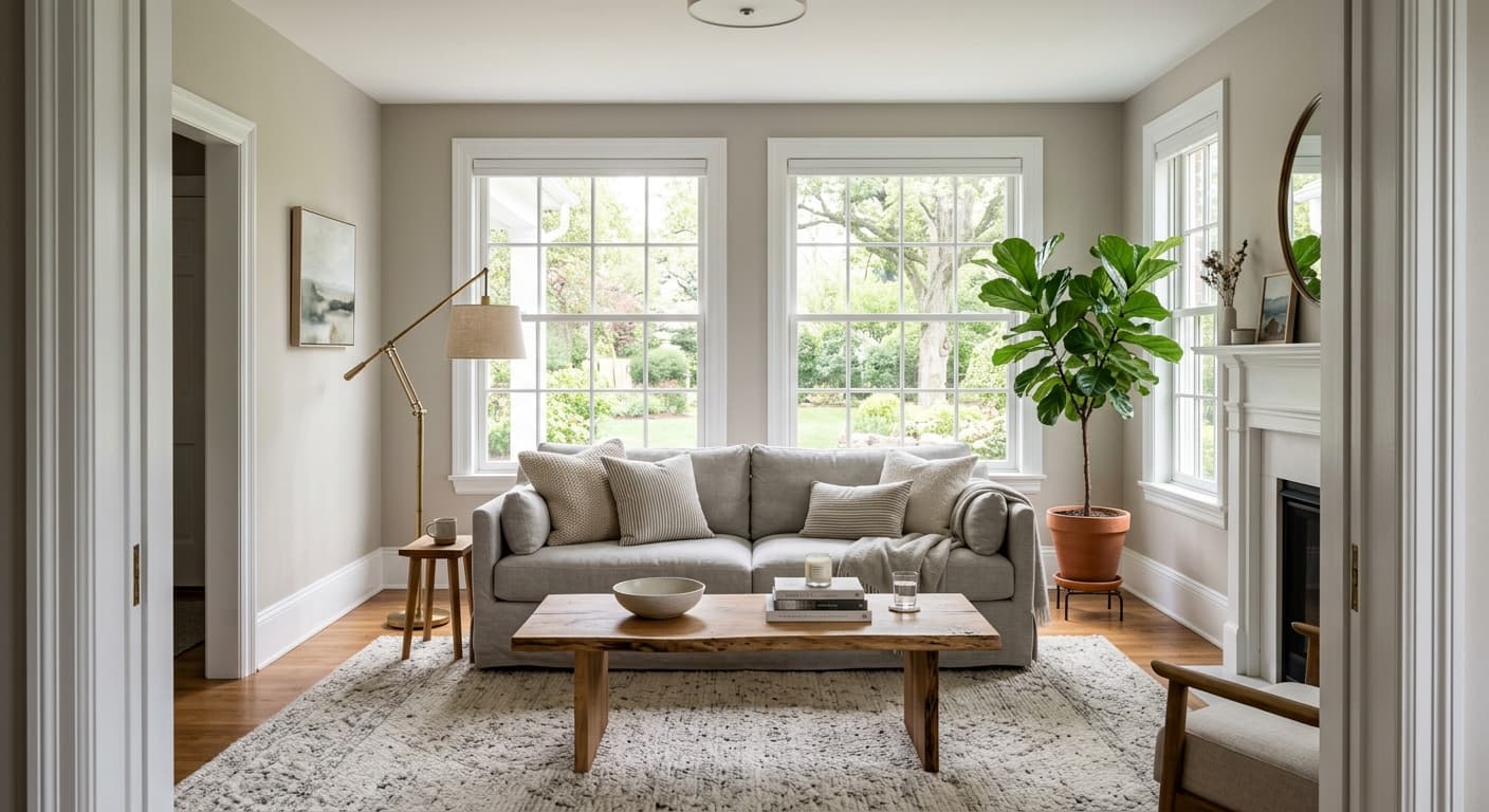
Graytint is one of those colors that barely reads as gray at all in the right light. It sits at the pale end of the spectrum, closer to a tinted off-white than a true gray. On a bright morning, your walls will look almost white with just a whisper of cool depth. By late afternoon, the gray settles in and gives the room a quieter, softer feel.
What makes it distinctive is the restraint. There's no drama here, no heavy pigment fighting for attention. It's the kind of color that holds a wall without announcing itself, which is exactly why people reach for it when they want light walls that don't feel stark.
You'll notice it shifts more than you'd expect for such a light shade. Under cool LED bulbs it leans crisper and slightly bluish. Under warm incandescent or in a south-facing room flooded with sun, it softens and picks up a faint greenish-gray cast. That movement is part of its appeal, but it also means you should test it before committing.
Graytint Undertones
Graytint carries a green-gray undertone that surfaces in certain lights. It's subtle, but it matters. That green base keeps the color from feeling cold and clinical the way blue-grays sometimes do, but it can clash if you pair it with grays that lean purple or pink.
Pay attention to this when you choose trim, flooring, and furnishings. A warm white trim will let the green-gray read as soft and natural. Cool, blue-leaning whites can make the undertone look slightly muddy by comparison. Bring home a sample and look at it next to the actual materials in your room, not just on a chip.
Where Graytint Works Best
This color does its best work in rooms with decent natural light. In a south or east-facing space, Graytint stays bright and airy without tipping into sterile. North-facing rooms are trickier. The cooler light there can flatten the color and pull out more gray than you might want, so it works in north-facing spaces only if you're comfortable with a quieter, more muted result.
It's a strong choice for bedrooms, living rooms, and hallways where you want a light, calm backdrop. Because it reflects so much light, it also helps small or low-light rooms feel more open. In open-plan spaces, it flows well from room to room without feeling repetitive.
What to Pair With Graytint
For trim, Benjamin Moore White Dove (OC-17) is a reliable partner. It's warm enough to complement the green-gray undertone without competing with it. Chantilly Lace works too if you want a cleaner, brighter contrast, though it leans cooler.
For furnishings, lean into natural tones. Oak and walnut flooring both look good against Graytint, as do linen, wool, and other soft textiles. If you want a deeper accent wall or adjacent color, look at Stonington Gray (HC-170) for a step darker in the same family, or bring in a muted green like Saybrook Sage for a more layered, organic palette. Black hardware and matte metal fixtures give the room a little grounding.
Colors That Clash With Graytint
Don't pair Graytint with warm beiges or yellow-based creams. The contrast pulls the green undertone forward in an unflattering way and makes the whole scheme look dated. Skip cool, blue-gray accents too, since they fight the green base. The most common mistake people make is choosing this color for a dim north-facing room and then wondering why it looks dull and lifeless. Test it in your actual space first.