Graphite
What Graphite Actually Looks Like
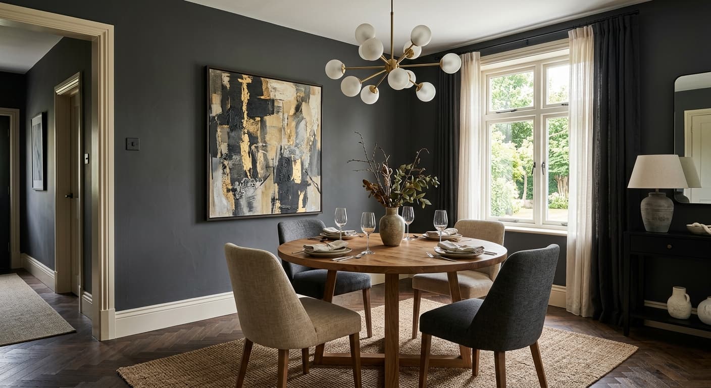
Graphite reads as a deep, saturated charcoal that sits right on the edge between gray and near-black. In low light, it can look almost like soft black. Pull back the curtains on a bright morning and you'll see its true character: a cool, smoky gray with real depth.
This is not a flat, lifeless dark color. There's dimension here. The pigment shifts with the day, going moodier and heavier as the sun drops, then lightening into a clear slate tone under midday light. You'll notice it behaves differently on a large wall versus a small sample card, where it tends to look much darker than it actually paints out.
What makes Graphite distinctive is how it holds its cool composure without tipping into harsh, industrial territory. It feels grounded and architectural. On cabinetry or a fireplace surround, it gives you weight and presence without the starkness of true black.
Graphite Undertones
Graphite carries a quiet blue undertone. It's subtle, but it matters. Under cool LED lighting or in a north-facing room, that blue can come forward and make the whole color feel crisper and a touch cooler. In warm incandescent light, the blue settles back and the gray reads more neutral.
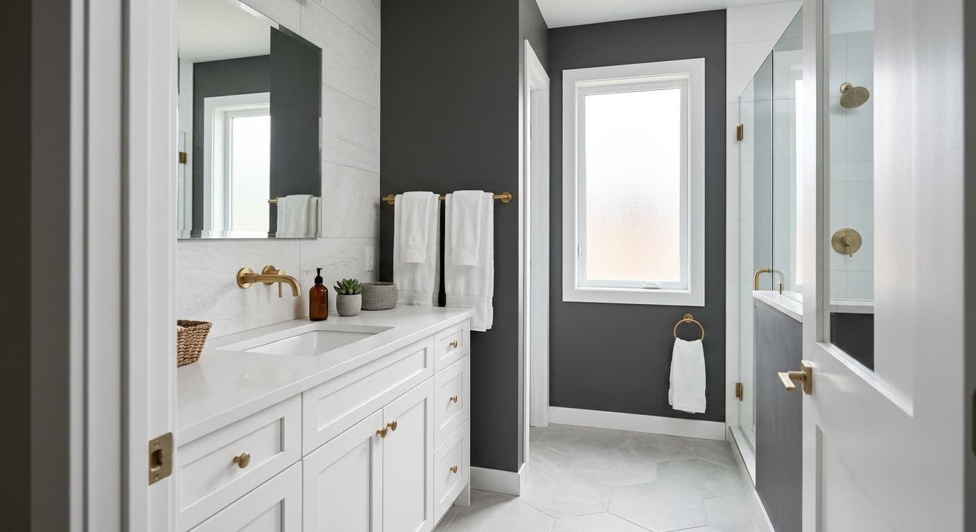
Because of that cool lean, you want to be careful with the warm tones around it. Beige trim or yellow-based whites will fight the blue and look slightly dingy. Cooler whites and grays sit beside it much more comfortably. Test it against your existing finishes before you commit, since the undertone is the thing that trips people up.
Where Graphite Works Best
Graphite thrives in spaces where you want drama and definition. Think dining rooms, studies, powder rooms, and bedrooms where a cocooning effect is the goal. It's a strong choice for an accent wall behind a bed or for built-in shelving you want to recede into shadow.
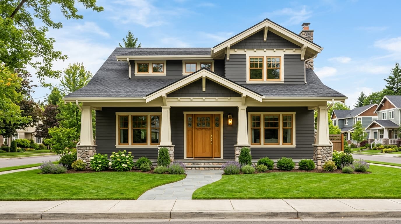
South-facing rooms with plenty of natural light handle Graphite beautifully, since the sun keeps it from feeling oppressive. In north-facing rooms, the cool light intensifies its blue side, so you'll get a moodier, more atmospheric result. That can be exactly what you want in a den, but think twice in a small north-facing space that already feels chilly. On exteriors, it's a confident, modern choice for siding, doors, and shutters.
What to Pair With Graphite
For trim, reach for a clean cool white like Chantilly Lace (OC-65) or Decorator's White (OC-149). These keep the contrast sharp and let the blue undertone stay honest. If you want softer contrast, a mid-gray like Stonington Gray (HC-170) works well.
For furnishings, Graphite plays beautifully against natural wood tones, especially white oak and walnut, which warm it up. Brass and aged bronze hardware add a glow that keeps the cool gray from feeling severe. On floors, pale oak or a warm honey wood balances the depth, while concrete or cool gray tile leans into its modern edge. As a companion wall color, Pale Oak (OC-20) or Classic Gray (OC-23) give you a light, airy counterpoint.
Colors That Clash With Graphite
Don't pair Graphite with warm cream trim or yellow-toned whites. The clash makes both colors look muddy. Avoid using it in a small, windowless room without enough lighting, where it will swallow the space and feel claustrophobic rather than intimate. Skip the high-gloss finish on large walls too, since it amplifies every imperfection and reflects light in a way that flattens the color's depth. Matte or eggshell shows it best.