Dark Harbor
What Dark Harbor Actually Looks Like
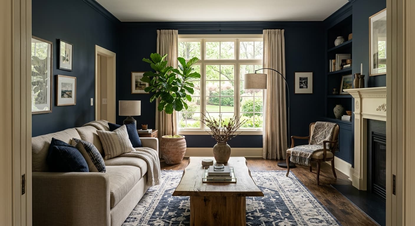
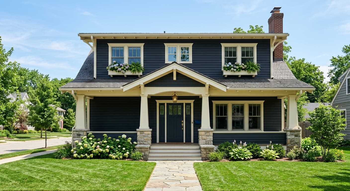
Dark Harbor reads as a deep, inky navy that hovers right at the edge of charcoal. In low light, it goes nearly black, the kind of color that swallows the corners of a room and makes everything feel quieter. Step into bright daylight and the blue starts to surface. You'll see a slate-like quality, with just enough gray mixed in to keep it from looking like a primary navy.
This is a color that changes its mind depending on what you put it next to. Against white trim, the blue pops and the contrast feels crisp. Surrounded by other dark tones, it can disappear into a moody, almost monochrome backdrop. That shape-shifting quality is what makes it interesting and also what trips people up.
What sets it apart from a standard navy is the weight. It feels heavier and more grounded, less nautical and more architectural. Think library, not beach house.
Dark Harbor Undertones
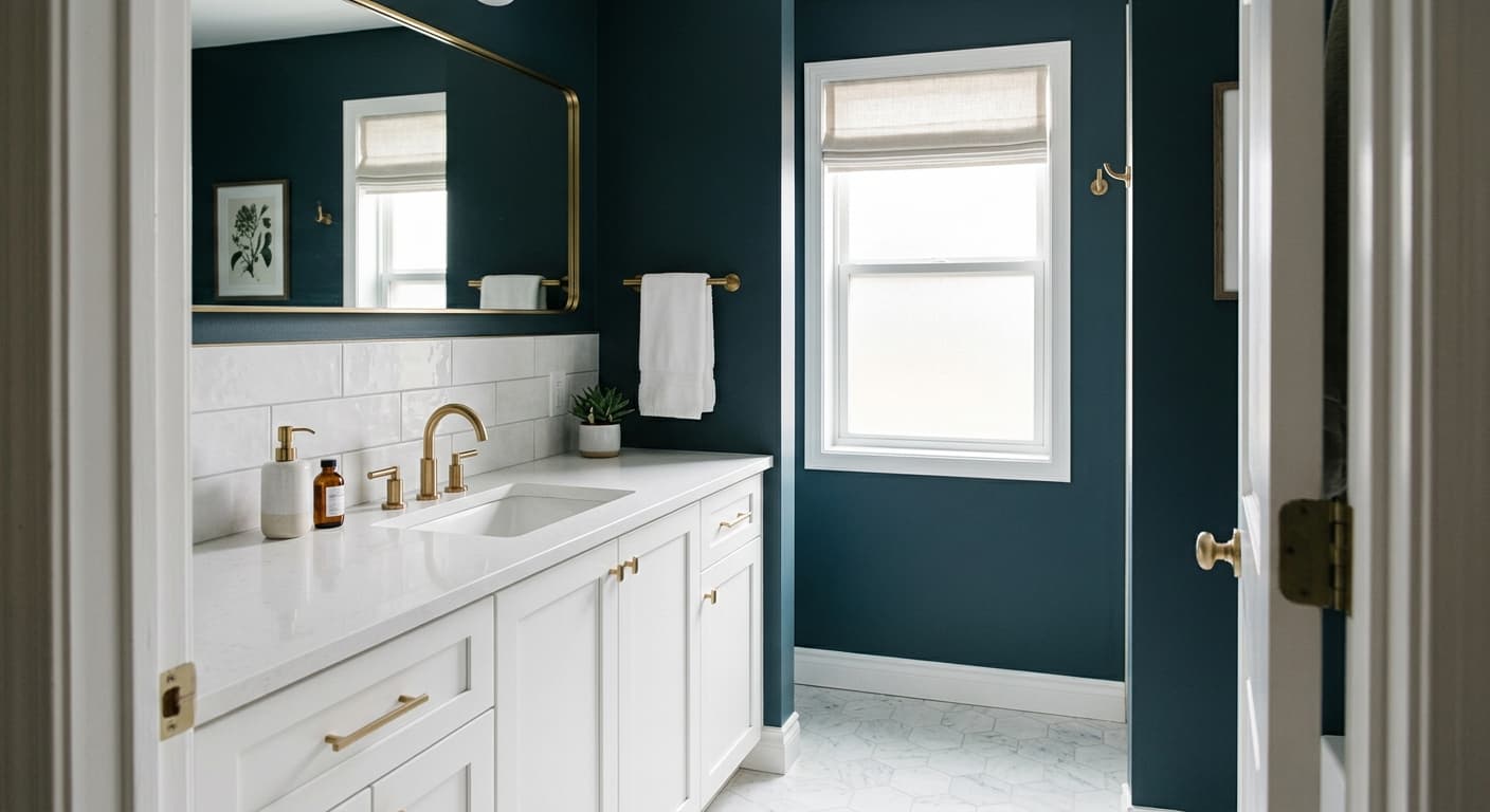
The undertone here is a cool gray-blue, and it leans more gray than most people expect. That matters because it can clash with warmer navies that have a violet or red base. If you're pairing Dark Harbor with other blues, check that they share the same cool, slightly gray foundation, or the difference will look like a mistake rather than a choice.
The gray undertone also means it plays better with cool whites and silvery metals than with warm creams and brass. You can absolutely break that rule, but do it on purpose, because the contrast between cool walls and warm accents needs to be deliberate to read as intentional.
Where Dark Harbor Works Best
This color thrives in rooms you want to feel cozy and enclosed. Dining rooms, home offices, powder rooms, and bedrooms all benefit from its enveloping quality. It's a strong choice for cabinetry, built-ins, and front doors, where the depth gives you richness without going fully black.
Orientation is everything with a color this dark. In a north-facing room with cool, flat light, Dark Harbor will lean very gray and can feel cold, so layer in warm lighting and textiles. In south-facing or well-lit spaces, the blue comes alive and the room feels more dimensional. In small rooms, lean into the drama instead of fighting it. A tiny powder room painted floor to ceiling in this color feels like a jewel box, not a closet.
What to Pair With Dark Harbor
For trim, a clean cool white like Chantilly Lace keeps things sharp and modern. If you want softer contrast, Simply White warms it slightly without muddying the blue. White Dove works when you want the trim to recede rather than frame.
For flooring, mid-tone to dark wood with cool or neutral undertones grounds the color nicely, while pale oak creates a striking contrast. Bring in furniture in camel leather, warm wood, or soft oatmeal linen to keep the space from feeling severe. Brass and aged bronze hardware add warmth and a touch of polish. If you want a coordinating wall color in an adjacent room, Stonington Gray or Gray Owl bridge the cool tones without competing.
Colors That Clash With Dark Harbor
Don't pair Dark Harbor with warm, yellow-based whites like Navajo White or a heavy cream, because the contrast turns the blue dingy and the white looks dirty. Avoid flat finishes on anything you touch often, since dark colors show every fingerprint and scuff. And resist the urge to use it in a room that already gets very little natural light unless you commit to serious artificial lighting. A dark color in a dark room reads as gloomy, not cozy.