Camouflage
What Camouflage Actually Looks Like
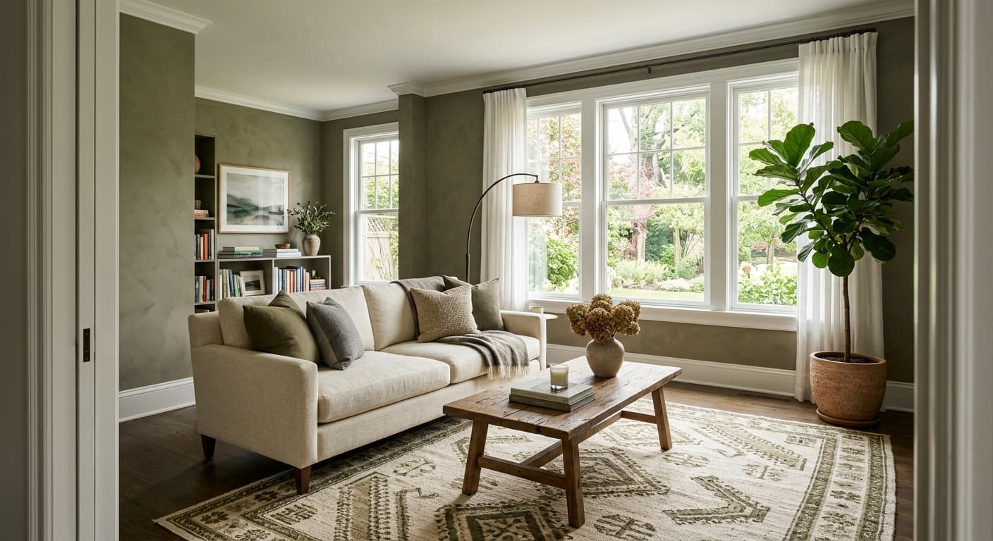
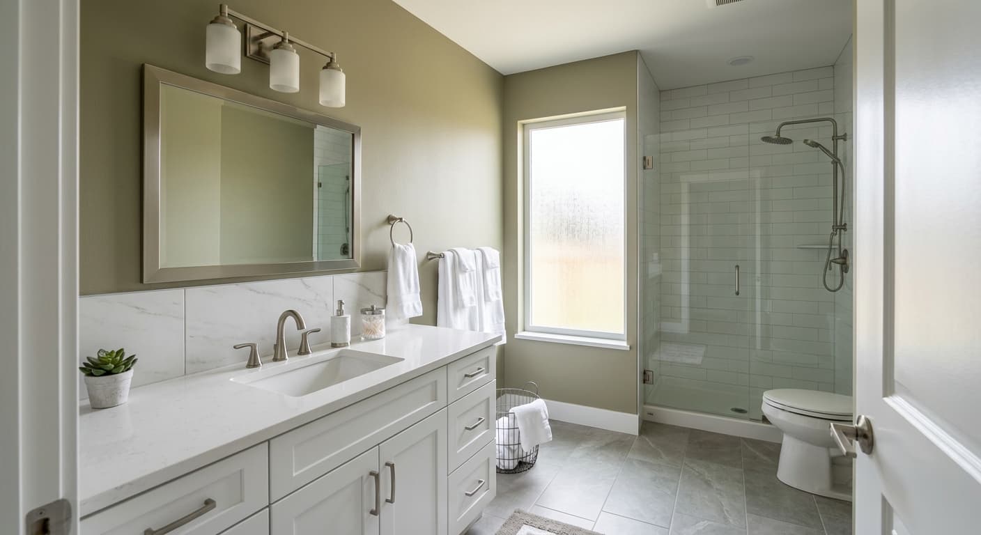
Camouflage is a muted, earthy green with a heavy dose of gray and a quiet brown base. It reads less like a true green and more like a green that got tired and sat down. In a bright room it leans soft and sage. In dimmer light it pulls toward olive drab, closer to the military green its name suggests.
The color shifts more than most greens do. Morning light brings out the gray. Late afternoon sun warms it up and the brown undertone starts to show. Under warm artificial bulbs it can go almost khaki, which is either exactly what you want or a surprise you did not plan for.
What makes it distinctive is that it never shouts. You will not walk into the room and immediately register "green." Instead you notice a calm, grounded wall color that takes on the character of whatever light and furnishings surround it. That chameleon quality is the whole point.
Camouflage Undertones
The undertones here are gray and brown, and they matter a lot. Because Camouflage is desaturated, it will borrow from nearby colors. Put it next to something cool and the gray takes over. Put it next to warm wood or cream and the olive warmth comes forward. Test it on the actual wall before you commit.
The brown base is what keeps this from feeling cold or clinical. It also means crisp blue-white trim can fight with it. Knowing whether you are working with the gray side or the green-brown side will guide every other choice you make in the room.
Where Camouflage Works Best
This works well in studies, bedrooms, dens, and dining rooms where you want a settled, low-key mood. It suits south and west-facing rooms that get warm light, since that light pulls out the better, earthier version of the color. In north-facing rooms it can turn gray and a little flat, so account for that or add warm lighting to compensate.
It holds up in both small and large spaces. In a small room it adds depth without closing things in. In a larger room it gives walls some weight so they do not feel empty. Just avoid rooms with very little natural light unless you are fine with the muddier, grayer read.
What to Pair With Camouflage
For trim, reach for a soft warm white rather than a bright cool one. Benjamin Moore White Dove (OC-17) and Simply White (OC-117) both work without competing. If you want contrast, a deeper charcoal or near-black on doors and trim looks sharp against the green. Natural wood tones, especially walnut and warm oak, complement the brown undertone nicely.
For furnishings, lean into earthy and natural materials. Leather, linen, rattan, and aged brass all sit comfortably here. Cream and camel upholstery warms the space. For adjacent walls or accents, consider Benjamin Moore Revere Pewter (HC-172) or a deeper green like Backwoods (469) for a layered, tonal scheme. Black hardware grounds everything.
Colors That Clash With Camouflage
Skip stark, blue-based whites for trim, since they make the green look dull and slightly dirty by contrast. Avoid pairing it with cool grays and icy blues, which flatten the warmth and leave the room feeling washed out. Do not use it in a dark room and expect the sage version you saw on the chip. Without good light it slides toward gray-brown and can feel heavy.