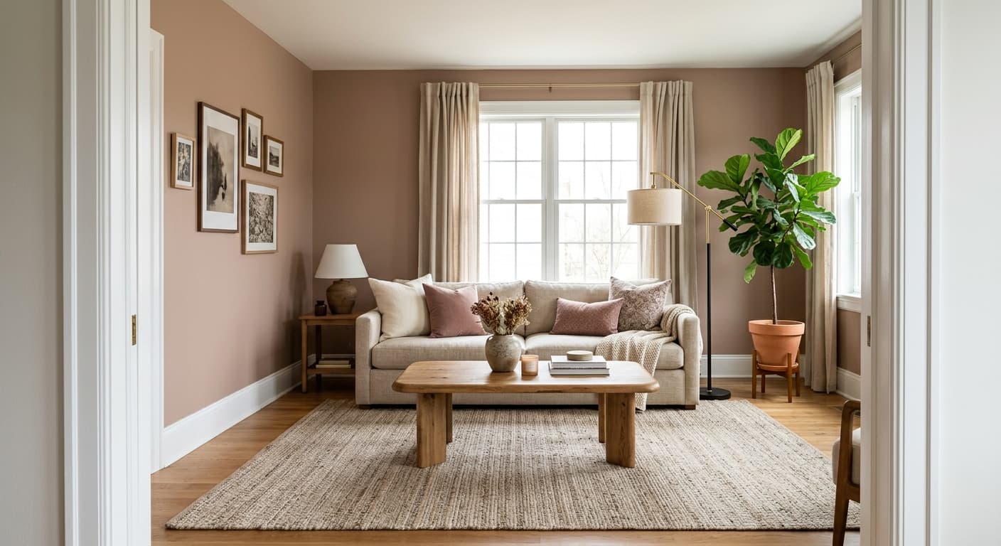
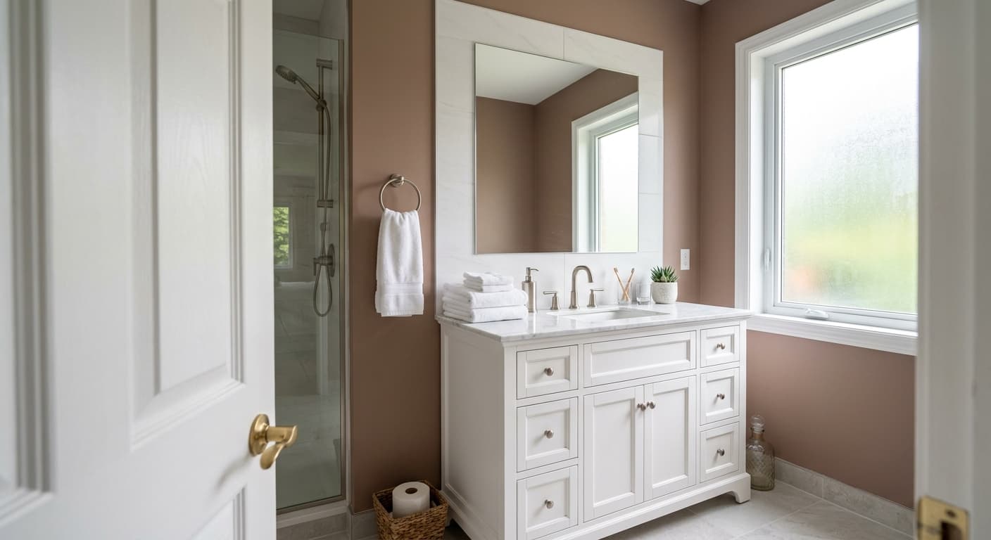
Boudoir
What Boudoir Actually Looks Like
Boudoir is a deep, smoky rose with real weight to it. This isn't a soft pink or a sweet blush. It reads closer to a dusty plum-mauve, the kind of color that feels grown-up and a little moody. In a paint can it looks almost brown. On the wall it opens up into something far more interesting.
Lighting changes this color significantly. Under warm incandescent or LED bulbs in the evening, Boudoir leans into its rosy, wine-tinged side and feels enveloping. In bright daylight, especially with cool northern light, you'll notice the gray pulling forward, which tones down the pink and gives it a more muted, sophisticated cast. South-facing rooms warm it up and make the plum read richer.
What makes it distinctive is that balance between rose and gray. Too many deep pinks go either cloying or muddy. Boudoir sits in a middle zone that feels intentional. It has enough saturation to make a statement without tipping into a color you'll tire of in a season.
Boudoir Undertones
The dominant undertone here is mauve, that mix of pink and gray that sits between warm and cool. There's a subtle brown grounding it underneath, which keeps the color from feeling overly sweet or feminine in the wrong way. This matters because that brown base plays nicely with natural wood and warmer neutrals.
Watch how the undertone shifts against your fixed elements. Next to cool grays or blue-toned flooring, the pink in Boudoir becomes more obvious. Against warm woods and cream, the gray-brown side steps forward. Test it on multiple walls before you commit, because this is a color that genuinely behaves differently depending on what surrounds it.
Where Boudoir Works Best
Boudoir was made for bedrooms, and the name isn't an accident. It creates an intimate, cocooning effect that suits a room you want to feel restful and a little luxurious. Dining rooms are the other natural fit, since the depth of color reads beautifully under candlelight and pendant lighting at night.
This is a confident color, so it handles small spaces well rather than overwhelming them. A powder room, a study, or a reading nook can carry it easily. In larger rooms, use it on a single accent wall or commit to all four walls if you want full drama. South and west-facing rooms flatter it most. North-facing spaces will mute it, which can be lovely if you want something subdued, but know it will read grayer and cooler there.
What to Pair With Boudoir
For trim, a soft white like White Dove (OC-17) keeps things crisp without going stark. If you want a more seamless, modern look, try a deeper greige trim or even painting the trim the same color for a tonal effect. Natural oak and walnut flooring both work, picking up that warm brown undertone underneath the rose.
For adjacent walls or complementary colors, look to muted greens like Saybrook Sage (HC-114) or a deep slate like Hale Navy (HC-154) for contrast that feels collected rather than expected. Brass and aged bronze hardware sing against it. For furnishings, lean into cream linen, camel leather, and brushed gold. These tones let Boudoir stay the star.
Colors That Clash With Boudoir
Skip pairing Boudoir with bright, cool whites that have a blue base, since they'll fight the warmth and make the walls look dingy. Avoid cool gray flooring, which drags out the gray undertone and flattens the whole room. Don't combine it with primary brights or anything overly saturated, because Boudoir already carries plenty of personality and needs calmer companions. And resist the urge to use it in a poorly lit room with only cool overhead lighting. You'll lose everything that makes the color worth choosing.