Black Beauty
What Black Beauty Actually Looks Like
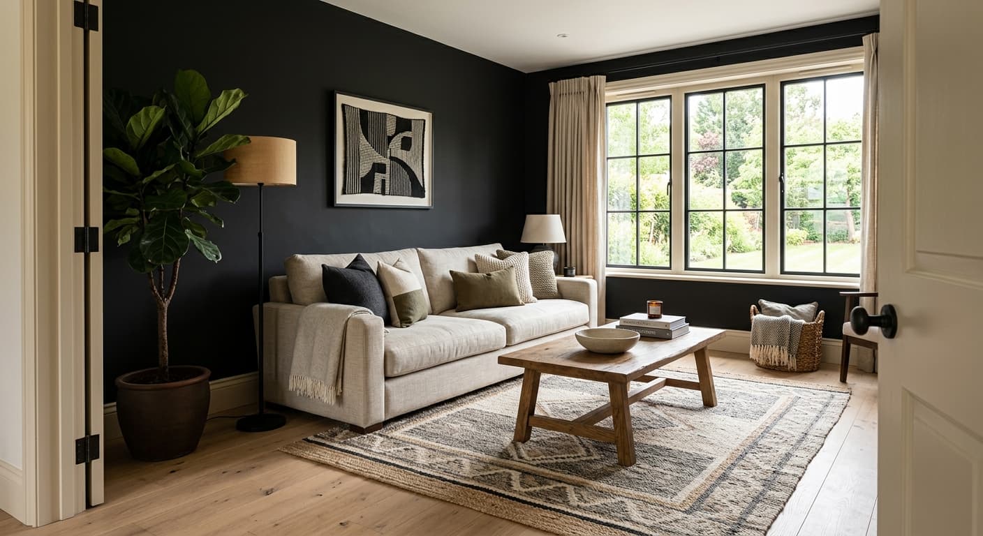
Black Beauty is a near-black with a soft blue-charcoal core. In a dark room or at night, it reads as a true black. But put it next to a window in daylight and you will see the blue come through, especially on a north-facing wall where cooler light tends to amplify that undertone.
This is not a flat, dead black. It has depth that catches and holds light differently depending on the finish you choose. In a matte finish, it absorbs light and feels dense and quiet. In satin or semi-gloss, it picks up reflections and the blue base becomes more obvious, particularly around lamps and natural light sources.
You will notice it shifts more than most people expect. Morning light can make it look almost slate. By late afternoon, with warmer light, it settles into something closer to pure black with just a hint of cool underneath. That movement is what separates it from a basic jet black like Onyx.
Black Beauty Undertones
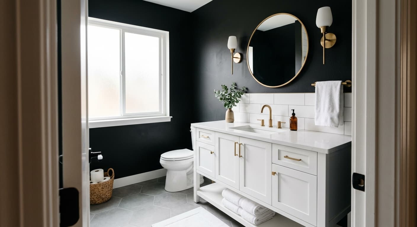
The undertone here is blue, sometimes leaning slightly toward charcoal. This matters because it will fight with warm-toned woods and brass if you are not paying attention. A blue-black next to honey oak or a yellow-based beige can look mismatched and cold.
Lean into the cool side instead. Black Beauty plays well with greys, crisp whites, and cooler metals like nickel and chrome. If you want to warm it up, you can, but you will need to do that deliberately with your furnishings and lighting rather than expecting the paint to do it for you.
Where Black Beauty Works Best
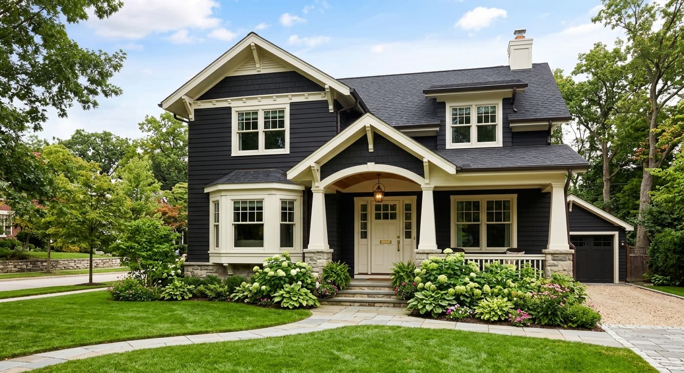
This color earns its place on accent walls, front doors, kitchen islands, and cabinetry. It works in small rooms you want to feel like a deliberate, enveloping space, a powder room or a study, rather than trying to make them feel bigger. In larger rooms with good natural light, you can take it across all four walls without the space feeling like a cave.
South and west-facing rooms get the most flattering result because the warmer light balances the cool base. North-facing rooms will read cooler and bluer, which can work beautifully if that is the mood you want, but go in knowing it. Avoid pairing it with poor artificial lighting. A dark color shows every shortcoming in a badly lit room.
What to Pair With Black Beauty
For trim, Chantilly Lace (OC-65) gives you a clean, bright contrast that makes the black look intentional and sharp. If you want something softer, Simply White (OC-117) takes the edge off without going warm. For a tonal, low-contrast look, pair it with Kendall Charcoal (HC-166) or Cheating Heart (1617) on adjacent walls.
Flooring-wise, this color suits cooler woods like a greyed oak or a darker walnut, plus concrete and natural stone. For furniture, lean into greys, deep greens, and leather in cognac or black. Cool metals work best, so think brushed nickel, chrome, and matte black hardware. A pop of brass can work if you keep it minimal and treat it as a deliberate accent rather than the dominant metal.
Colors That Clash With Black Beauty
Skip the warm beiges, the golden oaks, and the yellow-based creams. They make the blue undertone look off and the whole palette feels uncoordinated. Do not use it in a room with weak or yellow-heavy artificial lighting, because it will look muddy and flat instead of crisp. And resist the urge to surround it with too many warm tones to compensate. That tension between cool paint and warm everything-else is the most common mistake people make here.