Bittersweet Chocolate
What Bittersweet Chocolate Actually Looks Like
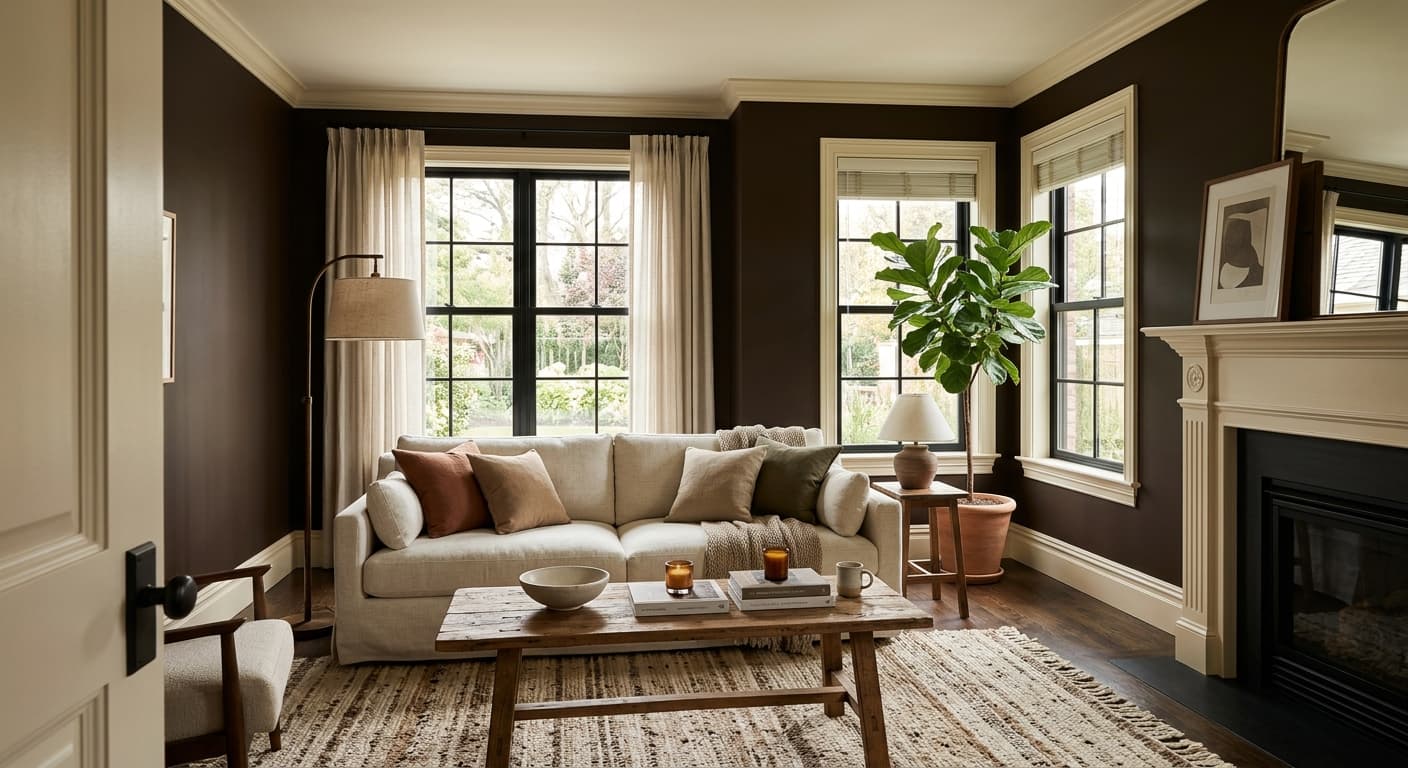
Bittersweet Chocolate is about as deep as brown gets before it reads black. In a paint chip it looks almost solid and impenetrable, but on a wall it has more life than you'd expect. There's a real cocoa quality to it, a richness that comes through in good light and goes quiet and shadowy when the light drops.
In bright daylight you'll notice the warmth. It leans into espresso territory, with a hint of that roasted, slightly red depth that keeps it from feeling cold or industrial. As the sun moves and the room dims, the color closes up. By evening it can pass for near-black, especially under warm artificial light.
What makes it distinctive is how it holds its brown identity even at this saturation. Plenty of dark browns flatten out into a generic dark smudge. This one keeps its character. You can tell it's chocolate, not charcoal, and that difference matters when you're trying to create warmth instead of severity.
Bittersweet Chocolate Undertones
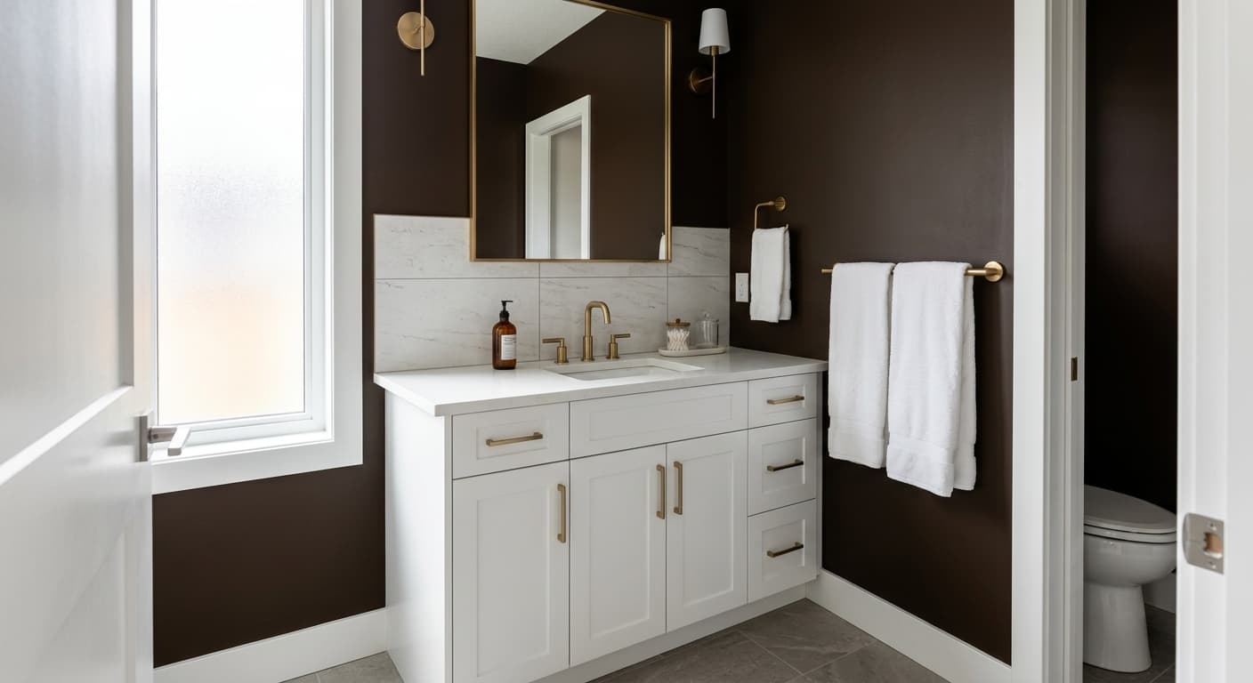
The undertone here is warm, sitting somewhere between red and a touch of grounding gray. That warmth is the whole reason to choose this color, but it also means you need to watch what you place beside it. Cool grays and blue-leaning whites will fight against it and make the brown look muddy by comparison.
Undertones matter most at the edges, where your wall meets trim, flooring, and furniture. Put a stark cool white next to this and the contrast turns harsh. Pair it with warmer neutrals and the whole scheme settles into something cohesive and intentional.
Where Bittersweet Chocolate Works Best
This is a color for spaces where you want intimacy and depth. Dining rooms, libraries, studies, and powder rooms all take it well. It wraps a room and makes it feel enclosed in the best way, which is why small spaces actually benefit from it rather than shrinking. A tiny powder room painted in Bittersweet Chocolate feels deliberate and rich, not cramped.
South-facing rooms get the most out of it because the warm light brings out the cocoa tones. North-facing rooms will read darker and cooler, so you'll need solid artificial lighting to keep it from going flat. Avoid using it as the only color in a room with very little natural light unless that moody, cocooning effect is exactly what you're after.
What to Pair With Bittersweet Chocolate
For trim, go warm. Benjamin Moore White Dove or Cloud White give you a soft, creamy contrast that won't feel jarring. If you want something with more warmth still, Swiss Coffee works nicely. For walls in adjacent spaces, consider a warm greige like Revere Pewter or a muted tan like Shaker Beige to ease the transition.
Furniture in caramel leather, brass, aged bronze, and natural oak all sing against this backdrop. Flooring in medium to warm wood tones grounds it well, while a wool rug with cream and rust tones adds depth. Brass hardware especially earns its keep here, catching the light and breaking up all that depth.
Colors That Clash With Bittersweet Chocolate
Don't pair it with cool, blue-based whites or gray. The clash flattens the warmth and makes everything look dingy. Avoid using it across every wall in a low-light room with no contrast, because without lighter elements to push against, the space turns into a dark box. And resist the urge to combine it with too many other dark, saturated colors. This brown needs lighter companions to read as rich rather than oppressive.