Abalone
What Abalone Actually Looks Like
Abalone is a soft greige that reads more gray than beige in most rooms. It sits right at the line where warm and cool meet, which is why it can look like two different colors depending on when you walk into the room. In flat morning light it leans cool and almost lavender-gray. By late afternoon, with warmer sun coming in, it softens and picks up a faint mushroom quality.
The color stays quiet. You will not get a strong reaction from it, and that is the point. It works as a backdrop rather than a statement, so your furniture and art do the talking while the walls stay neutral behind them.
What makes Abalone distinctive is that subtle violet thread running through the gray. Hold it next to a pure gray and you will see it immediately. That trace of purple keeps it from feeling cold or institutional, which is a common problem with grays that have blue or green bases.
Abalone Undertones
The undertone here is a soft gray-violet, and it matters more than you might expect. Under cool LED bulbs or north light, that violet shows up clearly. Under warm incandescent or in a south-facing room, it gets muted and the color reads closer to a plain warm gray. Test it on your actual walls before committing, because the same can of Abalone behaves differently in two rooms of the same house.
This undertone also affects everything you put against it. Warm wood tones and creamy whites bring out the soft side. Cool grays and stark whites push the violet forward. Neither is wrong, but you should decide which direction you want and choose your trim and furnishings to match.
Where Abalone Works Best
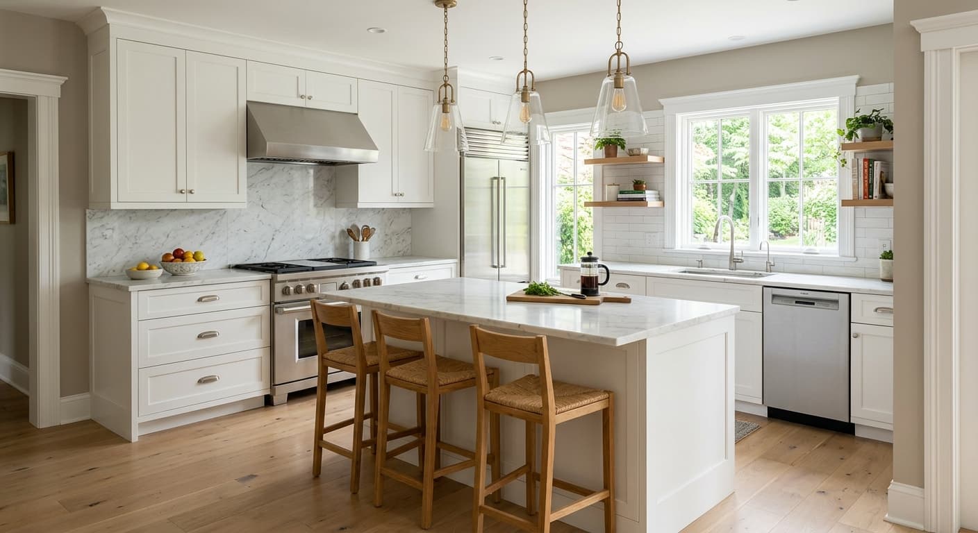
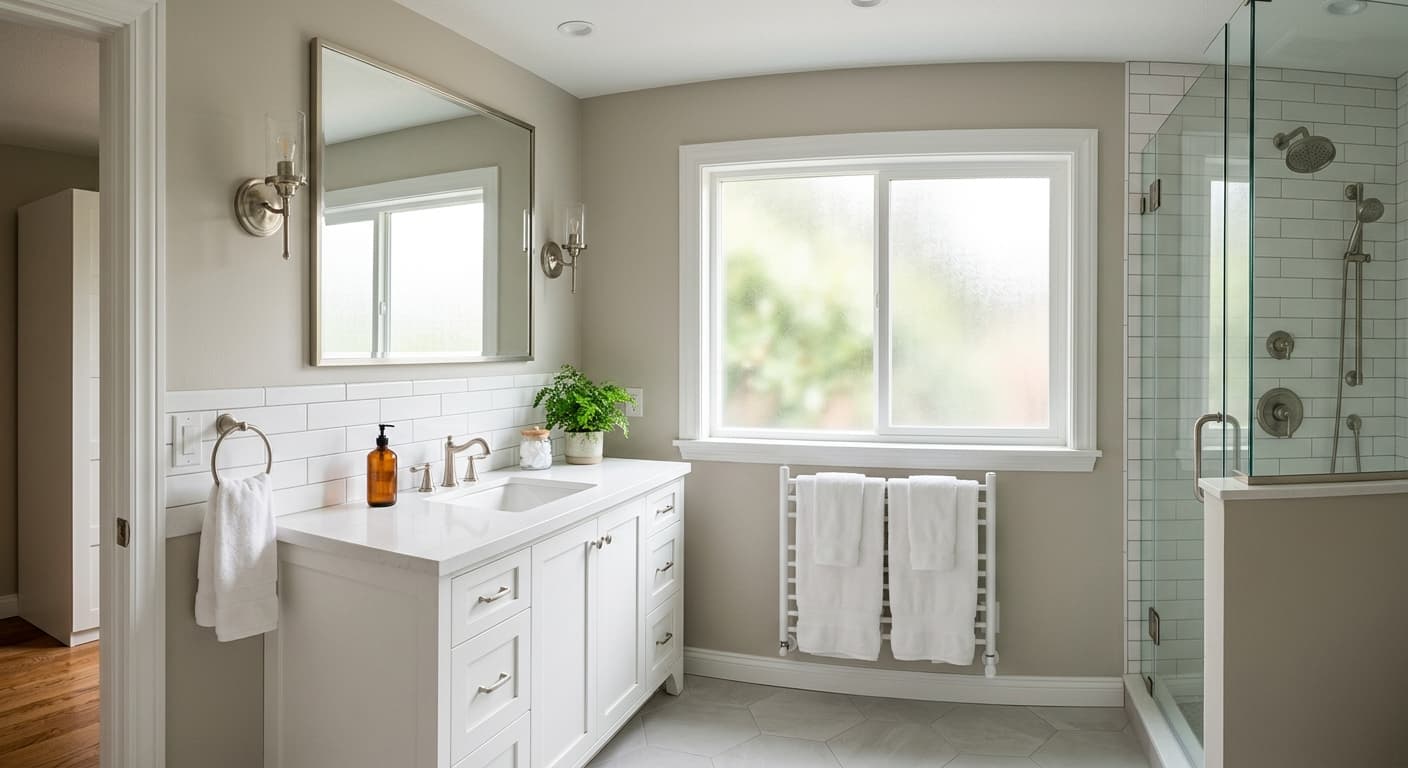
Abalone does well in bedrooms, bathrooms, and living rooms where you want calm without going fully gray. North-facing rooms can flatten it and pull the cool violet forward, so if you have north light and want warmth, this may not be your color. South and west-facing rooms treat it kindly and let the softer side come through.
It works in both small and large spaces. In a small room it keeps things light and open without feeling sterile. In a large open-plan area it reads as a consistent neutral that flows from wall to wall without drawing attention to itself.
What to Pair With Abalone
For trim, Benjamin Moore White Dove (OC-17) is a reliable match. It is soft enough that it does not fight Abalone, and the warmth keeps the pairing from feeling cold. If you want more contrast, Simply White (OC-117) works, though it will sharpen the violet undertone. Chantilly Lace (OC-65) gives you a crisp, clean trim if you prefer a cooler look.
For furnishings, lean into warm woods like oak and walnut to balance the cool side of the color. Brass and aged bronze hardware look good against it. For flooring, both light oak and mid-tone wood work well. If you want a coordinating wall color elsewhere, look at Gray Owl (OC-52) for something slightly deeper, or Classic Gray (OC-23) for a lighter, warmer companion.
Colors That Clash With Abalone
Skip pairing Abalone with strong yellow-based beiges or golden creams. The violet undertone clashes with them and the whole thing starts to look muddy. Stark bright whites in poor lighting can also make the walls look dingy by comparison, so be careful with trim if your room runs cool. And do not assume the swatch in the store tells the whole story. The biggest mistake people make is committing without testing in their own light, then wondering why the violet showed up uninvited.