Warm Oats SW 9511 lands in the quieter part of the neutral range. It reads as a soft, muted beige with a creamy tan character, light enough to keep a room feeling open but warm enough that no one will ever mistake it for white. At LRV 62.6 it sits solidly in the light range, which means it warms a space without absorbing light or closing a room down.
On the wall, the color has a gentle oat quality, that soft biscuit-tan you associate with natural linen or raw grain. It does not pop or demand attention. Reviewers consistently describe it as calm and cozy, the kind of neutral that lets furniture and finishes do their work while the walls hold everything together. It stays subdued rather than tilting bright yellow or golden, which is one of the main reasons people gravitate toward it as a whole-house color.
Under different conditions it behaves well. In natural daylight it feels soft and slightly sunny, the warmth reads clearly without going saturated. Under artificial light it shifts a touch more neutral and the taupe side comes forward, giving it a slightly richer, greige-leaning quality. Neither shift is dramatic. It stays in character across a range of exposures, which is exactly what you want from a color you are committing to across multiple rooms.
The base undertone read is warm oat and beige, and most reviewers land there. The color has enough warmth to feel genuinely inviting, not clinical or cold, but it never tips into yellow or gold territory. That restraint is central to its appeal and to why it reads so neutrally across a variety of light conditions.
Where reviewers disagree is on the secondary undertone. Under warm incandescent or soft LED bulbs, some see a clear taupe note emerge, nudging it toward greige. Others, especially in rooms with a lot of natural light, report it stays firmly in creamy beige territory with very little gray influence. Neither camp is wrong. The hex value (#D8CFBA) and the RGB mix of 216 red, 207 green, and 186 blue tell the story: there is red-warmth and a meaningful drop in blue, which produces that tan-oat base, but the tight spread between the red and green channels gives it the muted, slightly greige quality that becomes more visible under certain artificial sources.
There is also a question of surrounding context. Pair Warm Oats with very cool whites or blues and the warmth will stand out more clearly. Put it next to heavily golden or orange woods and it can read almost neutral by comparison. In rooms with a lot of gray or cooler finishes, the taupe undertone is likely to come forward more than the oat warmth. Test it in your specific lighting before committing, particularly if you have warm-toned bulbs throughout the house, because that taupe layer is real and it will deepen under those conditions.
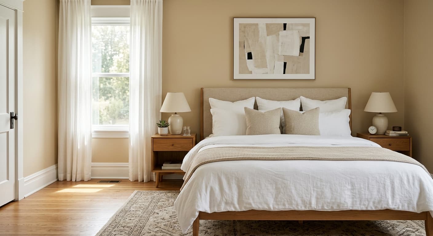
Warm Oats is a natural fit for living rooms and bedrooms, where the goal is a calm, enveloping atmosphere. At LRV 62.6 it is light enough to keep those rooms feeling airy, and the muted warmth creates a relaxed, cozy quality that reads as restful rather than energizing. Bedrooms in particular benefit from that quality. It gives the room enough color personality to feel considered, but it will not compete with bedding, furniture, or art.
Because it is forgiving across exposures, it also works well as a whole-house neutral. You can carry it through a living room, hallway, dining room, and into bedrooms without it reading dramatically different in each space, which is what makes a whole-house color actually functional. It suits both traditional and transitional interiors, pairing naturally with warm woods, rattan, linen, and organic textures. If your home leans toward a cozy, grounded aesthetic with natural materials, this color will feel right at home.
For orientation, south and west-facing rooms get the most from Warm Oats because direct and afternoon sun deepen the soft, sunny warmth in the color. North-facing rooms will read a bit more neutral and the taupe undertone will be more present, which is not necessarily a problem but is worth accounting for. East-facing rooms in the morning will look warm and inviting, then settle into a softer neutral by afternoon. It is not a difficult color in challenging light, just a slightly different character depending on which way your windows face.
In a living room, Warm Oats creates a settled, welcoming envelope without making the space feel smaller. The LRV of 62.6 keeps it light enough for an active common area, and the muted warmth pairs naturally with warm wood furniture and textile-heavy styling. It is a color that looks good at any time of day, which matters in a room you use from morning through evening.
Bedrooms are one of the strongest applications for Warm Oats. The cozy, quiet beige quality reads as restful, and at LRV 62.6 the room still feels light and calm rather than cave-like. It works equally well behind warm wood headboards and against crisp white bedding, giving you flexibility as your textiles change.
In a dining room, Warm Oats provides a warm, unpretentious backdrop that flatters wood furniture and candlelight well. Under warm artificial light in the evening, the slight taupe note that emerges gives the room a richer, cozier quality. It is not a dramatic dining room color, but it is reliable and it ages well.
Warm Oats is explicitly suited to whole-house use. It reads consistently across different rooms and exposures without jarring shifts, which is the main practical requirement for a unifying neutral. Running it through hallways, living spaces, and bedrooms ties the home together while leaving room for variation through trim, accent walls, and furnishings.
In a hallway or entry, Warm Oats keeps the transition spaces feeling connected to the rest of the home rather than like separate zones. The warmth is welcoming at the front door, and the muted quality means it does not fight with the colors in adjacent rooms. Pair it with Frost Bite SW 9505 on trim to sharpen the edges.
Warm Oats coordinates cleanly with a tight palette of warm, nature-leaning tones. Frost Bite SW 9505 works well as a crisp warm white on trim and ceilings, it gives you contrast without introducing cool gray, which keeps the overall palette feeling cohesive and warm rather than split. For a deeper anchor, Lauriston Stone SW 9593 offers a rich warm greige that grounds the palette on cabinetry, an accent wall, or built-in shelving, providing contrast against Warm Oats without pulling the room into a different color family.
Frosted Fern SW 9648 opens up a more layered direction. It is a soft warm sage-gray that adds a nature-leaning, organic dimension to the palette, useful if you want to introduce a muted green note in textiles, a door, or a single accent wall. Beyond the coordinating palette, Warm Oats plays well with warm wood tones, natural rattan and cane, cream and off-white linens, and aged brass or brushed gold hardware. Keep metals warm and materials natural and the color will do the rest.
All comparisons are matched against Warm Oats at LRV 62.6.
Pairing Warm Oats walls with a cool gray or blue-gray trim creates an undertone conflict. The warm oat base of the walls will look dingy or yellowed against cool gray, and the gray will read cold and unwelcoming by comparison.
Very orange or red-toned wood floors can clash with Warm Oats by making its yellow-oat component more visible and pushing the overall palette toward an overly warm, muddy look that feels dated.
True bright whites in kitchens or bathrooms will make Warm Oats look more yellow and less refined by contrast. The gap between a stark optical white and this muted beige reads as unintentional rather than deliberate.
Warm Oats is a light, muted beige with a soft oat-tan character. At LRV 62.6, it is firmly in the light range but warm enough that it never reads as white or gray. Think natural linen or raw oat grain, a quiet, cozy neutral.
The primary undertones are warm oat and beige. Most reviewers describe it as a creamy, inviting neutral that avoids going yellow or gold. Under warm artificial light a secondary taupe note becomes more visible, nudging it toward a greige quality. In bright natural daylight it stays firmly in warm beige territory. The two reads are both real, which is why testing in your actual lighting matters.
Warm Oats is warm. It has no meaningful cool undertone in standard conditions. The RGB values (216 red, 207 green, 186 blue) show a clear warm bias, with the red and green channels well above the blue. Under artificial light it can pick up a slight taupe note, but it never crosses into cool or gray territory.
The LRV of Warm Oats SW 9511 is 62.6. That places it solidly in the light range. It will keep rooms feeling open and airy while still delivering genuine warmth and color presence on the wall.
The Sherwin-Williams color code is SW 9511. The hex value is #D8CFBA and the RGB is 216 red, 207 green, 186 blue.
Frost Bite SW 9505 works well as a warm white on trim and ceilings. Lauriston Stone SW 9593 gives you a deep warm greige for contrast on cabinets or an accent wall. Frosted Fern SW 9648 adds a soft sage-gray dimension if you want a more layered, nature-leaning palette. Beyond those coordinating colors, Warm Oats pairs naturally with warm wood tones, rattan, linen, cream textiles, and aged brass or brushed gold hardware.
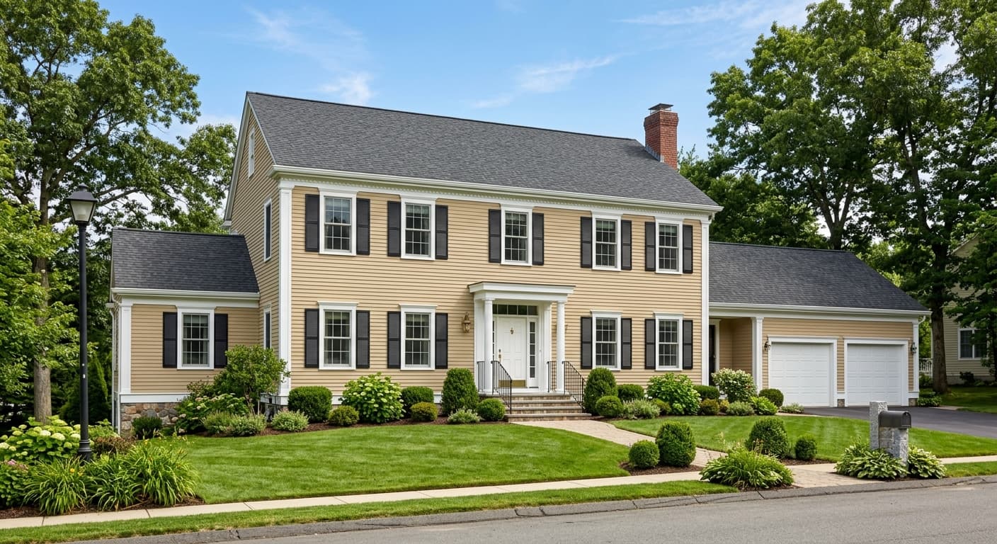
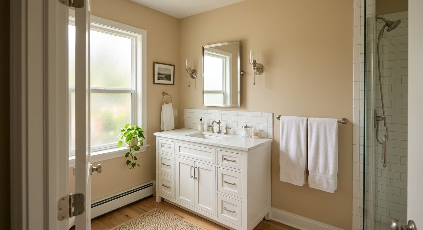
Warm Oats is available in both interior and exterior formulas, so exterior use is possible. On a front door it would read as a soft, understated warm beige, low contrast and quiet rather than a statement. On cabinets it works well in a kitchen or bathroom where a warm, muted neutral is the goal, particularly with warm wood countertops or open shelving. For a deeper cabinet option in the same family, Lauriston Stone SW 9593 would provide more contrast and visual weight.
