
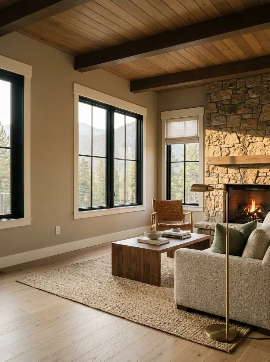
MorningWarm S/E light, tan forward

A warm, earthy greige with a real green undertone layered underneath, complex and muted at LRV 40.5. Sample it in your actual light before you commit.
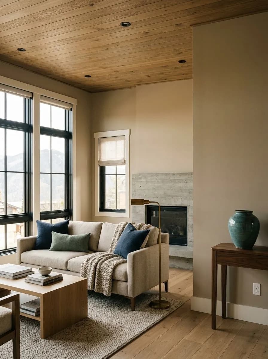
Universal Khaki lands somewhere between a warm tan and a grayed-down greige. It is medium in depth, carrying an LRV of 40.5, which puts it at the darker edge of what most people consider a wall neutral. Go any darker and it stops reading as tan and starts reading as brown. In good light it presents as a rich, earthy, autumnal color with a muted quality that keeps it from feeling like a plain builder beige.
The low chroma is the defining quality. This is not a clean or bright tan. It is dirty and complex in the best sense, the kind of neutral that holds your eye without shouting. That complexity is exactly what makes it feel current and design-forward, and also what makes it tricky. Reviewers consistently note it looks better in person than in photographs, so do not judge it from a screen. Sample it on your actual walls before committing.
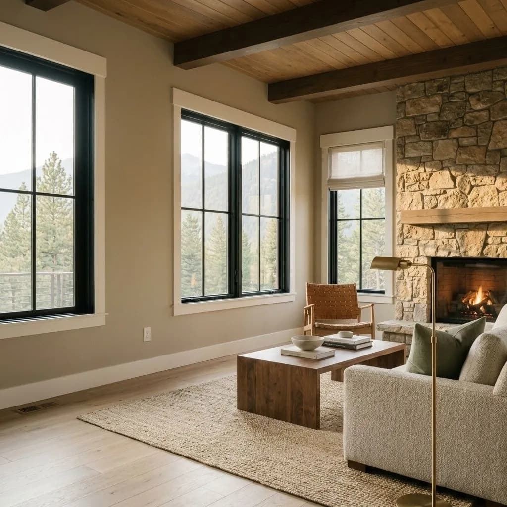
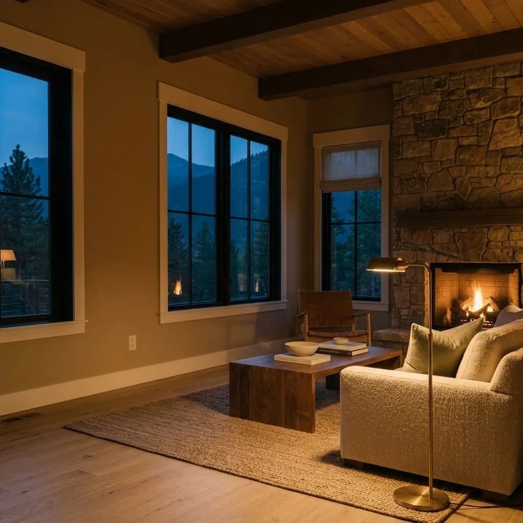

Nearly every reviewer agrees: Universal Khaki carries a real green undertone layered under its tan and yellow base. The green is muted and earthy rather than leafy or obvious, but it is there, and it matters enough to show up consistently across independent sources. Most describe the overall effect as warm greige with a green cast, grayed just enough to keep the warmth from feeling sunny or golden.
One strain of analysis traces the base differently, reading the foundation as orange with hidden yellow-green undertones rather than a straightforward tan, which explains why the color can shift so dramatically under different light conditions. All sources land in the same place about the overall impression, warm but grayed and green-leaning rather than clean beige, but the disagreement about what is underneath is worth knowing because it affects what colors will fight it versus work with it.
Light direction is the single most important variable. In south-facing rooms with warm, bright light, the tan and yellow come forward and the color reads as a cozy, inviting neutral. In north- or west-facing rooms with cooler or dimmer light, the muted green side dominates and the color can go flat or even drab. Always sample it at different times of day in the room you plan to paint. That green shift is not subtle.

Universal Khaki is best understood as a room-by-room color rather than a whole-house solution. Most designers and reviewers actively advise against using it across an open floor plan or as a continuous whole-house neutral. At LRV 40.5 it absorbs a meaningful amount of light, and over large connected areas it can feel heavy or oppressive rather than grounding. In a single, well-lit room it is a different story.
Living rooms and bedrooms are the two rooms Sherwin-Williams lists explicitly, and reviewers back that up. It also gets strong marks for dining rooms, offices, and dens where a cocooning, intimate feel is actually the goal. In kitchens, reviewers call out both walls and cabinets as strong applications. As a cabinet color it reads as a sophisticated warm neutral that bridges wood tones and stone countertops without competing. For millwork, built-ins, wainscoting, and interior doors painted against lighter walls, it adds depth and contrast without going dark.
On exteriors, reviewers single it out as one of its most successful applications. On siding it reads as a rich, warm, Polo-style autumnal neutral, and it pairs naturally with warm white trim, muted greens, navy, and reds. South-facing and east-facing exteriors will show the warmest, most tan-forward version of the color. If your home faces north or sits in heavy shade, expect it to lean more toward its grayed and green character.
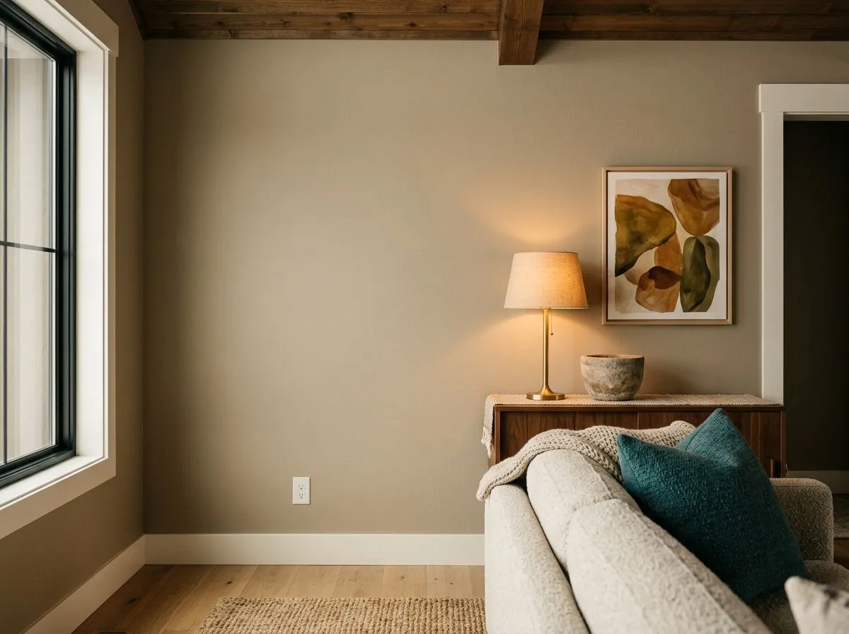
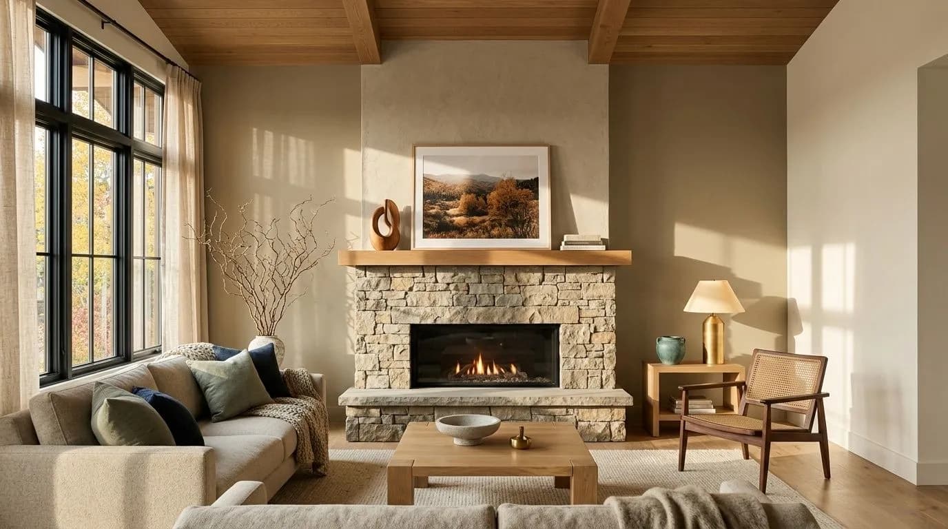
In a south-facing living room with good natural light, Universal Khaki reads as a warm, grounded tan that anchors furniture without overwhelming it. Keep trim in a warm off-white like Panda White (SW 6147) and lean into warm wood tones and linen textiles. In a north-facing living room, test it carefully first since the green undertone can dominate and make the space feel flat.
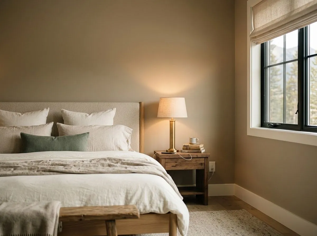
Universal Khaki creates a cocooning, restful atmosphere in bedrooms, where its lower LRV of 40.5 works in your favor rather than against you. Pair it with warm wood nightstands, linen bedding, and soft warm white trim to keep the mood cohesive. Avoid layering it with cool gray or blue-toned accents, which will pull out the muted green and make the palette feel disconnected.

As a cabinet color, Universal Khaki bridges warm stone countertops and wood floors without competing with either. It reads as a sophisticated, earthy neutral that sits in a different register than both gray and standard beige. Pair it with unlacquered brass or matte black hardware, and keep upper walls lighter to avoid a heavy feel.
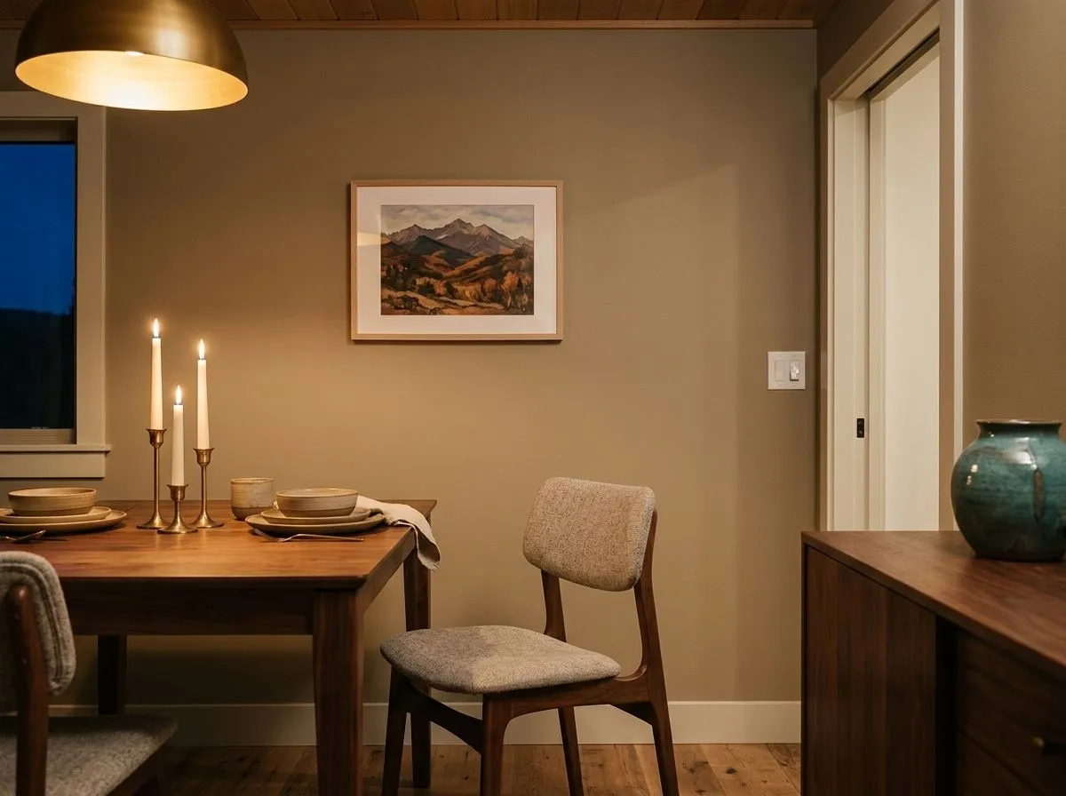
Dining rooms benefit from Universal Khaki's depth because an intimate, enveloping quality actually suits the function of the space. At LRV 40.5 it absorbs candlelight warmly in the evening while remaining livable during the day. Muted green or navy textiles and warm wood furniture complete the look naturally.
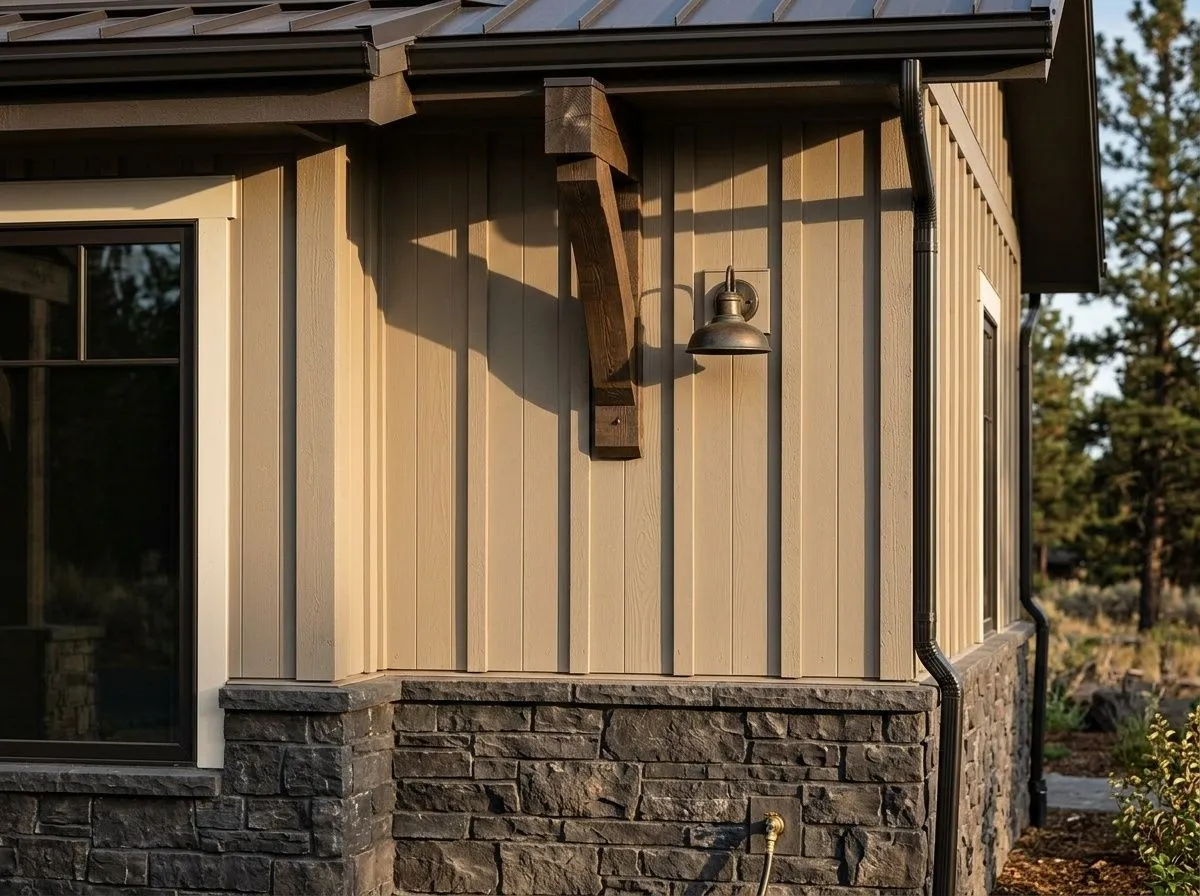
Reviewers call exterior use one of the strongest applications for Universal Khaki, where it reads as a rich, warm, autumnal neutral on siding. Pair it with warm white or cream trim and muted green, navy, or red accents for a classic result. South- and east-facing facades will show the warmest, most tan-forward version of the color.
Universal Khaki is designed to work with Panda White (SW 6147), Wool Skein (SW 6148), and Mediterranean (SW 7617). Panda White is your lightest trim option, a warm white that keeps the pairing cohesive without introducing any coolness that would fight the green undertone. Wool Skein is a tonal step closer in value, useful for layering adjacent rooms or adding warmth to ceilings without breaking the palette. Mediterranean brings in a muted blue-green that plays off Universal Khaki's own green cast for a earthy, sophisticated result.
Beyond those official coordinates, reviewers point to warm woods like white oak and walnut as natural companions, along with navy accents, black hardware, linen and stone textures, and muted greens for tonal layering. One caution that comes up repeatedly: avoid crisp, bright white trim. It conflicts with the dirty, grayed quality of Universal Khaki and the combination reads dated. Stay in the warm white and off-white family for trim and you will get a result that holds together.
Three of the seven colors here are actual paint: Universal Khaki saturates the feature wall and stone-and-plaster fireplace in a drenched zone, Panda White covers the surrounding walls and trim, and Wool Skein offers a tonal step lighter on an adjacent wall. The other four colors represent the room's furnishings and materials, each shown as its closest Sherwin-Williams paint match. Hover any pin or swatch to see which is which.
All comparisons are matched against Universal Khaki at LRV 40.5.
Pairing Universal Khaki with a cool or bright white trim creates a jarring contrast that reviewers describe as dated. The stark white pulls against the dirty, grayed warmth of the color and makes the undertones read more unsettled.
Universal Khaki's yellow-green undertone will emphasize the orange-yellow in honey oak floors or cabinets, and the two tones fight each other rather than harmonizing. The result looks muddy and unresolved.
In north- or west-facing rooms, or any space that gets limited natural light, Universal Khaki's muted green side takes over and the color goes flat or drab rather than warm and inviting. This is the most common disappointment reviewers report.
Universal Khaki is a warm, medium-depth tan-greige with an LRV of 40.5. It sits at the darker end of a wall neutral, carrying enough depth to feel grounding and complex rather than bland. Its hex value is #B8A992 and its RGB is 184, 169, 146.
The dominant undertone is a muted yellow-green layered over a warm tan base. Most reviewers describe it as warm greige with a real green cast, and one source traces a secondary orange base underneath the yellow-green. All sources agree it is warm overall but grayed and green-leaning rather than a clean or bright beige. The green shows most strongly in cool or dim light and recedes in warm south-facing light.
It is warm overall, but the warmth is muted and complicated by a soft green-gray cast. It will not read as crisp or cool, but it is far from the sunny, yellow warmth of a traditional beige. Think of it as earthy and grounded rather than bright and golden.
Universal Khaki's precise LRV is 40.5. That puts it in the medium range, at the darker edge of what most people consider a comfortable wall neutral. It absorbs more light than it reflects, so room size, ceiling height, and light direction all matter more with this color than with lighter neutrals above LRV 50.
The Sherwin-Williams color code is SW 6150. The hex value is #B8A992 and the RGB is 184 red, 169 green, 146 blue.
Warm off-whites are the most important pairing, particularly for trim. Panda White (SW 6147) and Wool Skein (SW 6148) are designed coordinates. Mediterranean (SW 7617) adds a muted blue-green accent that plays naturally off the color's green cast. For furnishings and accents, warm woods like white oak and walnut, navy, black, linen, stone textures, and muted greens all work well. On exteriors, warm whites, muted greens, reds, and navy are reliable choices. Avoid crisp bright white trim and cool-toned lighter colors.
Exteriors are one of its strongest applications. On siding it reads as a rich, warm, autumnal neutral that pairs naturally with warm white trim and contrasting accents. For cabinets, it works well as a sophisticated warm neutral that bridges wood tones and stone countertops. As a front door color it brings depth and warmth without reading too dark against lighter siding. It is available in both interior and exterior formulas.