
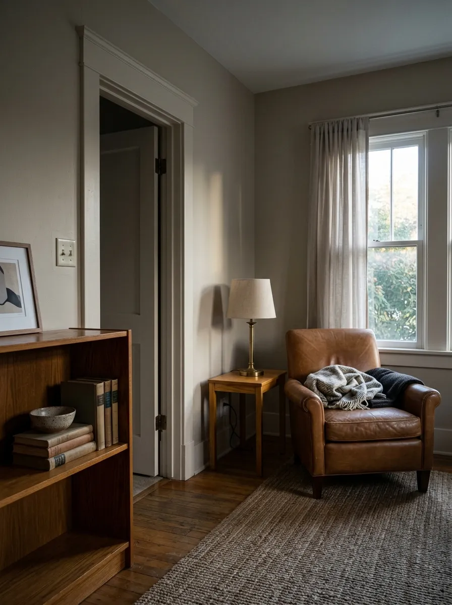
MorningSoft · golden-beige glow
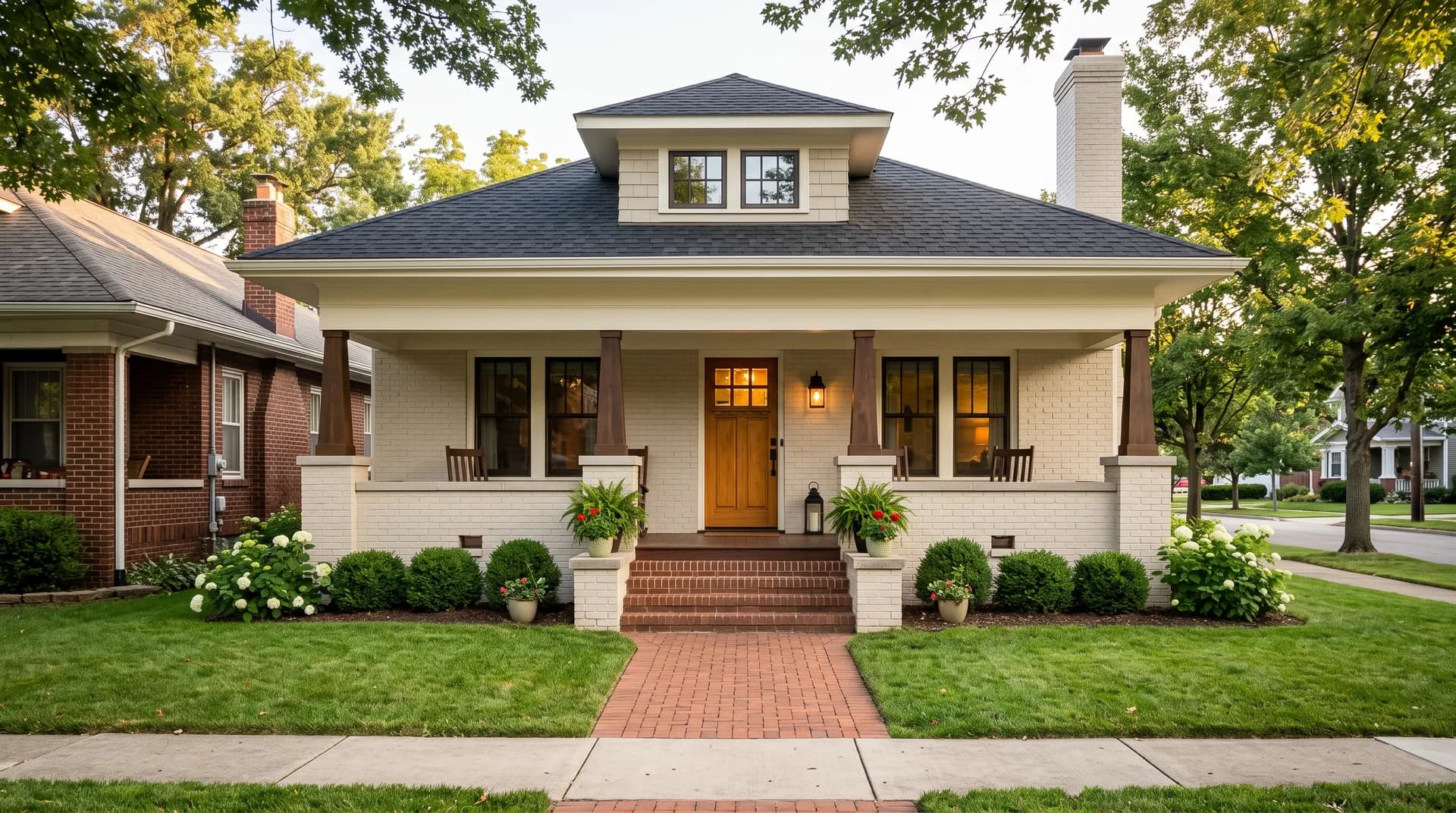
A warm, golden-edged beige that sits at LRV 66.3, light enough to feel open, settled enough to read intentional rather than blank. Sample it in your light before you commit.
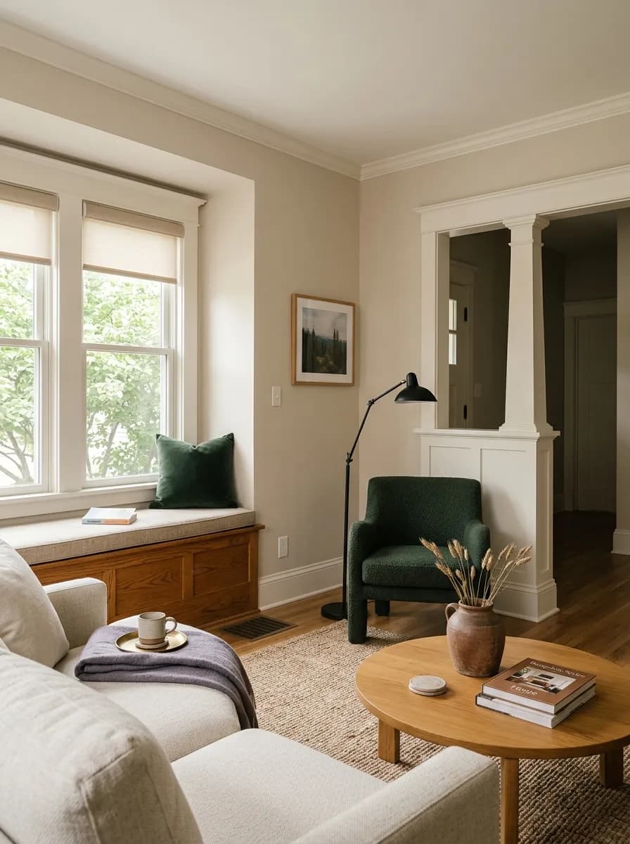
Natural Linen SW 9109 lands visually between beige and cream. At LRV 66.3 it is light and airy without reading as a true white, and it carries enough warmth to feel settled and intentional rather than blank. Independent reviewers consistently describe it as a modern beige, one that moves away from the heavy golden Tuscan tans that dominated early 2000s interiors while staying clearly warm and inviting.
In practice the color reads soft and approachable. It does not shout warmth, but it does not disappear into a bland off-white either. In a room with generous light it shows a gentle golden-beige glow. Pull the light back or shift to indirect sources and it quiets considerably, moving toward a more muted, almost greige register. That range is relatively narrow compared to some transformative neutrals, but it is real, and your morning versus afternoon reading of the wall will differ.
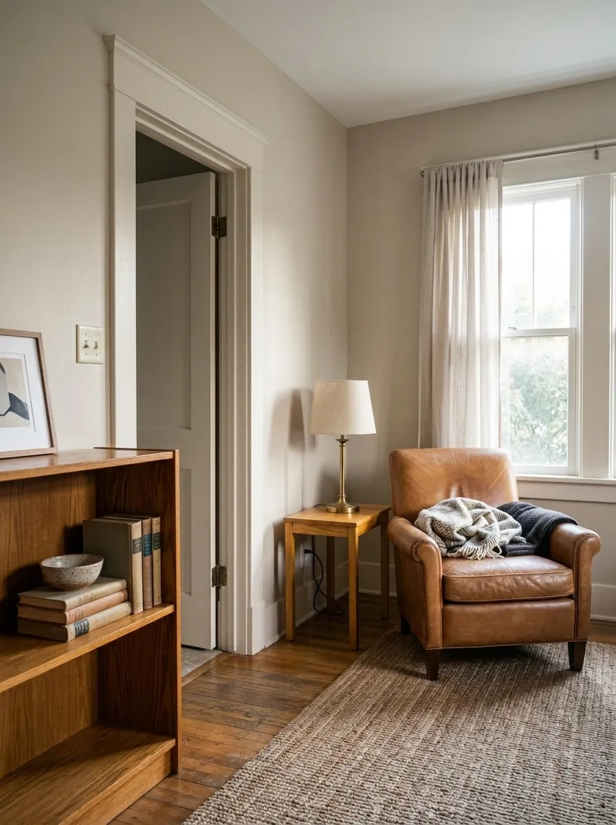
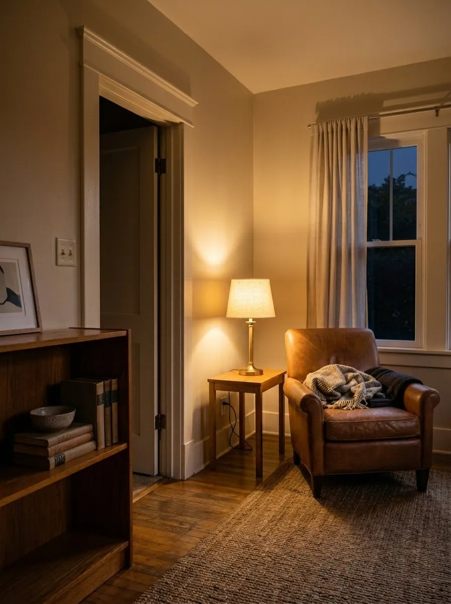
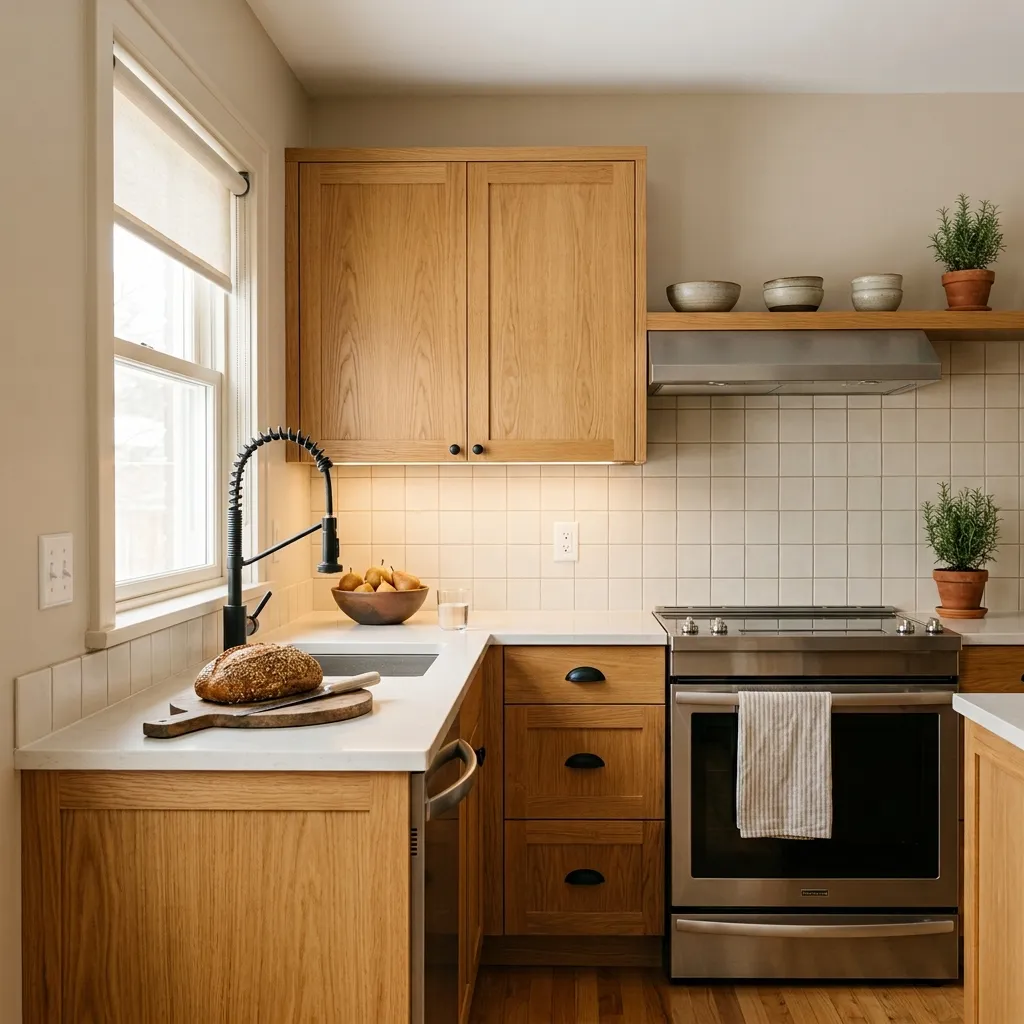
This is where Natural Linen earns the most debate among reviewers, and you should not skip the sample step. The dominant character is warm, but exactly what kind of warm is contested. Most sources agree the base mixes yellow and a touch of pink, with a softening note of gray that keeps it from tipping loud. The result for many reviewers reads as a soft, slightly orange-adjacent warmth that is neither strongly yellow nor strongly pink, just flexibly warm.
Other reviewers push back on that reading in different directions. One describes it as sand rather than sunshine, emphasizing a subtle greige quality with almost no visible yellow or pink. Another takes the opposite view and names both yellow and pink undertones plainly, warning that the pink is present enough to be a real factor for people who dislike pink-leaning walls. A third specifically categorizes it as not greige and not taupe, framing that orange-warmth note as the dominant character.
What this means practically is that the undertone you see depends on your light source, your surrounding finishes, and your own eye. South and west light push the yellow-golden side. North-facing rooms can mute the warmth to the point where cooler or even pastel qualities emerge, though some reviewers say the warmth simply counteracts cool north light for a pleasant balance. Bring a large sample, let it dry fully, and view it morning, midday, and evening before committing.
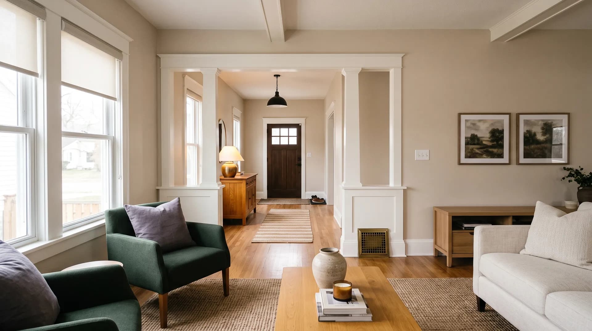
Natural Linen performs well across a wide range of interior spaces. Reviewers call it strong for living rooms, bedrooms, dining rooms, kitchens, entryways, and hallways. Its approachable LRV of 66.3 keeps it from feeling heavy in smaller rooms while giving it enough body to anchor larger open-plan spaces. It is a legitimate whole-house color because it flows from room to room without shifting into yellow, which is a common complaint about warmer beiges in connected floor plans.
Beyond walls, it shows up on cabinets, trim, doors, and ceilings in reviewer accounts. It pairs naturally with wood cabinetry, honey oak floors, and golden-toned wood furniture because its warmth reads as complementary rather than competing. One reviewer extends it to exterior brick applications, though another reviewer specifically advises against exterior use. That split is worth noting, and if you are considering it outside, sample it on the actual substrate and check it in full sun.
Orientation matters. South-facing rooms get the warmest, most golden reading. East and west rooms shift warm in the morning and can edge toward a near-orange feel in late afternoon light. North-facing rooms quiet the warmth the most, which can work well if you want the color to read more neutral, but reviewers flag that it can pull slightly pastel or cooler in deep north light. Rooms with large windows, skylights, or bright reflected light will show the color closer to its warmer character throughout the day.
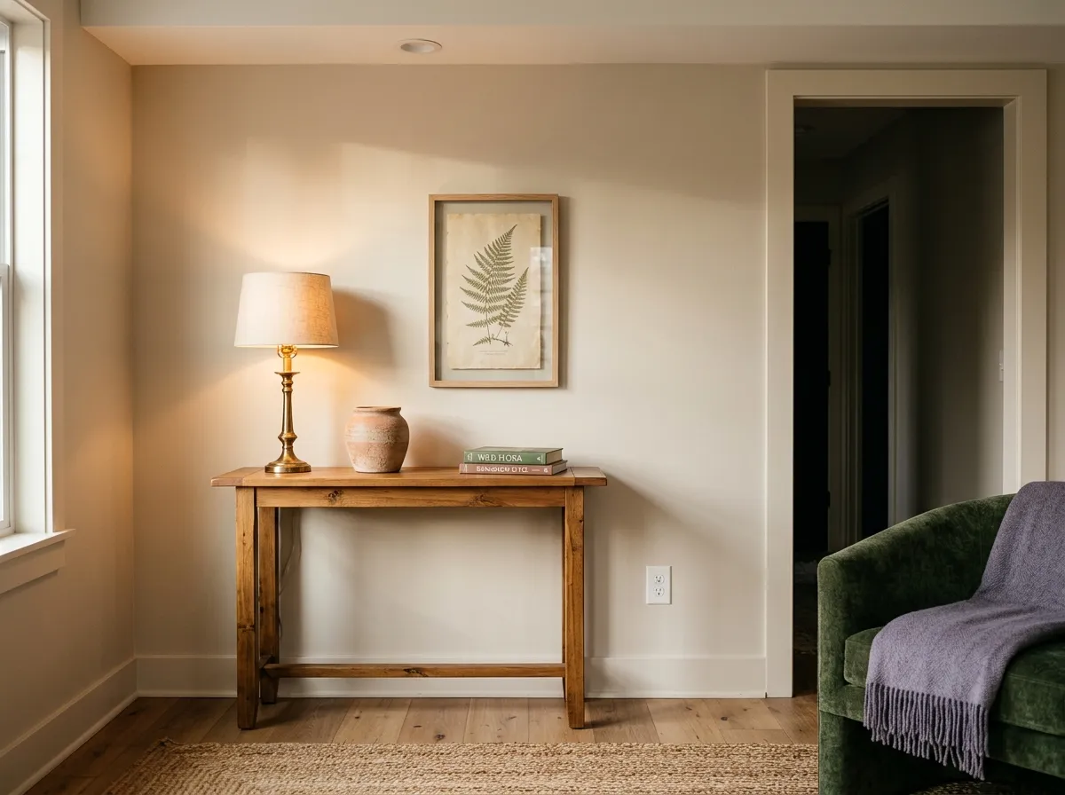
Living rooms are one of the strongest uses for Natural Linen. The LRV of 66.3 keeps the space feeling open while the warmth prevents the flat, cold look some off-whites create. It flows well in open-concept layouts that connect to dining or kitchen areas without shifting color character across the threshold.
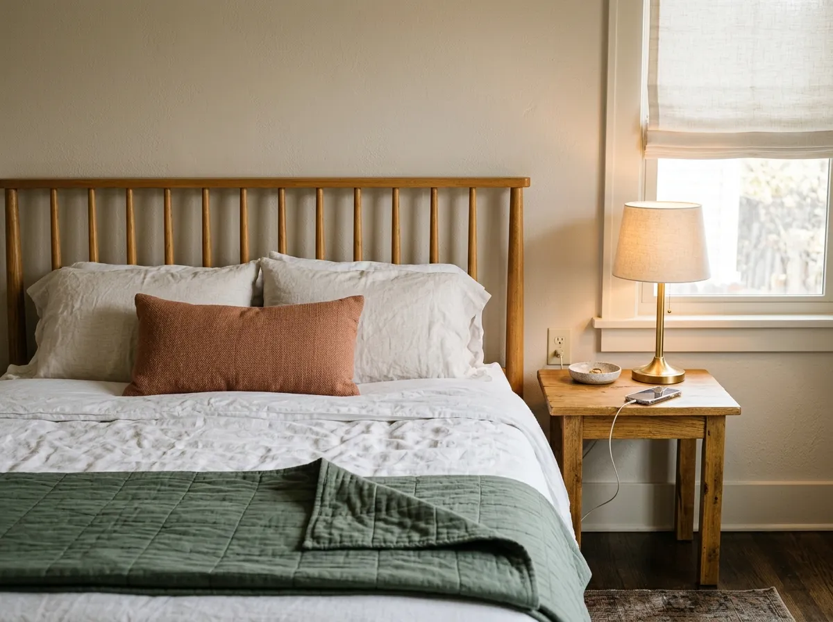
In a bedroom Natural Linen reads calm and warm without being heavy. Paired with wood furniture or warm-toned textiles it feels cohesive rather than matchy. North-facing bedrooms may push it toward a quieter, more neutral read, which many people find restful.
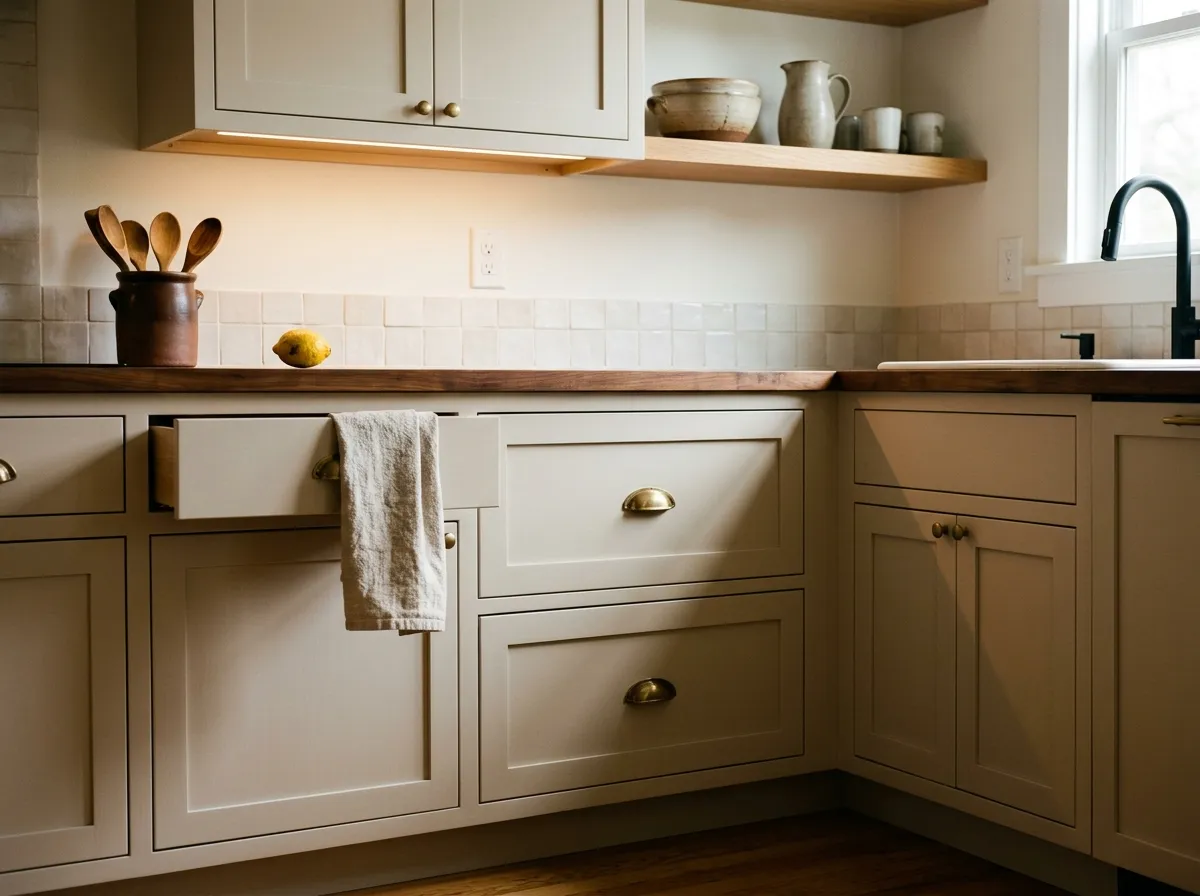
Reviewers note it works on both kitchen walls and cabinets. It complements honey oak, golden wood tones, and natural wood grain particularly well. Avoid pairing it with cream-toned cabinet or trim paint, since the similar warmth levels can compete and flatten both finishes.
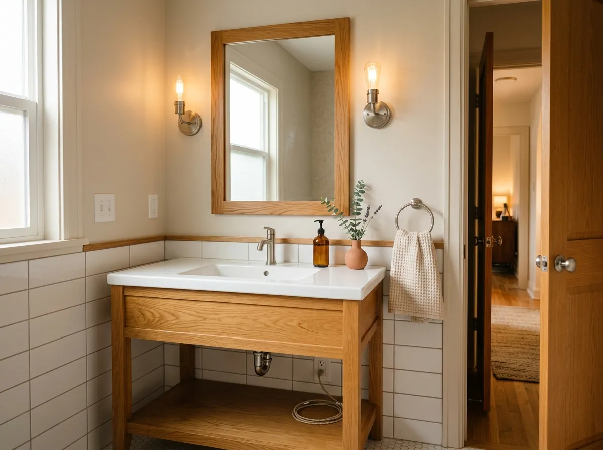
In a bathroom with good natural light it reads as a soft, warm neutral that avoids the clinical feel of bright whites. Be aware that artificial lighting, especially cooler LED or fluorescent sources, can shift the undertone read toward pink or bring out the gray, so test your specific lighting before committing.
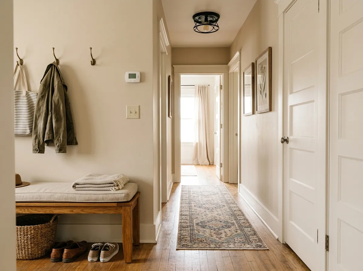
Natural Linen excels in entryways and hallways because its warmth is welcoming without being overwhelming and its LRV of 66.3 keeps tighter spaces from feeling closed in. It flows naturally into adjacent rooms if you use it as a whole-house color, which reviewers specifically flag as one of its practical strengths.
Natural Linen's coordinating palette leans into its warm neutral character. Divine White (SW 6105) works as a clean, warmer-white trim option that does not introduce conflicting undertones. Antler Velvet (SW 9111) gives you a deeper, earthier step-down in the same warm family, useful for an accent wall or adjoining space. Gris Morado (SW 9156) adds a muted lavender-gray note that plays against the warmth without fighting it.
Beyond those coordinates, the color layers well with deep greens, green-grays, warm taupes, and dark gray-blues as accent or furniture tones. Reviewers specifically mention warm neutrals like Accessible Beige for adjacent rooms and Urbane Bronze for accents. For trim, reviewers suggest a pure, slightly warm white rather than anything with heavy yellow, and they advise keeping cream-toned cabinets or trim separate since the overlap in warmth can muddy both. Greens deeper than its LRV of 66.3 are a reliable pairing because the contrast in value keeps either color from washing out.
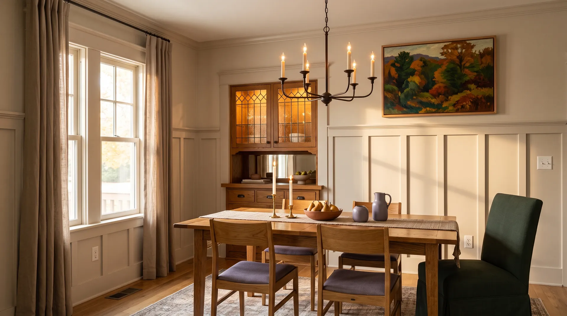
Every color in this dining room can be traced to a Sherwin-Williams match, making the whole scheme shoppable from a single brand. Two of the seven are actual paint: Natural Linen covers the board-and-batten wainscot and walls, and Divine White goes on the ceiling and window casings. The remaining five colors represent the room's furnishings and materials, each shown as its closest Sherwin-Williams equivalent, so hover any pin or swatch to start pulling the look together.
All comparisons are matched against Natural Linen at LRV 66.3.
Pairing Natural Linen with a stark cool white on trim or molding creates a jarring contrast that emphasizes the color's warmth in an unflattering way and makes the trim feel clinical next to it.
When Natural Linen meets cream-toned paint on adjacent cabinets or trim, the similar warm levels compete rather than complement, and both surfaces can look muddy or undefined.
In an open floor plan, a cool gray or blue-gray adjacent to Natural Linen can pull its pink undertone forward and make the transition feel mismatched rather than curated.
It reads as a soft, warm light neutral sitting between beige and cream. At LRV 66.3 it is light and airy but not a true white. Most people describe it as a modern beige: warm and settled, with enough body to feel intentional without the heavy golden quality of older Tuscan-style tans.
Reviewers do not fully agree, and that disagreement is worth taking seriously. The most common read is a warm mix of yellow and a touch of pink, softened by a hint of gray that keeps it from going loud. Some reviewers describe it as sand-like with a subtle greige quality and almost no visible yellow or pink. Others call out the pink plainly and warn it is real enough to matter if you dislike pink-leaning walls. Test a large sample in your specific light before committing.
It is warm. Its warm golden-yellow undertone base is consistent across reviewers, even when they disagree on the pink versus greige secondary note. In north-facing rooms or under cool artificial light it can quiet considerably and read more neutral, but it does not shift to a genuinely cool color.
The LRV is 66.3. That puts it in light neutral territory: light enough to keep rooms feeling open and airy, but with enough depth to read as a real color rather than a near-white.
The Sherwin-Williams code is SW 9109. The hex is #DFD3C3 and the RGB values are 223 red, 211 green, 195 blue.
For trim, a warmer pure white like Divine White (SW 6105) works well. Deeper greens, warm taupes, green-grays, and dark gray-blues are reliable accents. Antler Velvet (SW 9111) gives a deeper warm-neutral step in the same family. Reviewers flag warm neutrals as natural companions in adjacent rooms, and they specifically advise avoiding cream-toned trim or cabinets since the similar warmth levels compete rather than complement.
Reviewers confirm it works on cabinets and trim, and it pairs well with wood tones and honey oak floors in those applications. On exteriors the evidence splits: one reviewer applies it to brick successfully while another advises against exterior use entirely. If you want to use it outside, sample it on your actual substrate and evaluate it in full sun across different times of day before deciding.