Moonmist
What Moonmist Actually Looks Like
Moonmist sits in that quiet zone between green and gray, the kind of color that reads differently depending on when you walk into the room. In bright midday light it leans clearly green, soft and slightly herbal, like sage that has been washed out a few shades. By evening, or under warm bulbs, it pulls back toward gray and almost disappears into neutral territory.
This is a pale, low-saturation color. It will never shout. What makes it distinctive is its restraint. Many soft greens tip into minty or sea-glass territory, but Moonmist holds onto a dusty, slightly muted quality that keeps it grounded. You will notice it feels calm without feeling cold, which is a harder balance to strike than it sounds.
In rooms with a lot of natural light, expect the green to come forward. In darker spaces, it behaves more like a green-tinted greige. Test it on at least two walls before you commit, because this one genuinely changes character across a single day.
Moonmist Undertones
The dominant undertone here is gray, with green riding on top of it. There is no warmth pulling it toward yellow, which means it stays on the cool side of the spectrum. That cool gray base is exactly why Moonmist pairs cleanly with crisp whites and other cool neutrals.
Undertones matter because they decide what fights and what flows. Put Moonmist next to a warm cream and the contrast will feel slightly off, like the two colors are from different families. Keep your trim and adjacent surfaces in the cool-to-neutral range and everything settles into place. When you shop fabric and furniture, hold swatches against the wall color in the actual room. The gray undertone can grab onto nearby colors and shift in ways a paint chip will not predict.
Where Moonmist Works Best
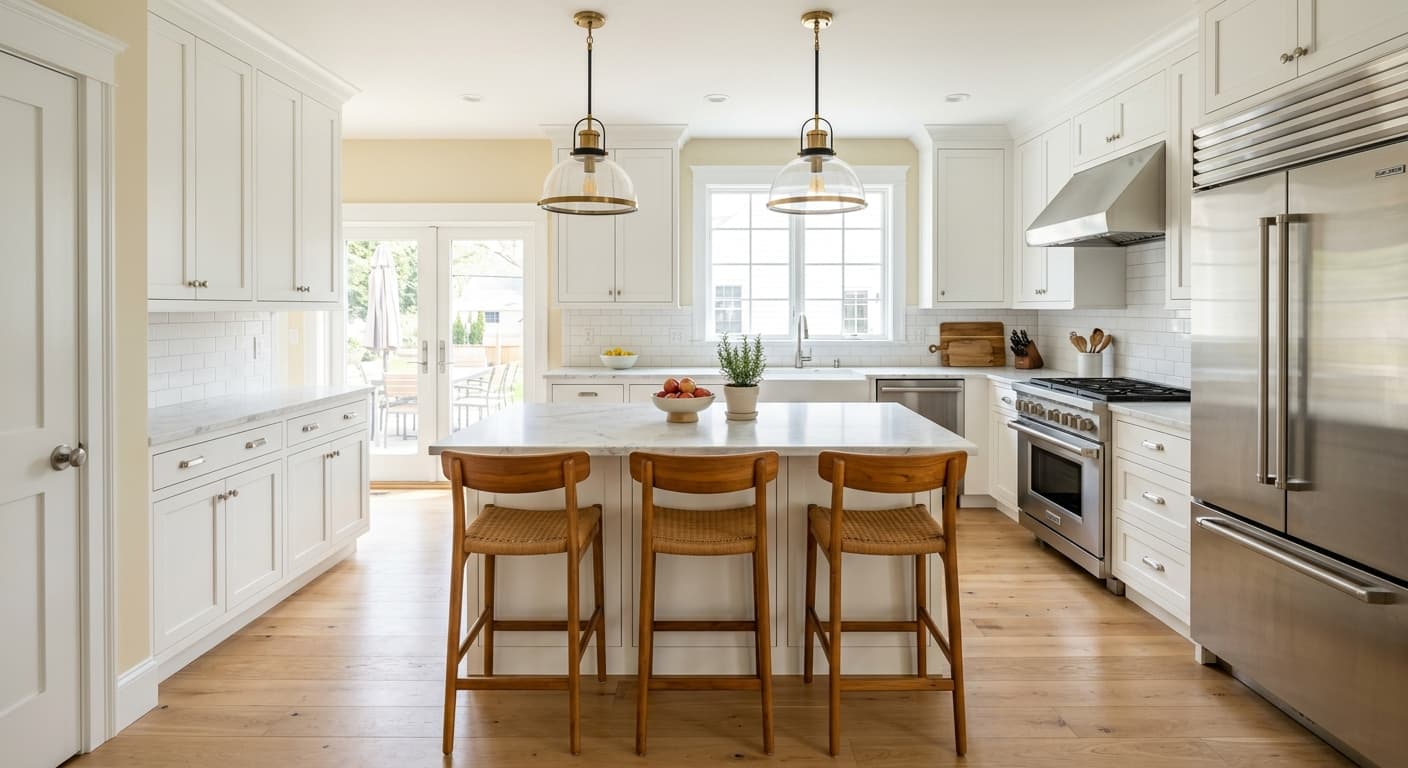
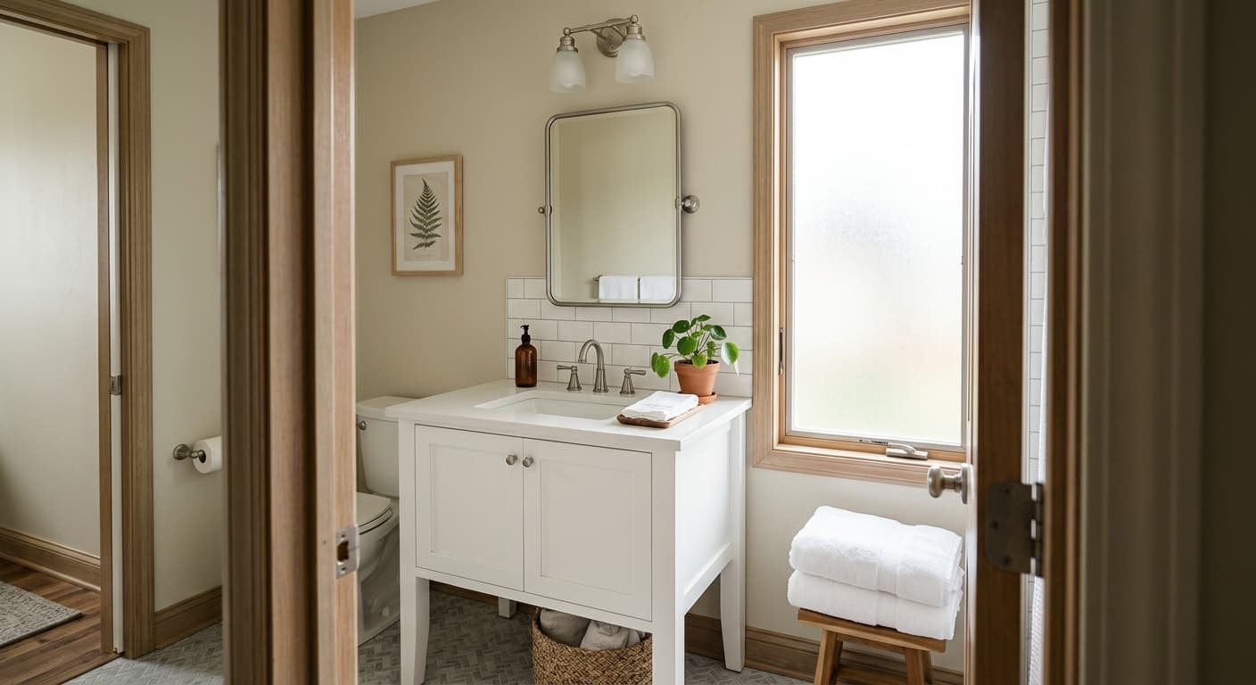
Moonmist does well in spaces where you want a sense of quiet. Bedrooms, bathrooms, and home offices all suit it. It also works in hallways and transitional spaces where a louder color would feel like too much.
Orientation is the thing to watch. In a south-facing room with strong sun, the green comes alive and the color stays fresh all day. In a north-facing room, expect it to cool down considerably and lean more gray, sometimes flattening out under weak light. If you have a north-facing space and want the green to stay visible, pair it with warm lighting to compensate. In small rooms its lightness keeps things open. In large rooms it acts almost like a soft neutral, so layer in texture and contrast to keep the space from feeling washed out.
What to Pair With Moonmist
For trim, a clean white like Extra White (SW-7006) or High Reflective White (SW-7757) gives you crisp definition without warmth getting in the way. If you want something softer, Pure White (SW-7005) works as a gentle off-white that still reads clean.
For deeper contrast, look at a charcoal or a muted navy in furnishings. Greens in the same cool family, like Sea Salt (SW-6204), create a layered, tonal look if you carry Moonmist into an adjacent room. Flooring in pale to medium wood with neutral or cool undertones supports the color nicely. White oak with a natural finish is a safe bet. For furniture, lean toward soft grays, natural linen, and black accents for grounding.
Colors That Clash With Moonmist
Stay away from warm, yellow-based whites and creams for your trim. They will make Moonmist look dingy by comparison and expose the gray in an unflattering way. Avoid pairing it with orange-toned woods like honey oak or red-toned flooring, since that warmth clashes with the cool base. And do not rely on it in a dim, north-facing room without good lighting, because it can lose its green entirely and read as a sad, flat gray.