White Down
What White Down Actually Looks Like
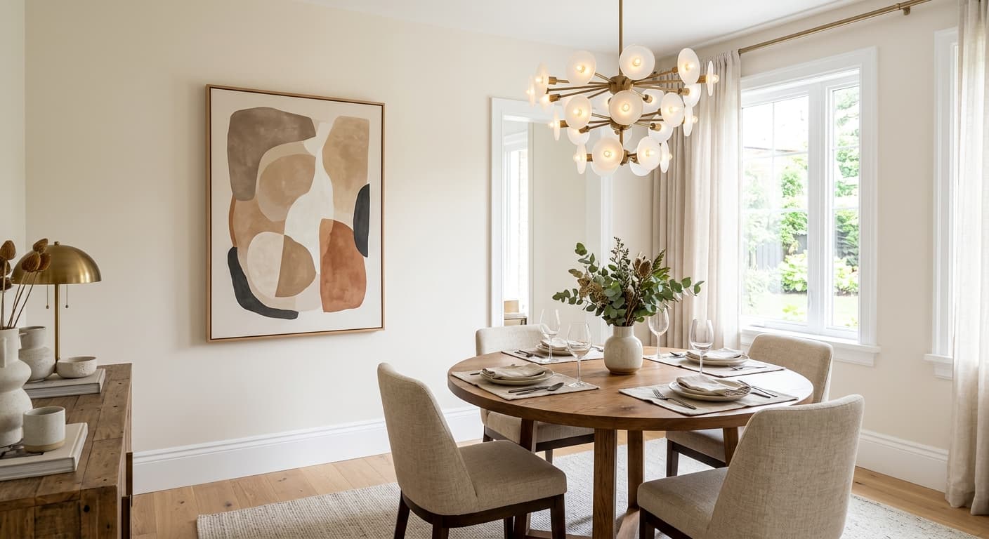
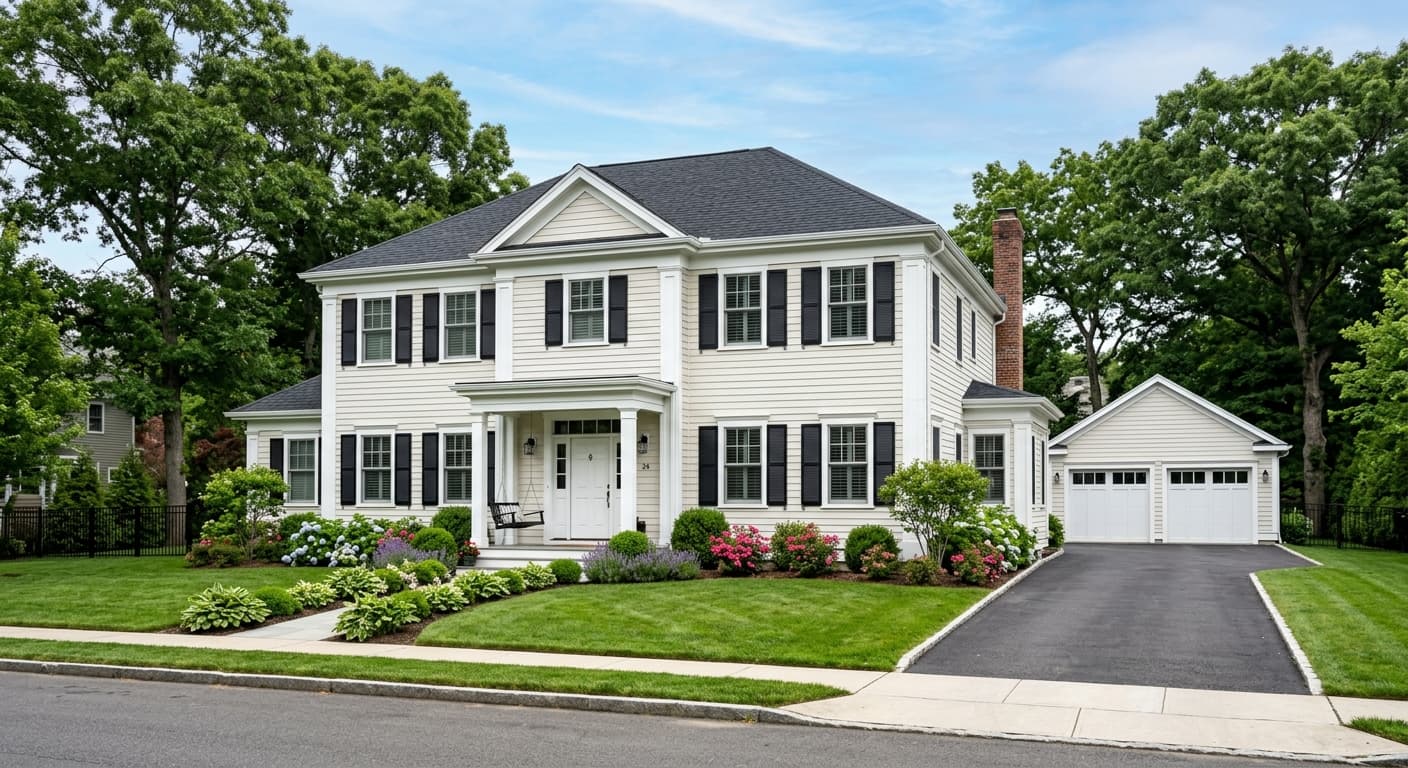
White Down is a soft, warm cream. It sits closer to a creamy off-white than a stark white, and it rarely reads as purely gray or purely white. The base is yellow, but a gray element pulls it back from feeling overtly buttery. The result is a color that feels grounded and lived-in rather than bright and crisp.
White Down Undertones
The dominant undertone is yellow, with a soft gray layer that keeps it from going fully warm. In strong south-facing or afternoon west-facing light, that yellow rises noticeably and the cream character becomes the whole story. In north-facing rooms or morning east-facing light, the gray element does more work and the color reads closer to a soft beige. It rarely reads truly gray, but the warmth is not constant across lighting conditions. Against cool stone or cool-toned materials in strong afternoon sun, it can read noticeably yellow, so context matters.
Where White Down Works Best
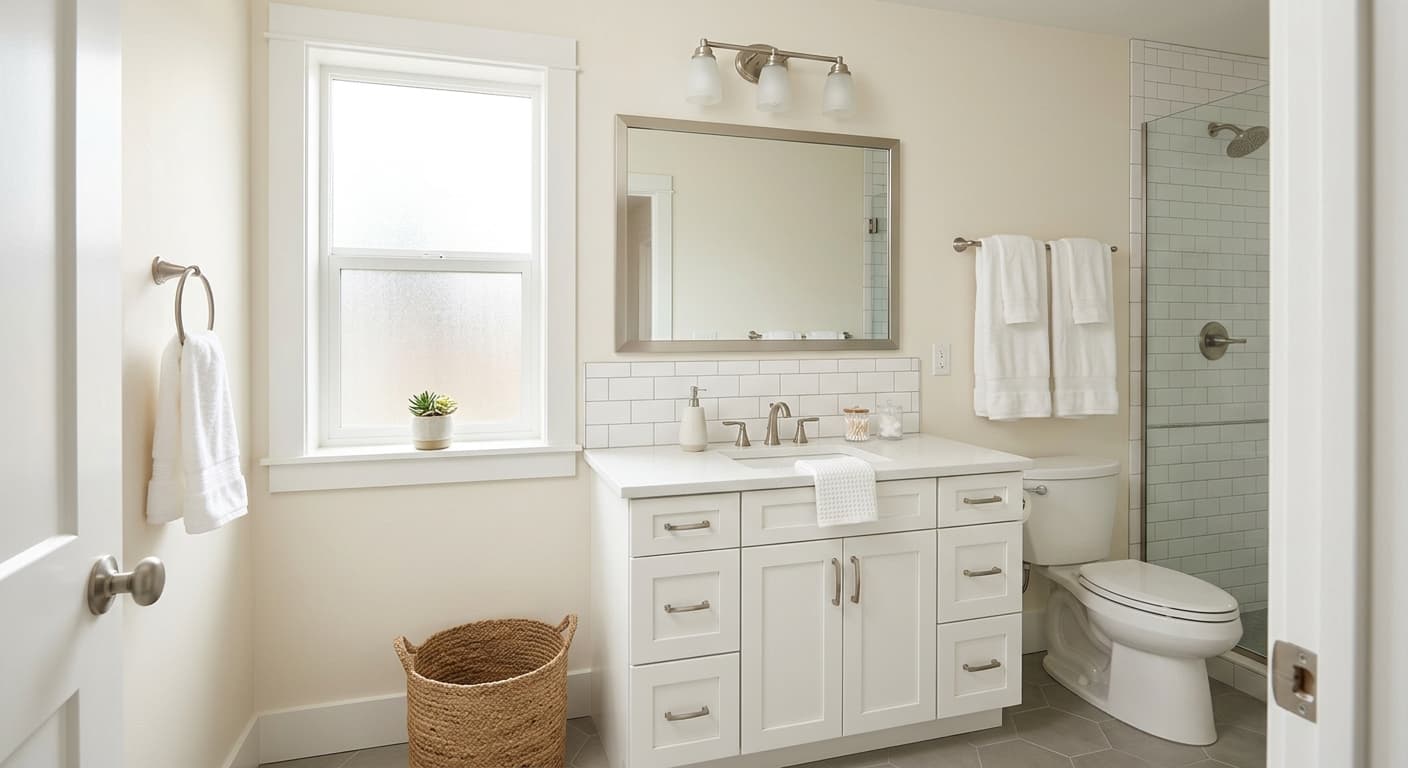
White Down works best in rooms where existing finishes lean warm. Think traditional kitchens, country-style spaces, and rooms with warm wood tones, warm quartz, or marble. It performs well on cabinets where a softer alternative to crisp white is the goal. In bathrooms with white tile and cool stone, it provides welcome contrast. Avoid using it in rooms with orange-pink or taupe stone, where it can fight the existing warmth and read too yellow. Whole-house applications work when the architecture and fixed finishes run warm throughout.
Where to put White Down
A south- or west-facing living room is where White Down earns its keep. The afternoon light draws out the cream and makes the space feel warm without being yellow-heavy. In a north-facing living room, expect it to read softer and more beige with less visible warmth.
Bedrooms with warm bulbs in the 2700K to 3000K range will feel soft and inviting with White Down on the walls. The matte finish works best here, giving the most grounded and calm appearance. In a bedroom that gets mostly morning east-facing light, expect a cooler, brighter feel early in the day that settles into gentle warmth by midday.
On kitchen cabinets, White Down reads as a softer alternative to stark white and pairs well with marble and warm quartz countertops. A semi-gloss finish will pull more light and make the color appear brighter and more defined. It suits Tuscan, country, and traditional kitchens most naturally.
Using White Down on trim works well in rooms where the walls also run warm, creating a cohesive tonal look. If the walls are a cool or stark white, the cream undertone in White Down can feel off. Pair it with Simply White (OC-117) on trim only when you want a clear but still-warm contrast to the wall color.
White Down can carry through an entire home when the fixed finishes, flooring, and architectural details all lean warm. In rooms that face north or receive minimal direct light, it reads more beige and muted, which may feel flat in those spaces. Plan for that variation and consider whether a deeper accent on millwork or cabinetry will anchor rooms that get less sun.
What to Pair With White Down
White Down coordinates naturally with Cloud White (OC-130) for a seamless trim-to-wall relationship, Simply White (OC-117) when you want a slightly crisper contrast on trim, and Flint (AF-560) when you need a deeper anchor color. It also takes well to warm grays and greiges, and it holds its own alongside cool stormy grays with blue undertones.
Colors that clash with White Down
In an average room, White Down reads too yellow against fireplace stone with orange-pink or taupe tones. The existing warmth in the stone and the yellow in the paint compete rather than complement.
In bathrooms where the tile, vanity, and hardware all run warm, White Down can tip too creamy and the whole room can feel heavy and yellow rather than fresh.
Pairing White Down walls with a stark or cool-white trim creates a mismatch where the cream undertone in White Down looks dirty rather than intentional.
In a north-facing room, the gray element in White Down becomes more visible and the color can read drab or dingy, especially if the flooring and furnishings also run cool.
Common questions
The LRV is 76.69, which puts it solidly in the light range. It will not make a room feel dark, but it is not a high-reflectance bright white either. The cream undertone absorbs a bit more light than a stark white would, so it feels softer on the eye.
It can, but manage expectations. In north-facing light, the warmth recedes and the color reads closer to a soft beige, sometimes drab. Warm artificial lighting helps. If you want to see the cream character, this color performs better in south-facing or afternoon west-facing rooms.
Matte gives the softest and most grounded look on walls. Eggshell is practical for walls in higher-traffic rooms since it cleans up more easily without looking shiny. On cabinets, semi-gloss pulls more light and makes the color appear brighter and more defined, which can be a good thing or too much depending on how yellow-forward your space already reads.
Yes, and that is not unusual with warm whites in complex lighting situations. Reflected light from nearby materials changes how the undertone reads. One side of a wall can read more muted and subtle while the other reads more yellow, depending on what surfaces are bouncing light onto it.
Avoid overly golden or pink-undertone beiges and tans, which will intensify the yellow and make the combination feel heavy. Cool stone in strong afternoon sun can also expose the yellow more than you expect. Stark or cool whites on trim will make White Down look dingy by comparison.