Shoreline
What Shoreline Actually Looks Like
Shoreline reads as a soft, light gray with just enough warmth to keep it from feeling clinical. In person, it sits right on the line between gray and greige, which is exactly why so many people reach for it when they want a neutral that does not commit too hard in either direction. You will not get the cold, steely look that trips up a lot of grays.
Lighting changes this color more than you might expect. In bright, south-facing rooms, Shoreline can lean almost soft white with a gray whisper underneath. In north-facing spaces or under cloudy skies, it deepens and the gray comes forward, sometimes hinting at a faint mauve or taupe edge. Morning and evening light shift it too, so test it on more than one wall before you buy gallons.
What makes it distinctive is its restraint. This is not a gray that announces itself. It behaves like a backdrop, which is a compliment in the world of neutrals. Art, furniture, and architecture all get to be the star while Shoreline holds the room together quietly.
Shoreline Undertones
The undertone here is a gentle warm gray with a touch of taupe. It is not a true neutral gray, and it is not a full greige either. That subtle warmth is what saves it from looking dingy or sad, but it also means you need to pay attention to what you put next to it. Cool grays and crisp blue-whites will pull the taupe forward and can make Shoreline look muddier than it is.
When you are choosing trim, adjacent paint, or upholstery, match the temperature. Warm whites and soft creams flatter it. Anything with a heavy blue or green base will fight the warmth and throw the whole palette off balance.
Where Shoreline Works Best
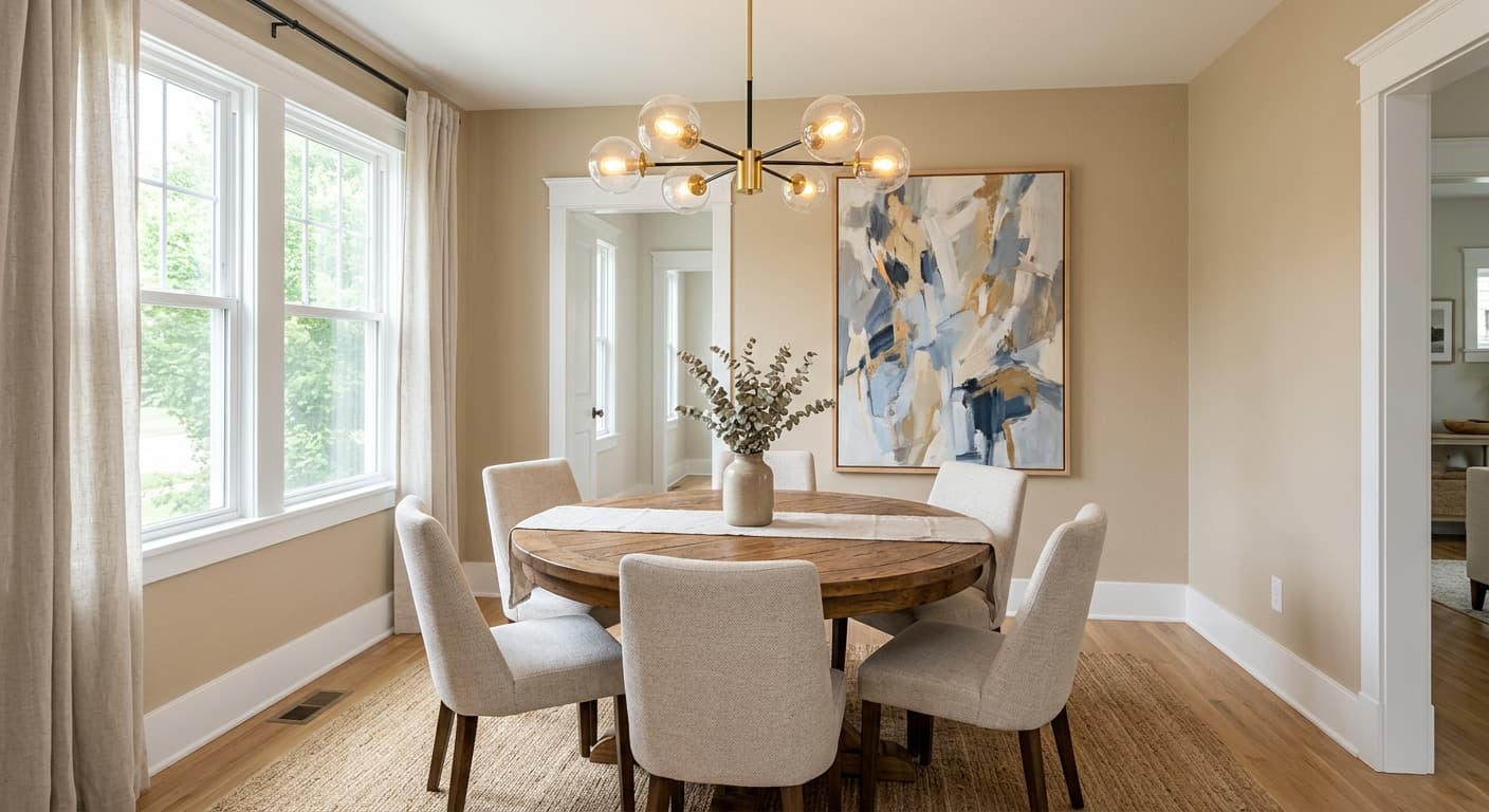
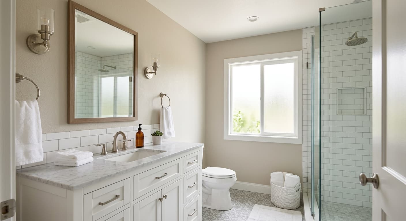
Shoreline is a strong choice for open-plan living areas, hallways, and bedrooms where you want continuity without flatness. It handles large, light-filled spaces beautifully because the warmth keeps big walls from feeling empty. In smaller rooms with decent natural light, it expands the space without washing it out completely.
South and east-facing rooms get the best of it, showing off that soft, airy quality. North-facing rooms can work too, but go in knowing the gray will read deeper and slightly cooler. If your room gets very little light, you may find Shoreline drifts toward a heavier taupe that you did not expect, so a generous sample test matters here more than usual.
What to Pair With Shoreline
For trim, Benjamin Moore White Dove (OC-17) is a natural partner. It is warm enough to sit with Shoreline without disappearing, and the contrast stays soft. Simply White (OC-117) is another solid option if you want a touch more brightness. For a deeper anchor, look at Edgecomb Gray (HC-173) on adjacent walls or Chelsea Gray (HC-168) for cabinetry or a feature element.
Flooring in warm oak, honey, or natural wood tones complements the taupe undertone nicely. Furniture in cream, camel, soft black, and aged brass all read well against it. If you want a little life, a muted sage or a dusty blue-green in accessories gives Shoreline somewhere to go without breaking the calm. Layer textures here. Linen, wool, and matte ceramics all play to its quiet strengths.
Colors That Clash With Shoreline
Do not pair Shoreline with bright, cool whites or stark, blue-based grays. That combination drains the warmth and leaves the color looking flat and a bit dirty. Avoid heavy, glossy finishes on the walls too, since sheen tends to amplify the taupe and can make the gray look uneven. And resist the urge to surround it with other warm neutrals that are too close in tone, because the whole room will go flat and sleepy with nothing to define the edges.