Sand Dollar
What Sand Dollar Actually Looks Like
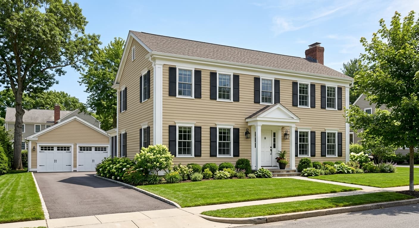
Sand Dollar is a mid-toned tan that leans warm without tipping into orange. Think of wet beach sand right at the waterline, that grounded, slightly muddy neutral that reads as comforting rather than flashy. On the wall it has more depth than a typical greige, with enough pigment to hold its own in a large room.
In morning light, especially in east-facing spaces, you'll notice a softer, almost golden quality. By afternoon it settles into a steadier earth tone. Under warm artificial light it can deepen and feel cozier, sometimes pulling slightly toward caramel. Cool LED bulbs flatten it out and pull some of the warmth, so the bulb temperature you choose matters here.
What makes Sand Dollar distinctive is its balance. It commits to being a real color, not a wishy-washy off-white, but it never demands attention. That quiet confidence is why it works as a backdrop in so many homes.
Sand Dollar Undertones
The dominant undertone is warm, with a touch of yellow-gold and a faint gray that keeps it from feeling too sweet. That gray is your friend. It stops the color from going buttery or dated, and it lets Sand Dollar sit comfortably next to cooler tones without clashing.
Pay attention to that warmth when you're choosing trim and furnishings. Set it against a stark, blue-white trim and the contrast can make Sand Dollar look heavier and more yellow than you expected. Pair it with warmer whites or natural materials and the undertone reads as intentional and cohesive.
Where Sand Dollar Works Best
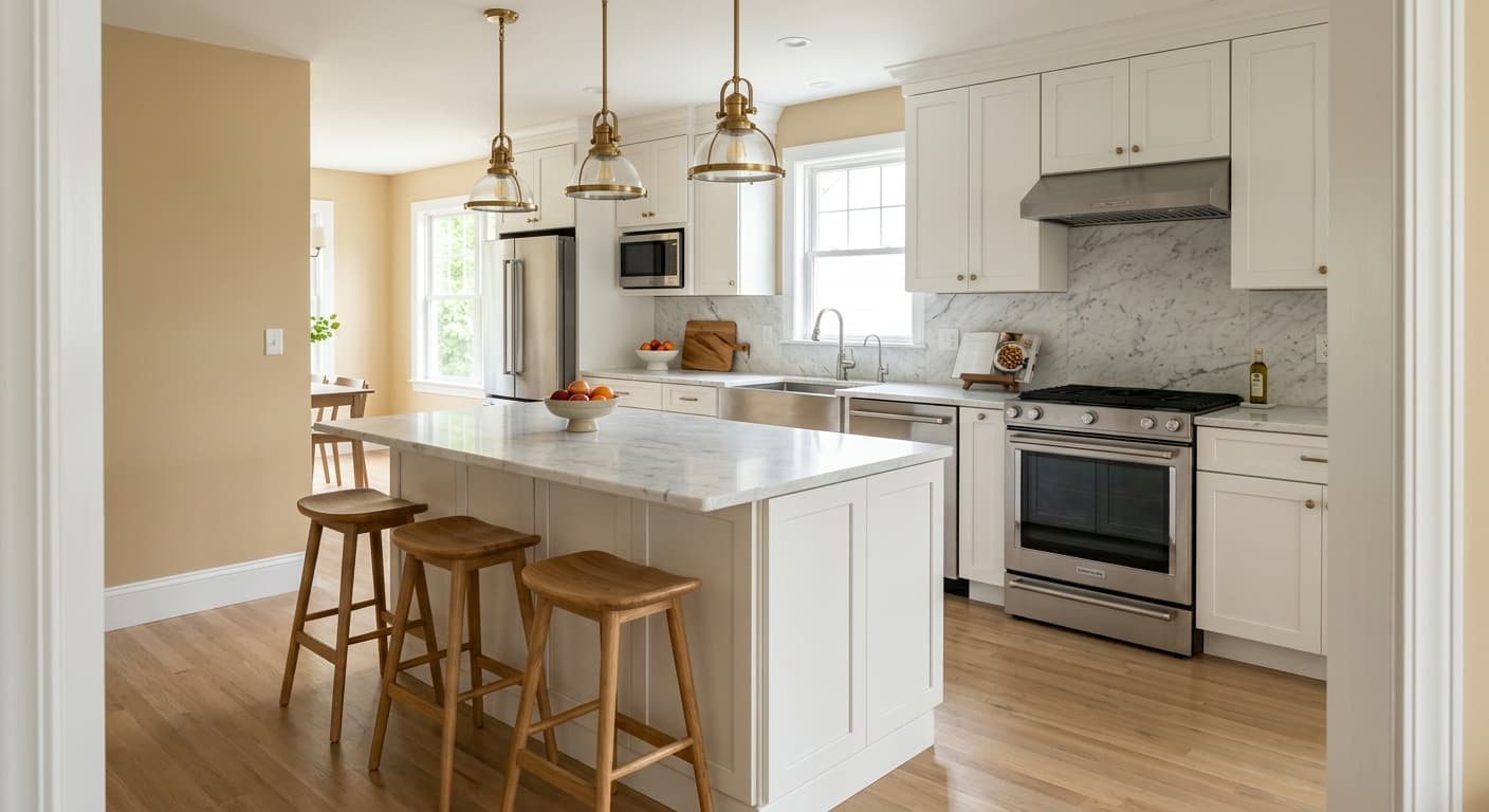
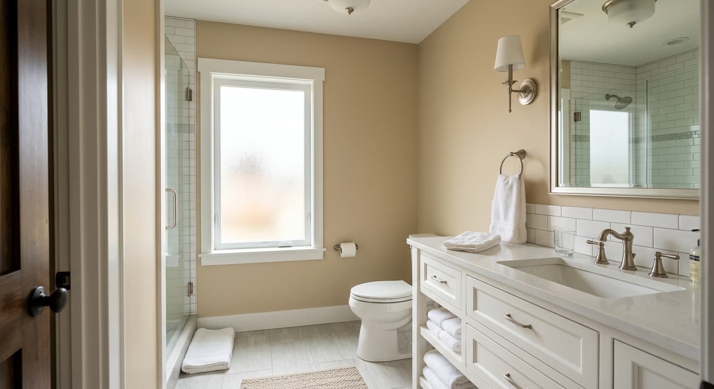
This is a workhorse for living rooms, bedrooms, and hallways where you want warmth without darkness. It shines in north-facing rooms, which tend to get cool, flat light. Sand Dollar pushes back against that chill and keeps the space feeling inviting. South-facing rooms with lots of sun will warm it up further, so test it if you're sensitive to anything too golden.
Size-wise, it suits medium to large rooms beautifully because the depth gives those spaces a sense of enclosure. In small, dim rooms it can feel a little closed in, so reserve it for spaces with at least some natural light or generous artificial lighting.
What to Pair With Sand Dollar
For trim, skip the cool whites and reach for something warm. Benjamin Moore White Dove (OC-17) is a reliable match, soft and creamy without competing. Simply White (OC-117) works too if you want a touch more crispness. For a tonal, layered look, pair Sand Dollar with a deeper companion like Alexandria Beige (HC-77) on an accent wall or built-ins.
Flooring in natural oak, walnut, or warm-toned wide planks looks right at home with this color. Avoid gray-washed floors, which fight the warmth. For furnishings, lean into linen, leather, rattan, and creamy upholstery. Black accents in lighting and hardware add a crisp anchor that keeps the whole scheme from feeling too soft.
Colors That Clash With Sand Dollar
Don't pair Sand Dollar with cool grays or blue-toned whites unless you want the contrast to expose its yellow. Stark, high-contrast color combinations tend to make this earthy tan look muddy. Avoid using it in a small windowless room expecting it to brighten the space, because it won't. And resist the urge to surround it with too many other warm beiges of slightly different undertones, which creates a dull, samey look instead of a layered one.