Pebble Beach
What Pebble Beach Actually Looks Like
Pebble Beach sits right in that comfortable middle ground between gray and beige. It reads as a warm greige most of the time, but it never tips fully into either camp. You get the softness of beige with enough gray to keep it feeling current rather than dated.
The color shifts noticeably depending on your light. In bright morning sun, it leans warmer and shows off its taupe character. By late afternoon or under overcast skies, the gray steps forward and the whole thing cools down a touch. This chameleon quality is part of why people love it, though it also means you absolutely need to test it on your own walls before committing.
What makes it distinctive is its restraint. There is nothing loud about Pebble Beach. It does not demand attention, which makes it a quiet backdrop that lets your furniture, art, and architecture do the talking. Some greiges feel muddy. This one stays clean.
Pebble Beach Undertones
The dominant undertone here is a soft taupe, with a faint hint of green that surfaces in cooler light. That green is subtle, but it matters. If you pair Pebble Beach with a trim that has strong pink or yellow undertones, you may notice an odd contrast where the colors fight each other rather than blend.
Pay attention to what you put next to it. Cool grays will pull out its warmth and make it look almost beige by comparison. Warm creams will do the opposite and cool it down. Knowing this lets you steer the color in the direction you want rather than being surprised by what shows up after the paint dries.
Where Pebble Beach Works Best
Pebble Beach performs beautifully in south-facing and east-facing rooms where natural light keeps its warmth alive. In these spaces it feels grounded and inviting. North-facing rooms are trickier. The cooler, flatter light there can flatten Pebble Beach and bring the gray and green forward, so you may want to test it carefully or add warm lighting to compensate.
It works in nearly any size room. In smaller spaces, its mid-range lightness keeps things from feeling closed in. In larger open-plan areas, it provides a cohesive thread that ties zones together without overwhelming them. Living rooms, bedrooms, hallways, and home offices all wear it well.
What to Pair With Pebble Beach
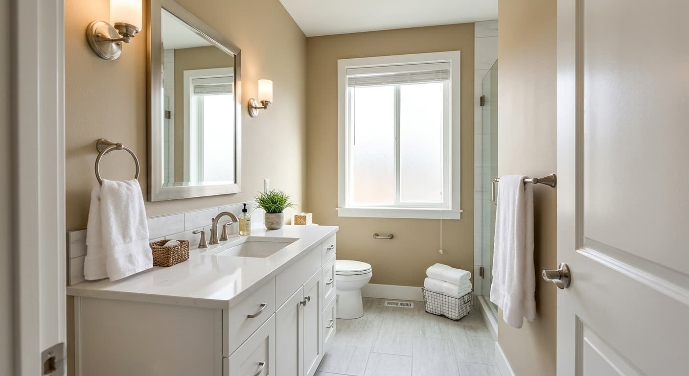
For trim, reach for a clean white that has a slight warmth to it. Benjamin Moore White Dove (OC-17) is a reliable companion that softens the contrast without going stark. If you want a little more crispness, Simply White (OC-117) also works.
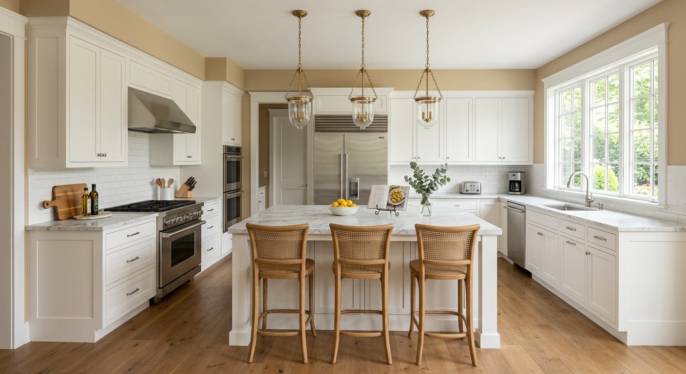
For a tonal, layered look, pair Pebble Beach with deeper neutrals like Chelsea Gray (HC-168) on a feature wall or built-ins. Natural wood tones, especially mid-brown oak and walnut, complement its warmth nicely. On flooring, light to medium hardwood feels harmonious, while a wool rug in cream or muted blue adds depth. Linen and natural fiber furnishings reinforce the relaxed, organic mood this color sets.
Colors That Clash With Pebble Beach
Skip pairing Pebble Beach with cool, blue-based grays. The clash makes the greige look dingy and tired rather than warm. Avoid bright, high-contrast accent colors like primary red or electric blue, which feel jarring against its gentle character. The most common mistake is choosing it from a tiny chip without sampling. Because it shifts so much in different light, what looks like a soft warm neutral in the store can read distinctly gray or green on your wall.