Oystershell
What Oystershell Actually Looks Like
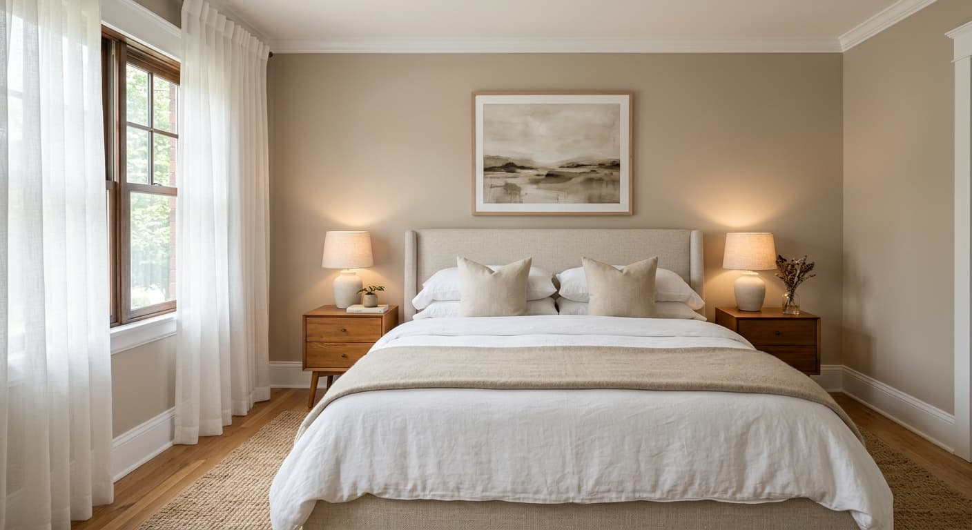
Oystershell sits in that tricky middle ground between gray and beige, which is why people reach for the word "greige" when describing it. On your walls, it reads as a soft, muted neutral that leans warm without tipping into tan. Think of the inside of an actual oyster shell, that quiet putty tone with a hint of dusty depth.
What makes this color worth your attention is how it behaves across the day. In bright morning light it can look almost taupe, with the warmth coming forward. By late afternoon, especially in cooler rooms, you'll notice it cool down and settle into something closer to a soft mushroom gray. It never goes flat or dingy, which is a common failure point for midtone neutrals.
The depth here is the real selling point. This is not a pale, washed-out neutral that disappears. Oystershell has enough pigment to hold a room together and give walls a sense of substance. You feel it in the space rather than looking right past it.
Oystershell Undertones
The dominant undertone is warm, sitting somewhere between beige and a faint olive-gray. Under certain light it can flash a subtle green or even a whisper of pink, so test it before you commit. Undertones are the secondary colors hiding inside a neutral, and they decide whether your whites look crisp or muddy next to the wall.
Because Oystershell carries warmth, it pairs naturally with warmer woods and creamy trim. If you fight that warmth by surrounding it with cool blue-grays and bright stark whites, the contrast can make the wall look dirty by comparison. Lean into what the color already wants to be.
Where Oystershell Works Best
This is a strong choice for living rooms, bedrooms, and open-concept main floors where you need one color to flow through several spaces. The midtone depth means it works in rooms with plenty of natural light, where paler neutrals would bleach out. South-facing and west-facing rooms bring out its best warmth.
In north-facing rooms, which get cooler, indirect light, Oystershell can lean gray and slightly somber. That's not always a problem. If you want a cozy, enveloping feel in a study or a den, that coolness can work in your favor. Just know what you're getting. It also performs well in medium to large spaces where its depth feels intentional rather than closing in on you.
What to Pair With Oystershell
For trim, reach for a soft warm white rather than a bright cool one. Benjamin Moore White Dove (OC-17) is a reliable companion, picking up just enough warmth to feel cohesive without matching exactly. Simply White (OC-117) also works if you want a touch more brightness.
For flooring, white oak and other warm to medium woods sit beautifully against it. Avoid cold gray-washed floors, which fight the wall's warmth. For adjacent walls or a deeper anchor, look at Chelsea Gray (HC-168) for contrast or Edgecomb Gray (HC-173) for a lighter step in the same family. Bring in furnishings in natural linen, camel leather, aged brass, and black accents to give the palette some grounding and crispness.
Colors That Clash With Oystershell
Steer clear of pairing Oystershell with cool, blue-based grays. The clash pulls the worst out of both colors and leaves the room feeling unresolved. Stark, ultra-bright whites are another misstep, since they expose the wall's warmth in an unflattering way and read as a mismatch rather than a deliberate contrast. And resist the urge to use this in a small, dark north-facing space without good lighting, where it can turn dull and heavy.