Jute
What Jute Actually Looks Like
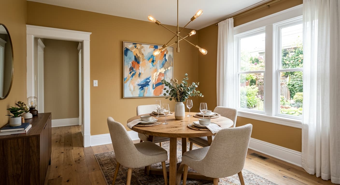
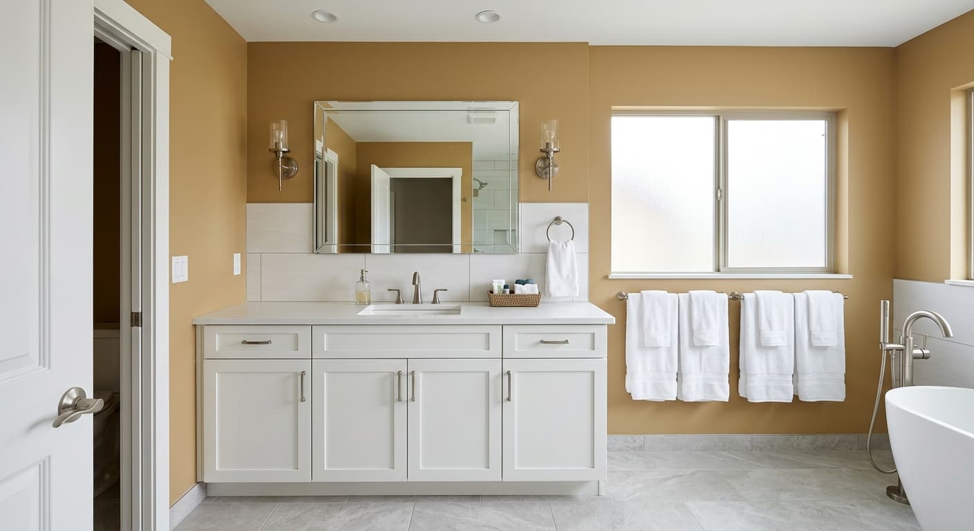
Jute is a warm mid-tone tan, the color of natural rope or a well-worn manila envelope. It sits firmly in the earthy beige family, but with enough gold in it to keep things from feeling flat. In a north-facing room with cool light, you'll see the more grounded, slightly muddy side of it. In afternoon sun streaming through a south window, it warms up and reads almost honey-toned.
This is a color that moves. Some tans stay stubbornly the same all day, but Jute shifts with whatever light it gets. Morning light pulls it toward a softer, paler tan. By late afternoon it can look noticeably deeper and more golden. If you're sampling it, paint a large swatch and watch it across a full day before you commit.
What makes it distinctive is that it never tips into orange or pink the way a lot of warm beiges do. It holds onto a natural, raw quality. Think of unbleached linen rather than a glossy caramel. That restraint is what keeps it usable in real homes.
Jute Undertones
The dominant undertone here is gold, with a faint green pulling underneath it. That green is subtle, but it matters. It's what keeps Jute from feeling overly yellow or dated. When you put it next to a true cream or a butter-yellow trim, that green undertone can quietly emerge and make your trim look slightly off.
Pay attention to what you place beside it. Against cool grays, Jute looks warmer and richer. Against other warm earth tones, its green-gold base settles back and behaves. Check your fixed elements first, your flooring, your stone, your cabinetry, because Jute will react to all of them.
Where Jute Works Best
Jute is a strong performer in living rooms, bedrooms, and hallways where you want warmth without going dark. It excels in south and west-facing rooms that get good natural light, since that light brings out its golden character. In north-facing rooms it still works, but expect a more subdued, earthier result, which can be exactly what you want in a den or study.
It suits medium to large spaces especially well. In a small room with limited light, Jute can feel slightly heavy, so reserve it for areas with decent square footage or good window access. Open-plan spaces handle it beautifully because the color carries continuity from room to room without overwhelming any single zone.
What to Pair With Jute
For trim, go with a clean warm white like Benjamin Moore White Dove (OC-17) or Simply White (OC-117). These keep the contrast soft and natural. Avoid stark, blue-based whites, which fight Jute's warmth. For a deeper, layered scheme, pair it with Kingsport Gray (HC-86) on an accent wall or with a soft sage like October Mist (1495).
Flooring-wise, Jute loves medium oak, walnut, and warm wood tones. It also plays nicely with natural fiber rugs, leather, and linen upholstery. Lean into the organic story the name suggests. For furniture, deep browns, cream, terracotta accents, and muted olive all sit comfortably against these walls. If you want a richer anchor color elsewhere in the room, try Van Buren Brown (HC-70).
Colors That Clash With Jute
Don't pair Jute with cool, gray-based whites or icy blues. They'll make the wall look dingy and pull out the muddier side of the undertone. Steer clear of bright lemon yellows and orange-leaning terracottas too, since they exaggerate the gold and tip the whole room toward dated. The most common mistake is using it in a dim, north-facing room with no warm light, where it loses its glow and just reads brown and tired.