Indian River
What Indian River Actually Looks Like
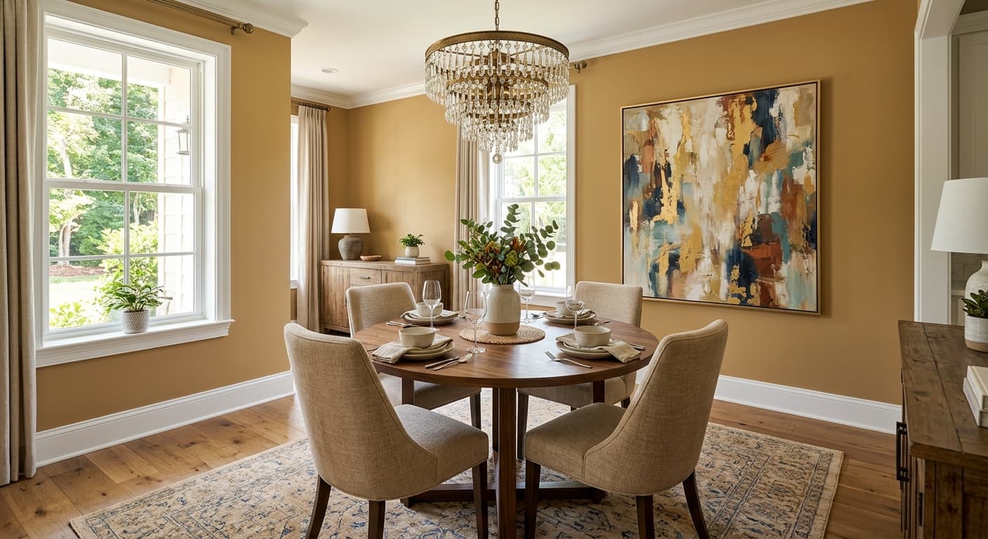
Indian River sits in that comfortable middle ground between a true tan and a soft terracotta. It reads as a warm, earthy neutral with a faint clay quality that keeps it from feeling flat or builder-grade. Think of the color of dried riverbank soil after the sun has worked on it. Grounded, a little dusty, never loud.
In bright midday light, you'll notice the warmth come forward and the color lifts toward a sandy peach. Early morning and evening light pull it deeper, closer to a muted adobe. Under warm artificial lighting, it can lean noticeably orange, so test it at night before you commit. This is a color that genuinely changes through the day, which is part of its appeal but also why a sample matters.
What makes it distinctive is the balance. It has enough pigment to feel intentional and cozy, but not so much that it overwhelms a room. You get the comfort of a warm tone without the heaviness that deeper terracottas bring.
Indian River Undertones
The dominant undertone here is orange-red, sitting under a layer of warm beige. That clay base is what gives Indian River its character, and it's also what you need to watch. Place it next to a cool gray or a blue-based white and the warmth will read as more orange than you expected. Pair it with creamy whites and natural materials, and the same undertone settles into something softer and more harmonious.
Because the undertone is assertive, it influences everything around it. Your trim, your flooring, and your furniture all need to acknowledge that warmth rather than fight it. Cool-toned furnishings will look slightly off against these walls.
Where Indian River Works Best
This color thrives in south and west-facing rooms where natural warm light supports its earthy quality. In those spaces it feels enveloping and rich. North-facing rooms are trickier. The cooler, bluer light can flatten Indian River or push the orange undertone in an unflattering direction, so supplement with warm bulbs if you go that route.
It works beautifully in living rooms, dining rooms, and entryways where you want a sense of welcome. In smaller spaces it creates a cocooning effect rather than feeling cramped, since the mid-range depth keeps things grounded without going dark. Bedrooms benefit too, especially if you want restful and warm over crisp and bright.
What to Pair With Indian River
For trim, reach for a soft warm white like Benjamin Moore White Dove (OC-17) or Cloud White (OC-130). These keep the contrast gentle and let the wall color breathe. Avoid stark, blue-leaning whites that will make the walls look muddy by comparison.
For complementary colors, Indian River plays well with deep greens like Tarrytown Green or muted blues like Van Deusen Blue, both of which balance the warmth without clashing. Natural wood flooring in oak or walnut reinforces the earthy story. For furniture, lean into cream, caramel leather, rattan, and warm brass hardware. Layered textiles in rust, ochre, and soft olive tie the whole room together. If you want a tonal scheme, pair it with a lighter sandy neutral on adjacent walls.
Colors That Clash With Indian River
Steer clear of cool grays, icy whites, and anything with a strong blue or purple base. These will fight the orange undertone and make Indian River look dirty rather than warm. Chrome and polished nickel finishes also feel disconnected here, since the cool metal contradicts the cozy clay tone. And resist over-lighting the room with bright white LED bulbs, which strip out the warmth and leave the color looking washed out and ashy.