Herbal Escape
What Herbal Escape Actually Looks Like
Herbal Escape is a saturated mid-tone green that lands somewhere between a forest and a fresh sage. It reads as a confident, slightly muted green without tipping into neon territory. Think of the color of rosemary or a healthy garden herb, which is exactly where the name comes from.
In bright daylight, you'll notice a clear, almost cheerful quality. The green looks alive and a touch botanical. As the sun moves and softens, the color deepens and gets cozier, leaning closer to a true forest green by evening. Under warm artificial light, it picks up a faint golden warmth that keeps it from feeling cold.
What makes it distinctive is the balance. Plenty of greens go too gray and turn flat, or go too yellow and look dated. Herbal Escape sits in a sweet spot where it stays vivid but grounded. It has enough depth to feel intentional and enough brightness to keep a room from going dim.
Herbal Escape Undertones
The primary undertone here is yellow-green, with just a whisper of gray to calm things down. That yellow base is the thing to watch. It means Herbal Escape will warm up alongside wood tones and brass, but it can clash with cooler, blue-based greens if you try to layer them in the same space.
Undertones matter most when you're choosing trim and adjacent colors. Because this green leans warm, you want trim and neighboring shades that either match that warmth or stay genuinely neutral. Pair it with a cool, blue-gray and the green will suddenly look muddy by comparison.
Where Herbal Escape Works Best
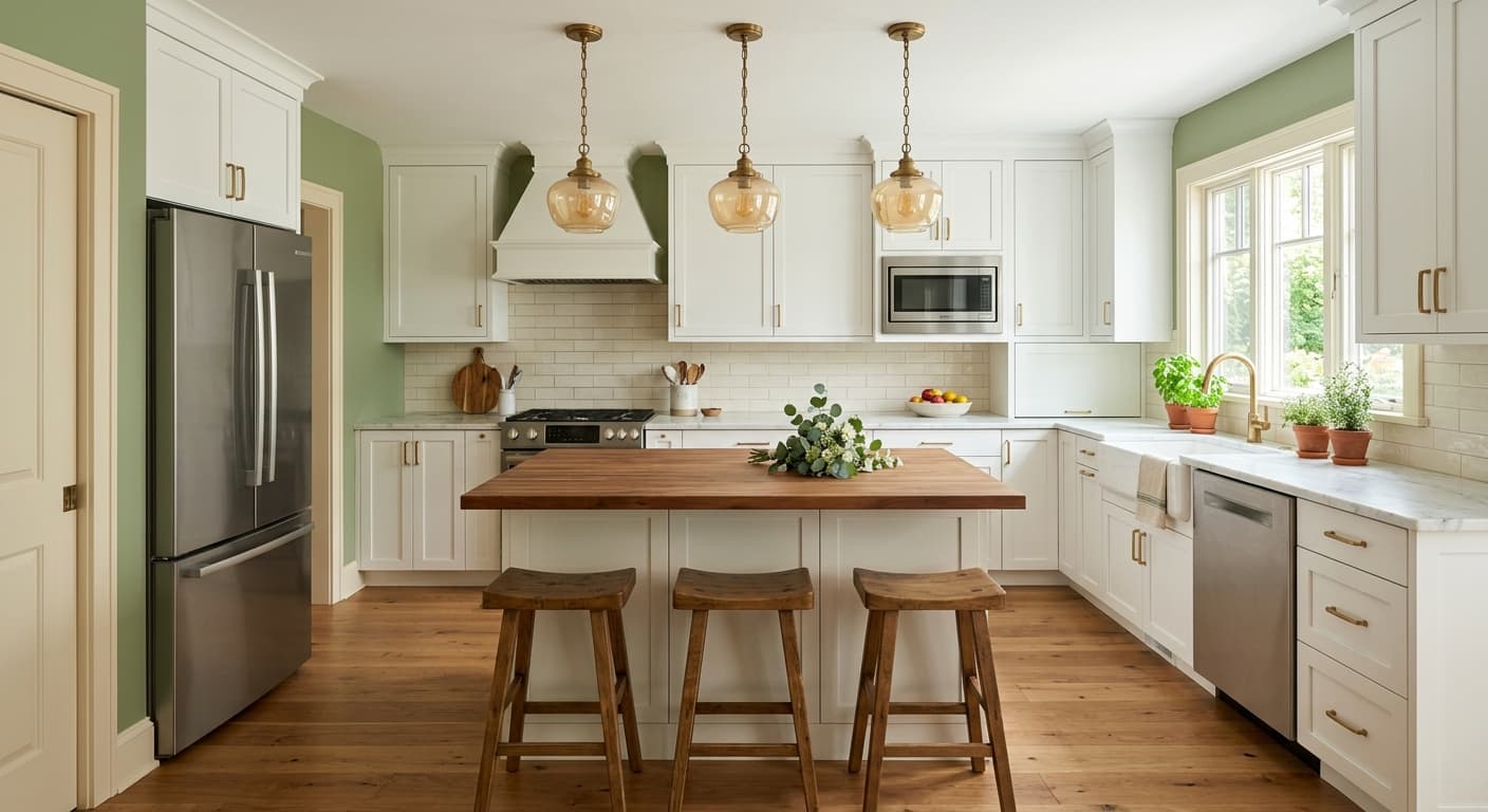
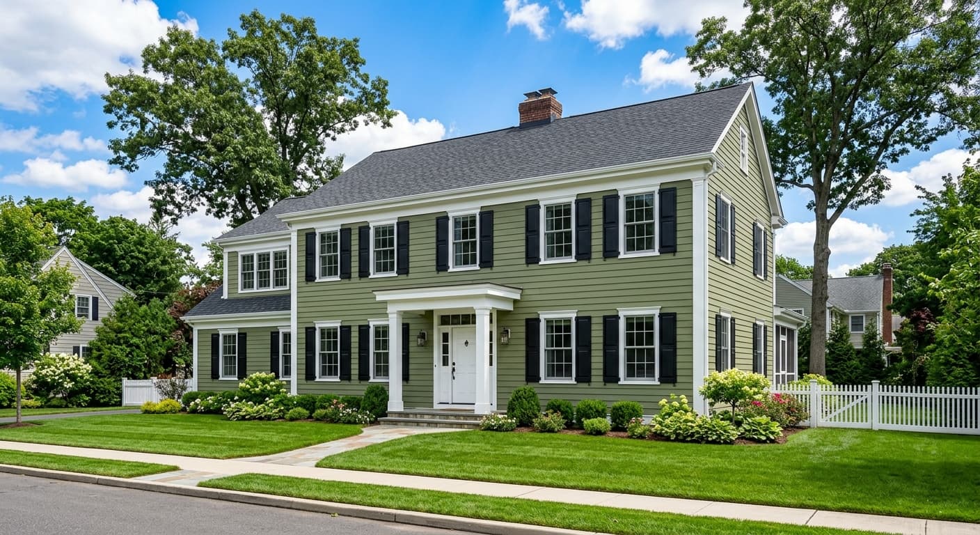
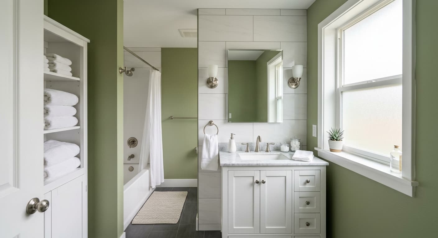
This is a versatile mid-tone, so it performs well in kitchens, dining rooms, home offices, and bedrooms. It has real presence on cabinetry, which is where I see it most often and where it shines. As a full-room wall color, it works best in spaces that get decent natural light.
Orientation makes a difference. In south-facing and west-facing rooms, the warm light brings out the green's liveliness and keeps it from going heavy. In north-facing rooms, where light is cooler and flatter, Herbal Escape can read darker and more subdued, which is fine if you want a moody den but worth testing if you want energy. In small spaces it creates a wrapped, enveloping feel rather than making things feel cramped, as long as you keep trim crisp.
What to Pair With Herbal Escape
For trim, a warm white like Benjamin Moore White Dove (OC-17) or Simply White (OC-117) keeps things fresh without fighting the green's warmth. If you want more contrast, a soft cream works beautifully against it. For flooring, mid-tone oak and walnut are natural partners, and natural materials like rattan, linen, and unlacquered brass all play nicely with the botanical feel.
Looking for complementary Benjamin Moore colors, reach for warm neutrals like Edgecomb Gray (HC-173) or a clay-based tone like Muslin (OC-12). For a bolder move, a terracotta or warm rust pulls out the energy in the green and creates a grounded, natural palette. Black hardware and accents give it a crisp, modern edge.
Colors That Clash With Herbal Escape
Skip pairing this with cool, blue-gray neutrals or stark, blue-white trims. Those combinations drain the warmth and make the green look dull and slightly dirty. Avoid stacking it next to a competing green from a different family, since the undertone mismatch will read as a mistake rather than a layered look. And resist using it in a windowless room with only cool LED lighting, because without warmth to lean on, Herbal Escape can go flat and lifeless.