Chimichurri
What Chimichurri Actually Looks Like
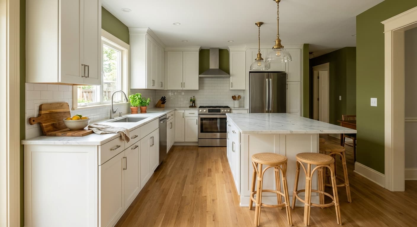
Chimichurri is a deep olive green with real grounding weight to it. This isn't a fresh spring green or a sage that whispers from the wall. It reads dark and earthy, the kind of green you'd find on a moss-covered stone or a worn leather book spine. In a well-lit room it shows its olive character clearly, with a touch of brown softening the edges.
Light changes it more than you might expect. Under bright midday sun, you'll notice the green pull forward and brighten slightly, almost taking on a khaki quality. As the light fades toward evening, it gets moodier and reads closer to a charcoal-green, swallowing detail and feeling enveloping. Artificial light matters too. Warm bulbs push it toward brown and amber, while cooler LEDs keep the green crisp and a bit more grey.
What makes it distinctive is that balance between green and earth. Some olive greens go too yellow and start looking like split pea soup. Chimichurri stays sophisticated because there's enough grey holding it back. You get richness without it turning loud.
Chimichurri Undertones
The dominant undertone here is a muted yellow-brown sitting underneath the green. That earthiness is what keeps it from feeling cold, but it also means you need to watch what you put beside it. Stark, blue-based whites will fight the warmth and make the green look slightly muddy by contrast.
Undertones decide your whole palette. Because Chimichurri leans warm and earthy, you'll get the most harmony pairing it with creamy whites, warm woods, and other muted naturals. If you bring in something cool and crisp, do it deliberately as a contrast, not by accident.
Where Chimichurri Works Best
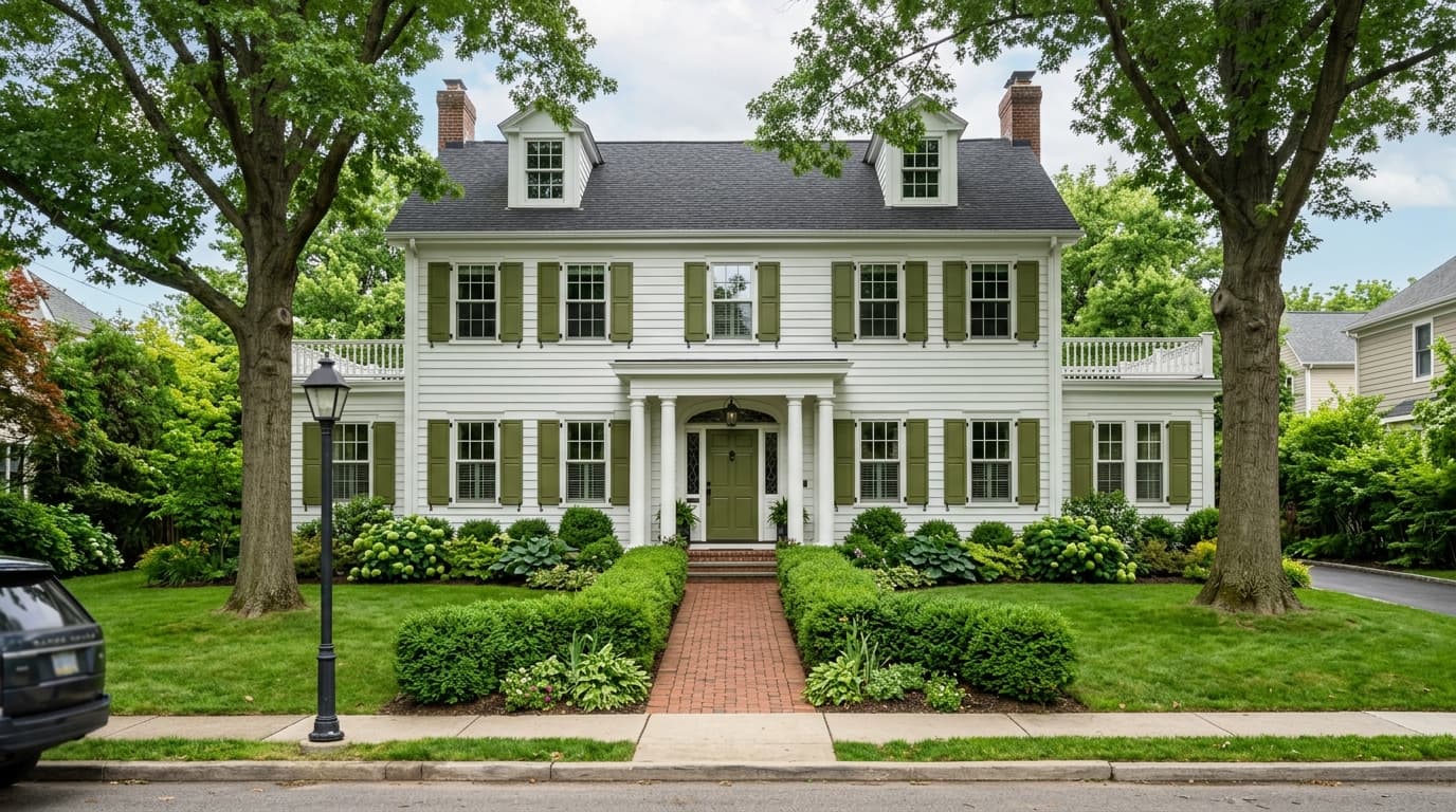
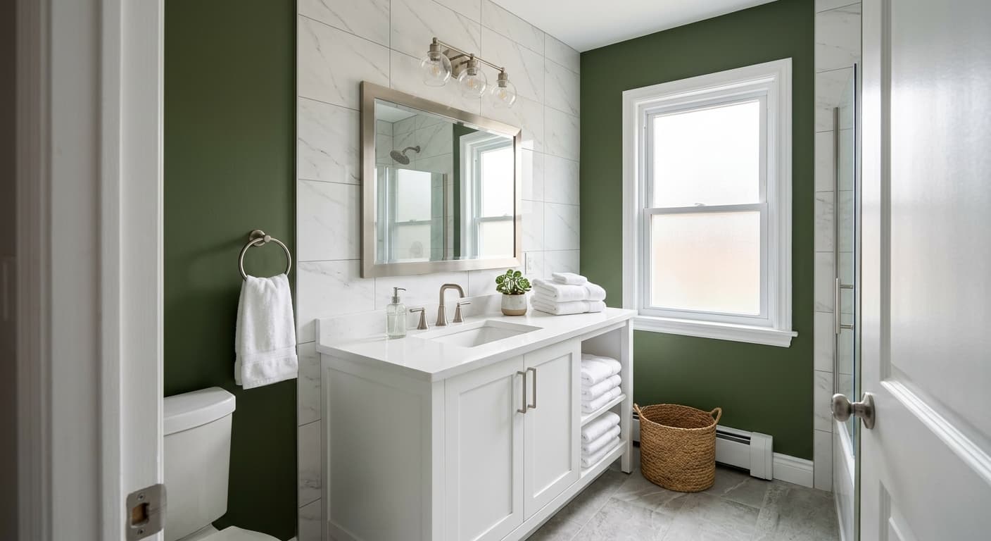
This color thrives in rooms you want to feel cozy and enclosed. Think studies, dining rooms, libraries, and bedrooms where a deep wrapping color works in your favor. It's a strong choice for cabinetry too, especially in kitchens and built-ins where you want something with more personality than a safe grey.
Orientation matters with a color this deep. In south-facing rooms with plenty of natural light, Chimichurri stays lively and shows off its green. In north-facing spaces, expect it to go darker and more subdued, which can be lovely if that's the mood you want, but it will eat light in a small north room. Larger spaces handle it best. In tight rooms, use it on a single wall or on millwork rather than wrapping the whole space.
What to Pair With Chimichurri
For trim, skip the bright whites and reach for something warmer. Benjamin Moore White Dove (OC-17) or Swiss Coffee (OC-45) soften the contrast and let the green feel intentional. If you want depth, painting trim and walls the same Chimichurri in different sheens creates a tailored, modern look.
Wood tones are your friend here. Walnut, oak, and warm mid-browns sit beautifully against this green. For flooring, natural oak or a medium warm stain grounds the room. Bring in brass or aged bronze hardware rather than chrome. For complementary wall colors in adjoining spaces, look at Edgecomb Gray (HC-173) for a soft neutral, or Cinnamon (2174-20) and clay tones if you want a warm, layered earthy scheme. Leather, linen, and terracotta all play well in furnishings.
Colors That Clash With Chimichurri
Don't pair it with cool greys and blue-based whites expecting harmony, because the warmth will clash and the green can look dingy. Avoid using it as your only color in a small, dark, north-facing room unless you genuinely want a cave-like effect. And resist the urge to combine it with too many other saturated colors at once. Chimichurri is already doing a lot, so let it lead and keep the supporting cast quiet.