Black Pepper
What Black Pepper Actually Looks Like
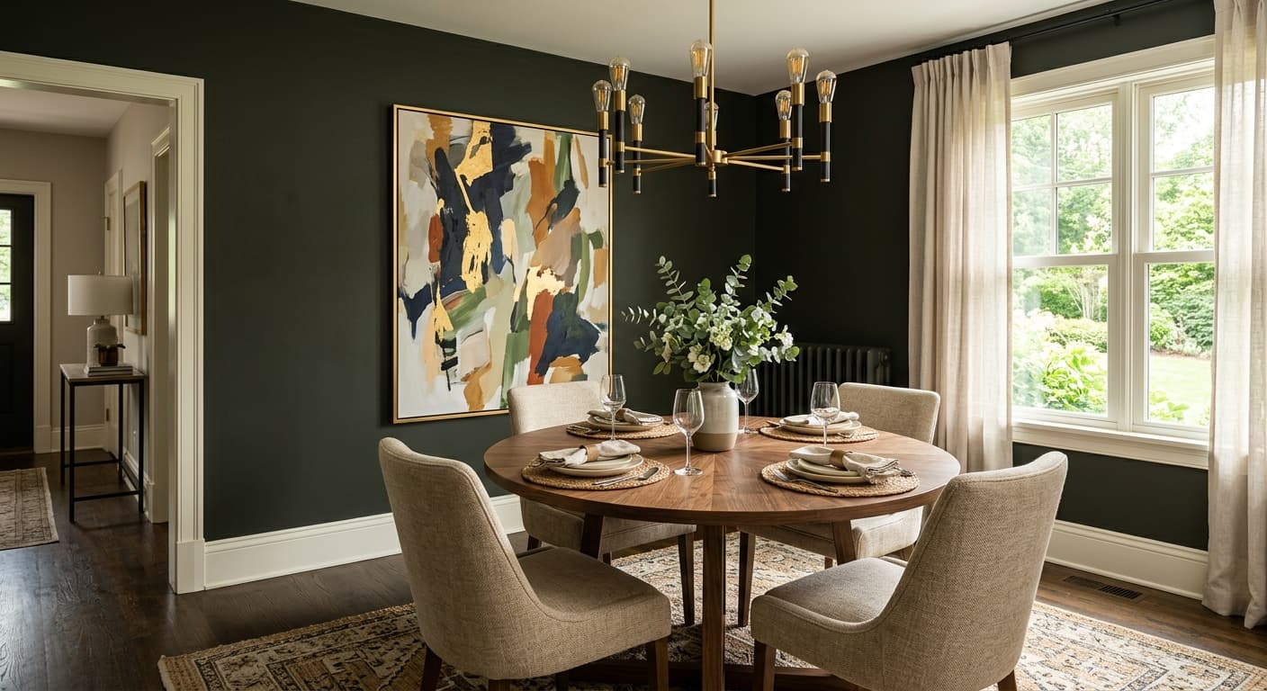
Black Pepper is a soft black, not a hard one. There's a warmth to it that keeps it from reading as a flat, inky void on your walls. Picture the color of freshly ground peppercorns, dark and rich, with just enough brown buried inside to feel grounded rather than stark.
In strong daylight, you'll notice it loosen up a little. It reads almost charcoal in a bright south-facing room, showing off its softer, slightly warm character. Move into low light or evening, and it deepens considerably, leaning closer to true black without ever feeling cold or clinical. That shift is what makes it so useful. One color, two distinct moods depending on the hour.
What sets it apart from sharper blacks like Onyx or Black is the lack of blue. Black Pepper feels organic. It plays nicely with wood, leather, and natural materials, which is exactly why designers reach for it when they want drama without the chill.
Black Pepper Undertones
The undertone here is a warm brown, sometimes reading faintly olive depending on what surrounds it. This matters more than people expect. A black with a brown base will fight against cool grays and crisp blue-whites, so you need to be intentional about what you set next to it.
Pay attention to your trim and adjacent walls especially. Against a cool white, Black Pepper can look slightly muddy. Against a warm or creamy white, the brown in it makes sense and the whole pairing settles. Test it before you commit, because lighting and neighboring colors will pull those undertones in different directions.
Where Black Pepper Works Best
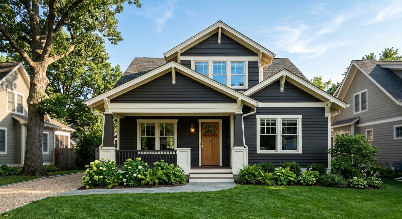
This color earns its keep in rooms where you want depth and intimacy. Studies, libraries, dining rooms, and bedrooms all suit it. In a north-facing room, where light skews cool, Black Pepper holds onto its warmth and prevents the space from feeling bleak. In a south-facing room, you get that softer charcoal effect during the day and a cozy envelope at night.
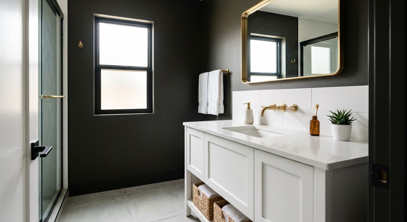
Don't shy away from small spaces. A powder room or a tight hallway painted in Black Pepper feels deliberate and enveloping rather than cramped. In larger rooms, use it on a single feature wall, the back of built-in shelving, or the ceiling if you're feeling bold. It also makes a strong cabinet and front door color.
What to Pair With Black Pepper
For trim, skip the brightest whites. Reach for something with a little warmth, like White Dove (OC-17) or Cloud White (OC-130). Both give you contrast without the harsh edge a cool white would create. If you want a softer transition, Edgecomb Gray (HC-173) on adjacent walls bridges the dark and light nicely.
For furnishings, lean into natural materials. Walnut and oak flooring look terrific against it. Brass and aged bronze hardware bring out the warmth, while brushed nickel can feel a touch sterile. Leather, linen, and rattan all read beautifully next to this depth of color. If you want a complementary accent, a muted sage like Saybrook Sage (HC-114) or a warm terracotta pairs well and keeps the palette grounded.
Colors That Clash With Black Pepper
Steer clear of pairing Black Pepper with cool, blue-based grays and stark optic whites. The clash of warm and cool undertones makes both colors look slightly off, and you'll never quite figure out why the room feels unsettled. Avoid using it across every wall in a room with poor natural light, since it can tip into oppressive without enough contrast to balance it. And resist chrome or chrome-toned finishes, which read cold against its warmth.