Wheat Bread
What Wheat Bread Actually Looks Like
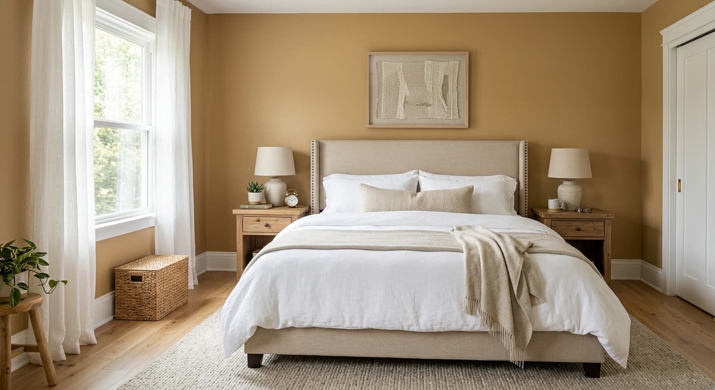
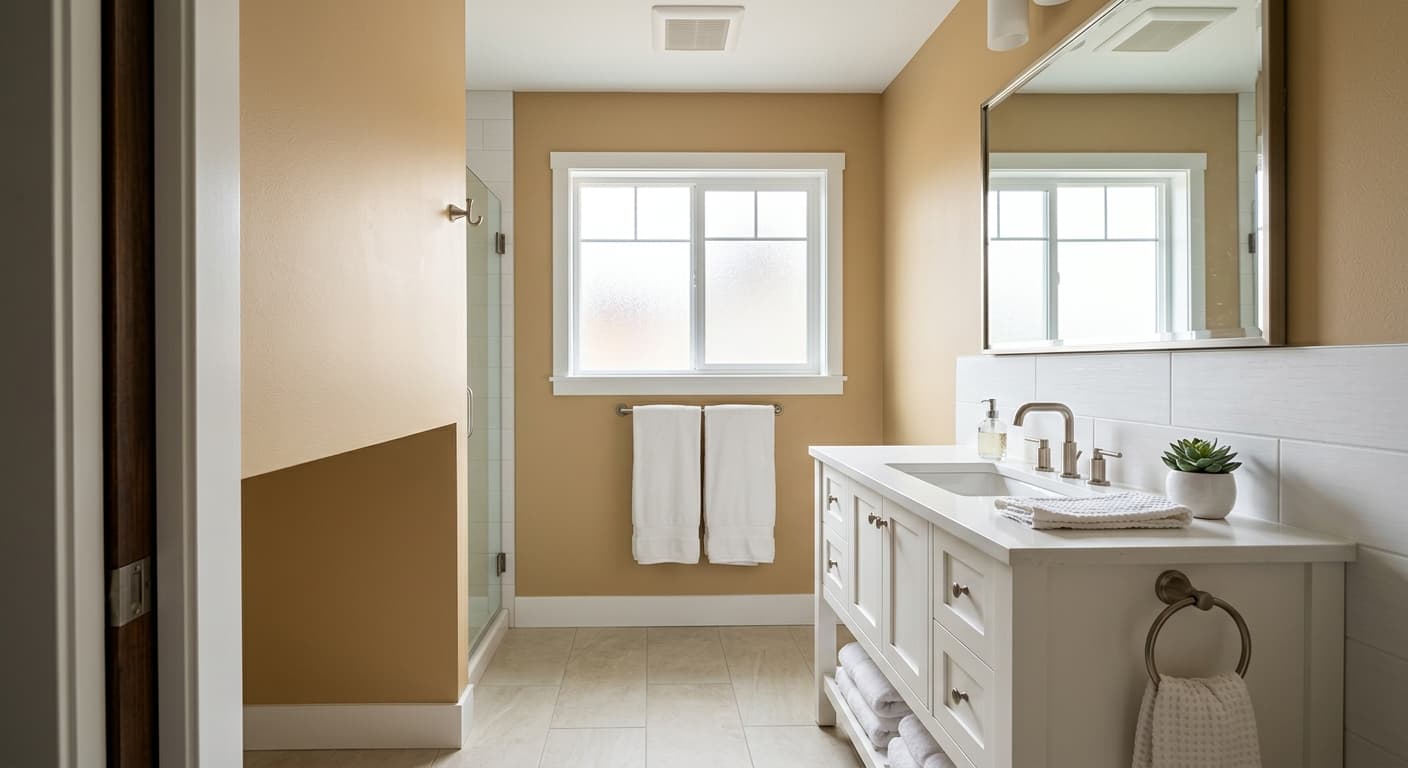
Wheat Bread sits in that comfortable middle zone between cream and tan. It reads as a warm, grounded beige with a soft golden cast, the kind of color that looks like toasted bread crust when the light hits it right. This is not a stark or cool neutral. It has warmth baked in, which keeps it from feeling flat or sterile on a large wall.
In morning light, you will notice the golden notes come forward and the whole room feels a little brighter and more honeyed. By late afternoon, especially in rooms that catch western sun, it can deepen and lean almost caramel. Under cooler overcast skies, Wheat Bread settles down and behaves more like a true mid-tone beige without much yellow showing.
What makes this color useful is its flexibility. It is dark enough to register as an actual color on the wall rather than disappearing into off-white, but light enough that it never closes a room in. Painted across a full space, it gives you depth without weight.
Wheat Bread Undertones
The dominant undertone here is golden yellow, with a faint greige base underneath that keeps the yellow in check. That base matters. It means Wheat Bread will not go neon or buttery the way a purely yellow beige might. Still, you need to respect that warmth when choosing what sits next to it.
Because the undertone is warm, cool grays and blue-leaning whites will fight with this color and make it look dirty or yellowed by contrast. Pull your neighboring shades from the warm side of the wheel and everything will feel intentional. Test trim and accent colors directly against the painted wall before committing, since undertones shift dramatically depending on what they touch.
Where Wheat Bread Works Best
Wheat Bread shines in north-facing rooms that struggle with cool, flat light. The built-in warmth counteracts that bluish cast and adds the coziness those spaces usually lack. It also works in south-facing rooms, where strong natural light keeps the gold from getting heavy. Living rooms, bedrooms, and hallways are natural homes for it.
In smaller spaces, this color creates an enveloping, snug feeling rather than an expansive one, so use it where you want comfort over airiness. In larger open-plan areas, it grounds the room and reads more sophisticated than a pale neutral would. Just be cautious in rooms with very little light, where it can drift toward muddy.
What to Pair With Wheat Bread
For trim, reach for a soft warm white like Behr Swiss Coffee or Cameo White rather than a bright cool white, which would expose the yellow and make the contrast jarring. Creamy whites let the trim and wall feel like part of the same family.
Furniture in espresso, walnut, or honey-toned wood looks settled against these walls. Leather in cognac or tan reinforces the warmth. For flooring, medium oak or warm-toned engineered wood pairs cleanly, and natural fiber rugs like jute or sisal echo the earthiness. If you want contrast, deep navy, forest green, or charcoal accents give the room structure without clashing.
Colors That Clash With Wheat Bread
Keep cool grays, icy whites, and anything with a blue or violet base away from Wheat Bread. Those combinations make the wall look dingy and bring out a sallow quality you do not want. Avoid pairing it with bright, lemony yellows too, since they compete with the existing gold and create a one-note, washed-out effect. The most common mistake is choosing a crisp white trim off a fan deck without testing it, then wondering why the walls suddenly look yellow.