Watery
What Watery Actually Looks Like
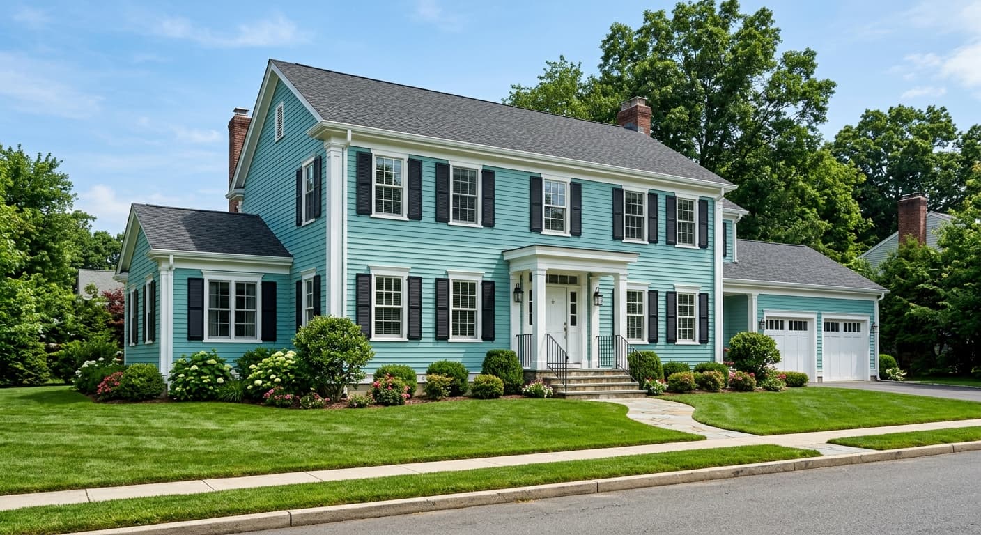
Behr Watery sits right where blue meets green, which is exactly what its name promises. It reads as a soft, watery aqua most of the time, but the balance shifts depending on what is hitting it. In bright daylight, you will notice the green coming forward and the color feeling fresh and airy. As the light fades toward evening, it settles into something cooler and more blue.
This is a mid-tone color, so it carries enough pigment to feel like an actual color choice rather than a near-white that hints at blue. It will never overwhelm a room. Think of it as the color of sea glass or the shallow end of a pool on a clear day.
Watery has a slightly muted, dusty quality to it. That softness is what keeps it from looking cartoonish or juvenile. You get the calm of a coastal palette without the color feeling like it belongs only in a beach house.
Watery Undertones
The dominant undertone here is green, with a cool blue running underneath. This matters more than people expect. Because the green is present, Watery can clash with colors that lean too warm or too gray. Put it next to a beige with yellow in it and the green will look slightly off, almost dingy by comparison.
Pay attention to your trim and any adjacent walls. The green-blue base wants to be surrounded by clean, cool neutrals. If your fixed elements like tile or countertops have warm undertones, test a large sample before committing, because Watery can either harmonize or fight depending on what is around it.
Where Watery Works Best
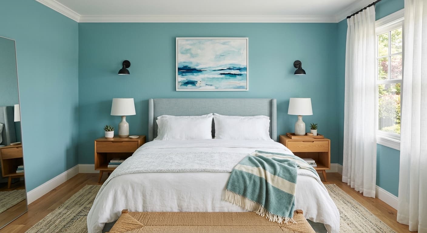
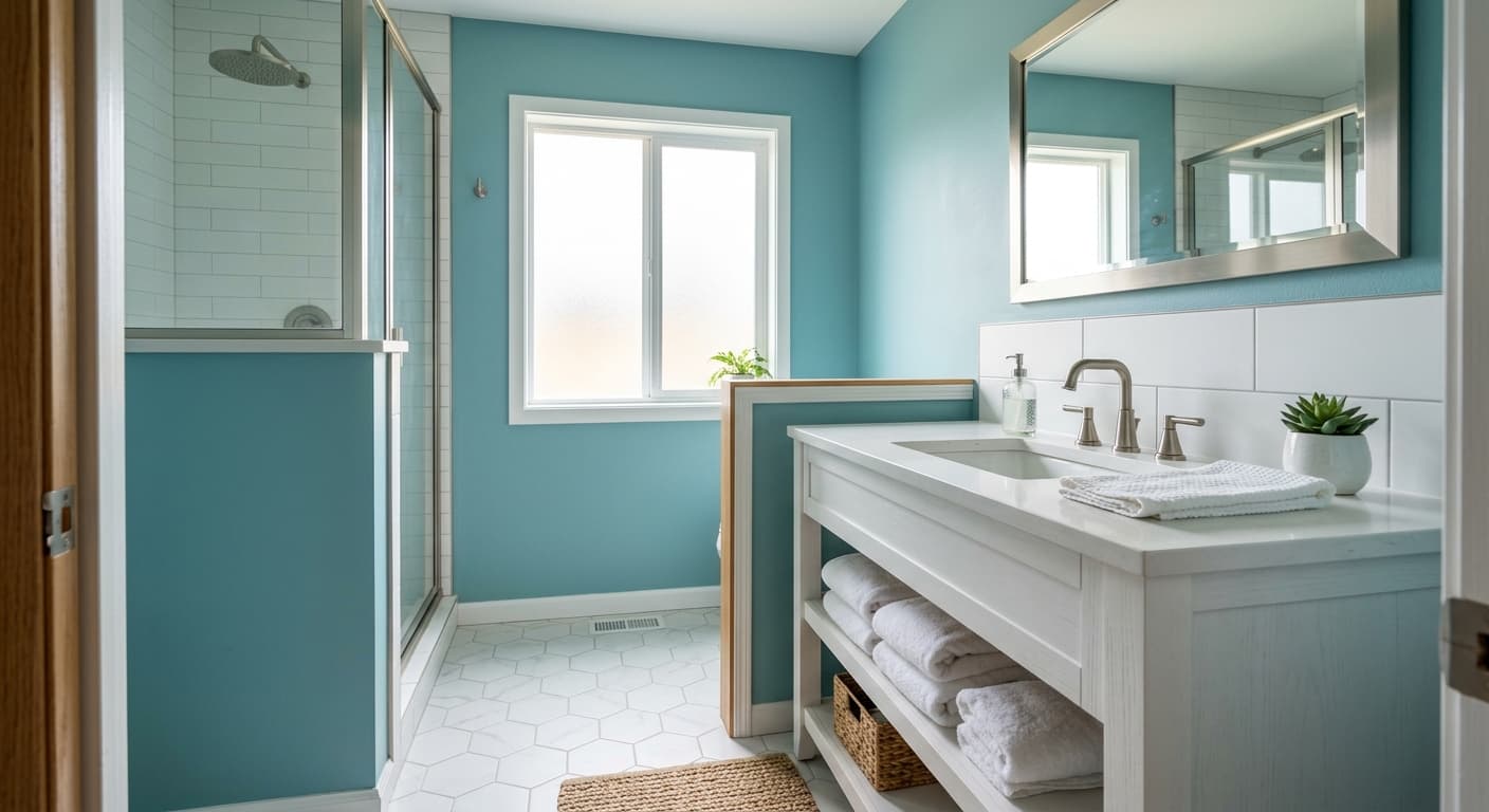
Bathrooms and bedrooms are the natural home for this color. The spa association is real, and Watery delivers a genuinely restful feeling in spaces meant for unwinding. It also works well in kitchens, especially on cabinetry or an island where you want a soft hit of color.
Orientation changes the experience. In a north-facing room, the cool light will pull Watery toward its blue side and can make it feel chillier, so balance it with warm textures and lighting. South-facing rooms get the best version, with plenty of warm sun keeping the green lively and the color looking its softest. In small rooms, the mid-tone LRV keeps things open without going stark white.
What to Pair With Watery
For trim, reach for a crisp white with a cool or neutral base. Behr Ultra Pure White is a safe, clean choice that lets Watery stay sharp. Avoid creamy whites that have heavy yellow in them.
For furnishings, natural wood tones in oak or a light walnut bring warmth that keeps the room from feeling cold. Rattan, linen, and unbleached cotton all sit nicely against these walls. On flooring, light to medium wood works, as does a pale gray or greige tile in a bathroom. If you want contrast, a deep navy or charcoal in an accent piece grounds the softness and gives the eye somewhere to rest.
Colors That Clash With Watery
Steer clear of warm, yellow-heavy beiges and tans, which make Watery look muddy and tired. Skip pairing it with other strong cool colors at full saturation, because two competing blues or greens in the same space will feel busy. The most common mistake is choosing this color from a tiny chip and being surprised when it reads more green or more blue on a full wall. Always sample it large and live with it across a full day before you paint.