Urban Nature
What Urban Nature Actually Looks Like
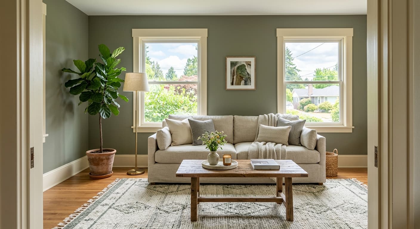
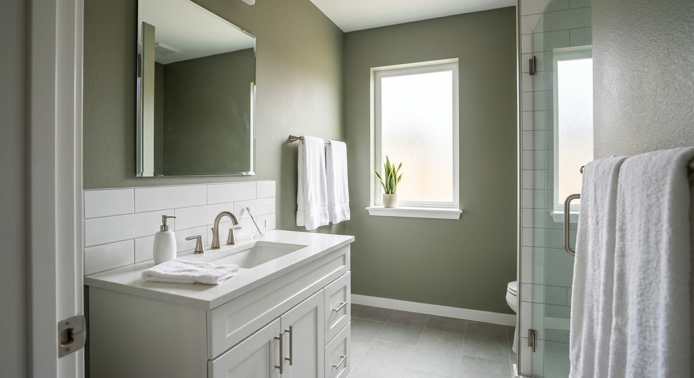
Urban Nature is a muted sage green that leans more gray than most people expect. It sits in that quiet middle ground where green and earth meet, so it reads as soft and grounded rather than fresh or vibrant. Think of the color of dried herbs or the back of an olive leaf. That is the territory you are in.
In bright daylight, the green comes forward and the wall looks alive without being loud. As the light fades toward evening, the gray takes over and the color settles into something closer to a warm stone. You will notice it shifts more than a lot of greens do, which makes it interesting to live with but also worth testing before you commit.
Under warm artificial light, Urban Nature picks up a slightly golden cast and feels cozier. Under cool LED bulbs, it can flatten toward gray and lose some of its character. The bulb you choose matters here as much as the wall orientation.
Urban Nature Undertones
The dominant undertone is gray, with a secondary earthy yellow that keeps the color from going cold. This is what separates it from sage greens that veer mint or blue. Knowing that yellow is hiding underneath helps you avoid pairing it with cool grays that will clash and make the green look muddy.
Undertones decide how your trim and furnishings read once they sit next to the wall. Because Urban Nature has warmth built in, it plays well with natural materials and warm neutrals. Bring in something too blue or too stark and the undertone fight becomes obvious.
Where Urban Nature Works Best
This color earns its keep in bedrooms, home offices, and kitchens where you want a calm backdrop that still has personality. It works in north-facing rooms, though you should expect the gray to dominate there and consider warming things up with lighting and textiles. South-facing rooms bring out the green and give the color more depth, which is where it looks its best.
Small spaces can handle Urban Nature without feeling closed in, since the muted quality keeps it from pressing on you. In larger rooms it gives you a soft, enveloping feel rather than a bold statement. It is a versatile mid-tone that suits people who want color but not commitment to anything loud.
What to Pair With Urban Nature
For trim, reach for a soft warm white like Behr Swiss Coffee or a creamy off-white rather than a crisp blue-white. The warmth keeps everything in the same family. If you want contrast, a deeper charcoal or a warm taupe on doors and built-ins gives you definition without breaking the mood.
Wood tones are your friend. Oak, walnut, and natural rattan all sit comfortably against this green. For flooring, warm mid-tone wood works beautifully, and so does a natural sisal or wool rug in oatmeal or sand. Brass and aged bronze hardware complete the look better than chrome or nickel, which can feel too cold against the warmth in the wall.
Colors That Clash With Urban Nature
Skip the cool, blue-based grays for adjacent walls and large furniture pieces. They drag the yellow undertone in the wrong direction and make Urban Nature look dirty instead of earthy. Stark bright whites also create an unwanted contrast that flattens the color. And resist the urge to pair it with another saturated green, since two greens in the same room tend to compete rather than complement.