Swirling Water
What Swirling Water Actually Looks Like
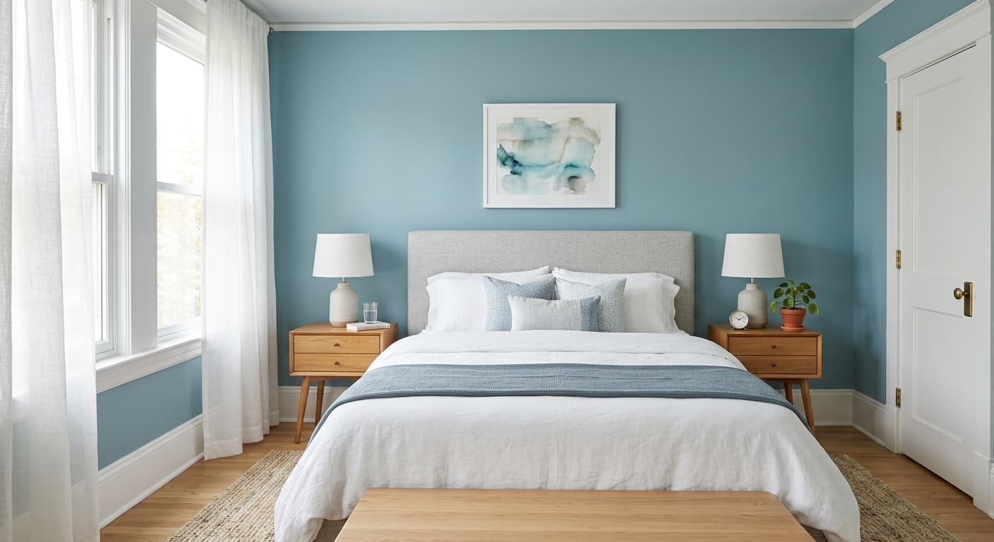
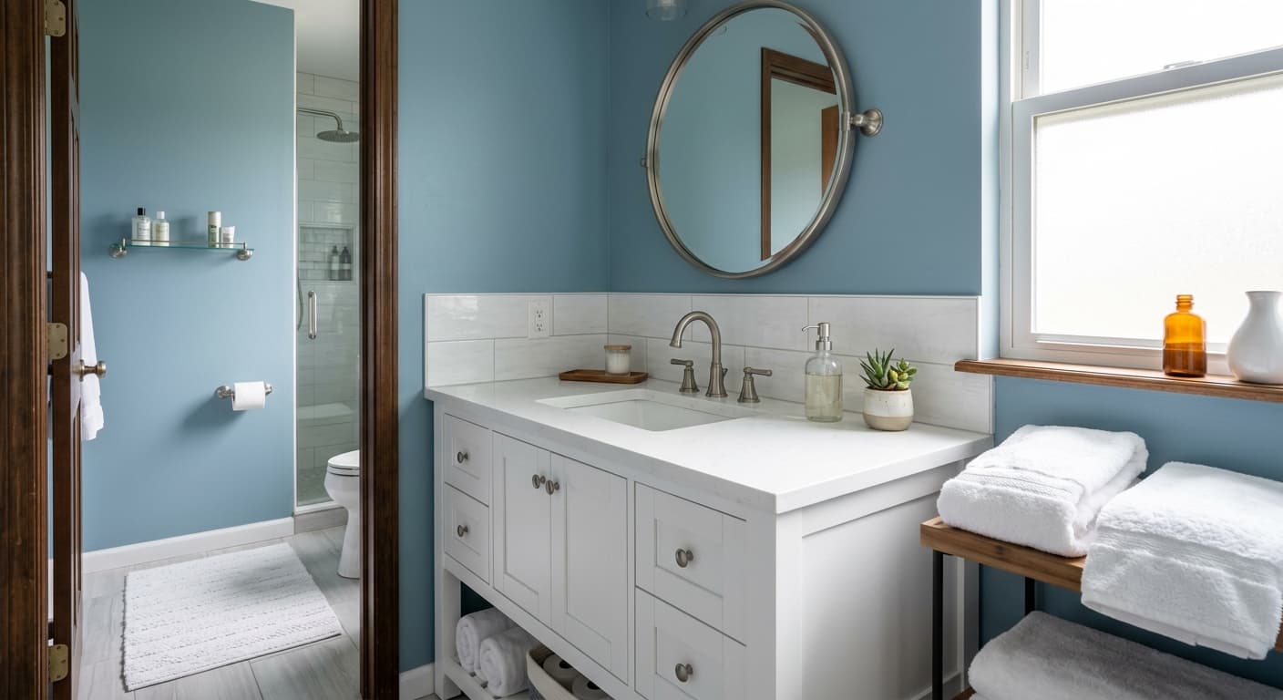
Swirling Water sits in that comfortable middle ground between blue and green where neither color fully wins. On the chip it reads soft and watery, like sea glass that has been tumbled smooth. On a full wall it has more presence than you would expect from a color this gentle.
The light does a lot of work here. In bright morning sun, the green comes forward and the wall feels fresh and almost minty. By late afternoon, especially in cooler light, the blue takes over and the room settles into something quieter and more spa-like. Under warm artificial light at night, it loses some of its crispness and reads as a soft muted aqua.
What makes it distinctive is restraint. This is not a saturated teal that demands attention. It is a mid-tone color with enough gray in it to keep things grounded, so it works as a backdrop rather than a statement.
Swirling Water Undertones
The dominant undertone is green-blue with a touch of gray underneath. That gray is the part people miss, and it changes everything. It keeps Swirling Water from going candy-bright, but it also means the color can flatten in low light and read more dull than fresh.
Pay attention to this when you choose your trim and adjacent colors. Warm undertones nearby, like a creamy beige or a yellow-based white, will fight the cool gray in this paint and make it look muddy. Cooler companions let the blue-green stay clean. Test it against your fixed elements before you commit.
Where Swirling Water Works Best
This color earns its keep in bathrooms, bedrooms, and kitchens. The watery quality reads naturally in spaces tied to washing and calm. South-facing rooms get the best of it because the warm, abundant light keeps the green lively and prevents the gray from taking over. East-facing rooms give you that fresh morning version.
North-facing rooms are trickier. The cool, flat light here pushes Swirling Water toward grayed-down and slightly cold. If your room faces north, layer in warm textures and lighting to balance it. The color also suits small and medium spaces well, where it opens things up without feeling stark. In very large rooms with little natural light, it can lose energy.
What to Pair With Swirling Water
For trim, reach for a clean white with a slight cool lean. Behr Ultra Pure White keeps it crisp, while a soft white like Polar Bear gives you contrast without harshness. Skip the warm antique whites. They clash with the gray base.
For furnishings, natural wood tones in mid to light ranges work nicely, especially oak and ash. Brass and matte black hardware both hold up against it, brass for warmth and black for a sharper, more modern edge. On flooring, pale wood or a warm gray tile grounds the room. Rattan, linen, and white ceramics all play well here and lean into the relaxed, coastal-adjacent feel without making it literal.
Colors That Clash With Swirling Water
Do not pair this with strong warm yellows or orange-based terracottas. They turn the gray undertone muddy and make the whole room feel uncertain about what it wants to be. Avoid heavy, glossy finishes too, since the sheen exaggerates the cool flatness in poor light. And resist using it across an entire dark, north-facing room without warming accents, because that combination drains the life out of it fast.