Stolen Kiss
What Stolen Kiss Actually Looks Like
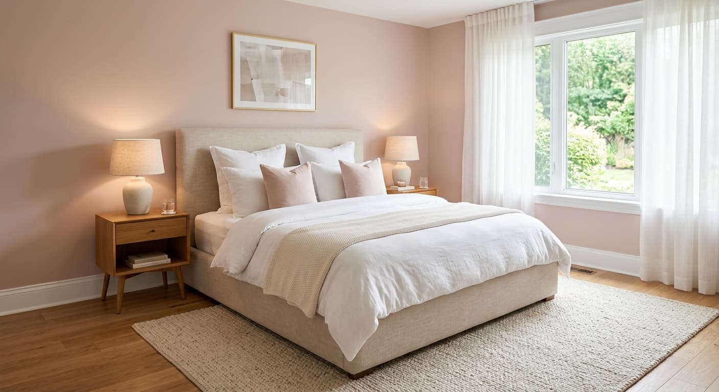
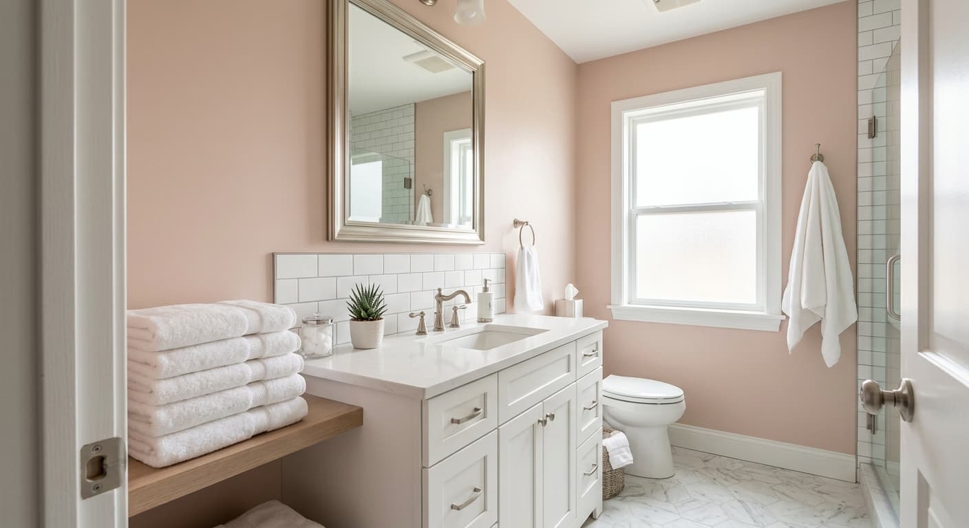
Stolen Kiss is a soft blush pink, the kind that reads more like a warm neutral than a bold color statement. On the wall it stays quiet. You will not get the bubblegum effect that scares people off pink. Instead, you get a gentle wash of color that feels closer to a tinted off-white in some lights and a clear, romantic pink in others.
The shift between those two states depends entirely on what kind of light hits it. In bright midday sun, Stolen Kiss can almost disappear into a creamy neutral, holding just a hint of warmth. As the light drops toward evening, the pink comes forward and feels cozier, richer, more saturated. Under warm artificial bulbs it leans peachy. Under cooler LEDs it stays truer to its rosy character.
What makes this color work is restraint. It has enough pigment to feel intentional but not so much that it dominates a room. That balance is harder to find than you would think.
Stolen Kiss Undertones
The undertone here is warm, sitting somewhere between rose and a faint peach. This matters because warm pinks play well with creamy whites and natural wood, but they fight against anything with a cool, blue-gray base. Put Stolen Kiss next to a stark, blue-leaning white and the pink will suddenly look more orange than you wanted.
Pay attention to the undertone when you choose everything else in the room. Your trim, your fabrics, your flooring all need to acknowledge the warmth in this color. When they do, the whole space feels pulled together. When they ignore it, you get a subtle clash that you can sense but cannot quite name.
Where Stolen Kiss Works Best
This is a strong choice for bedrooms, nurseries, and powder rooms, spaces where you want softness and a little warmth without much drama. It also works in a dressing area or a home office where you spend quiet hours.
Orientation changes the experience. In a north-facing room, where light tends to run cool and flat, Stolen Kiss warms things up and counteracts that gray cast. In a south-facing room flooded with warm light, the color glows and feels its most saturated. East and west rooms will show you both sides of it across the day. Small spaces benefit from the high LRV, which keeps things feeling open rather than closed in.
What to Pair With Stolen Kiss
For trim, reach for a warm white like Behr Swiss Coffee or Cameo White. These keep the warmth consistent and let the pink stay soft rather than turning chalky. Avoid bright, blue-based whites that compete with the undertone.
For furniture and flooring, natural wood tones are your friend. Honey oak, walnut, and warm-toned maple all sit comfortably next to this pink. Brass and aged gold hardware bring out the warmth. For fabrics, layer in cream, camel, soft terracotta, or muted sage if you want a touch of contrast that still respects the warm base. A deep plum or burgundy accent gives the room some weight without breaking the palette.
Colors That Clash With Stolen Kiss
Steer clear of cool grays, icy blues, and pure stark whites as your supporting colors. They make Stolen Kiss look muddy or weirdly orange, and they drain the softness that makes this color appealing in the first place. Also resist the urge to pair it with another pink or a strong red, which can tip the room into something saccharine. And do not flood a windowless room with it expecting the same glow you saw in the store. Without natural light, the color flattens and loses much of its charm.