Spun Wool
What Spun Wool Actually Looks Like
Spun Wool sits in that comfortable middle ground between beige and gray, which makes it a greige. It reads soft and warm without tipping into yellow or pink, and it has enough depth to keep walls from looking washed out. Think of the color of natural undyed wool or oatmeal left out in soft daylight. That is the territory you are working in.
In bright, south-facing rooms, Spun Wool warms up and leans toward a creamy taupe. You will notice the warmth most in the afternoon when the light goes golden. In north-facing rooms or under overcast skies, the color cools and the gray side becomes more apparent. This is normal for greiges, and Spun Wool handles the shift gracefully without ever looking dingy.
What makes it distinctive is its restraint. Some greiges shout for attention with strong undertones. This one stays quiet, which is exactly why so many people reach for it when they want a neutral backdrop that does not compete with everything else in the room.
Spun Wool Undertones
Spun Wool carries a subtle warm undertone that hovers between tan and the faintest hint of green-gray. You will not see green outright, but it keeps the color grounded and prevents it from going too pink in warm light. This matters when you choose your trim and furnishings. A warm undertone wants warm or neutral companions. Pair it with a cool blue-gray and the contrast can make Spun Wool look muddier than it actually is.
Before you commit, test a sample on at least two walls and watch it across a full day. Undertones reveal themselves in shadows and corners, and a swatch that looks ideal at noon can read differently at dusk.
Where Spun Wool Works Best
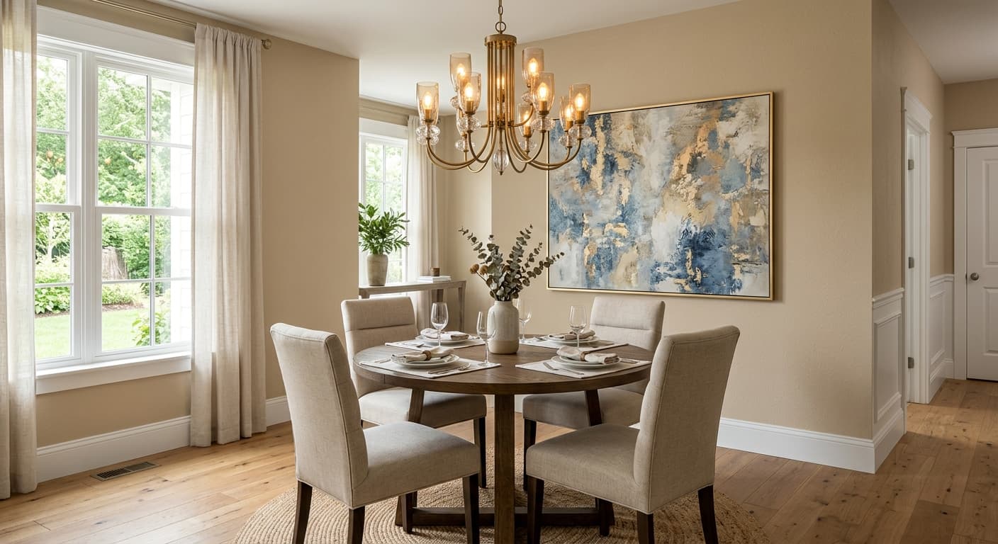
Spun Wool earns its keep in living rooms, bedrooms, and open-concept spaces where you want continuity from one room to the next. It flatters both small and large rooms. In a small space, the soft warmth keeps things cozy rather than cramped. In a large room with good light, it gives walls quiet substance.
South and west-facing rooms get the most out of it because the warm light brings the color to life. North-facing rooms still work, but pair Spun Wool with warm lighting and warm-toned decor to counter the natural coolness of that exposure. East-facing rooms shift through the day, bright and warm in the morning, cooler by afternoon.
What to Pair With Spun Wool
For trim, a creamy white like Behr Swiss Coffee or Polar Bear keeps everything in the warm family and gives you a soft, layered look. If you want more contrast, a clean off-white works without going stark. Avoid bright blue-white trim, which can make Spun Wool look dirty by comparison.
For furniture, lean into natural materials. Oak, walnut, rattan, and linen all sit comfortably against these walls. Brass and aged bronze hardware add warmth. For flooring, medium-toned wood with golden or honey notes is a natural match, and warm beige or wool area rugs tie the room together. Black accents in small doses, like picture frames or lamp bases, ground the softness and keep the palette from feeling flat.
Colors That Clash With Spun Wool
Steer clear of cool, blue-based grays and crisp icy whites as companions. They fight the warm undertone and can leave Spun Wool looking flat or grimy. Heavy, saturated colors next to it can overwhelm its quiet nature, so use bold accents sparingly. And resist the urge to skip sampling because the color photographs well online. Greiges are notorious for shifting with light, and what works in someone else's home may not behave the same in yours.