Solemn Silence
What Solemn Silence Actually Looks Like
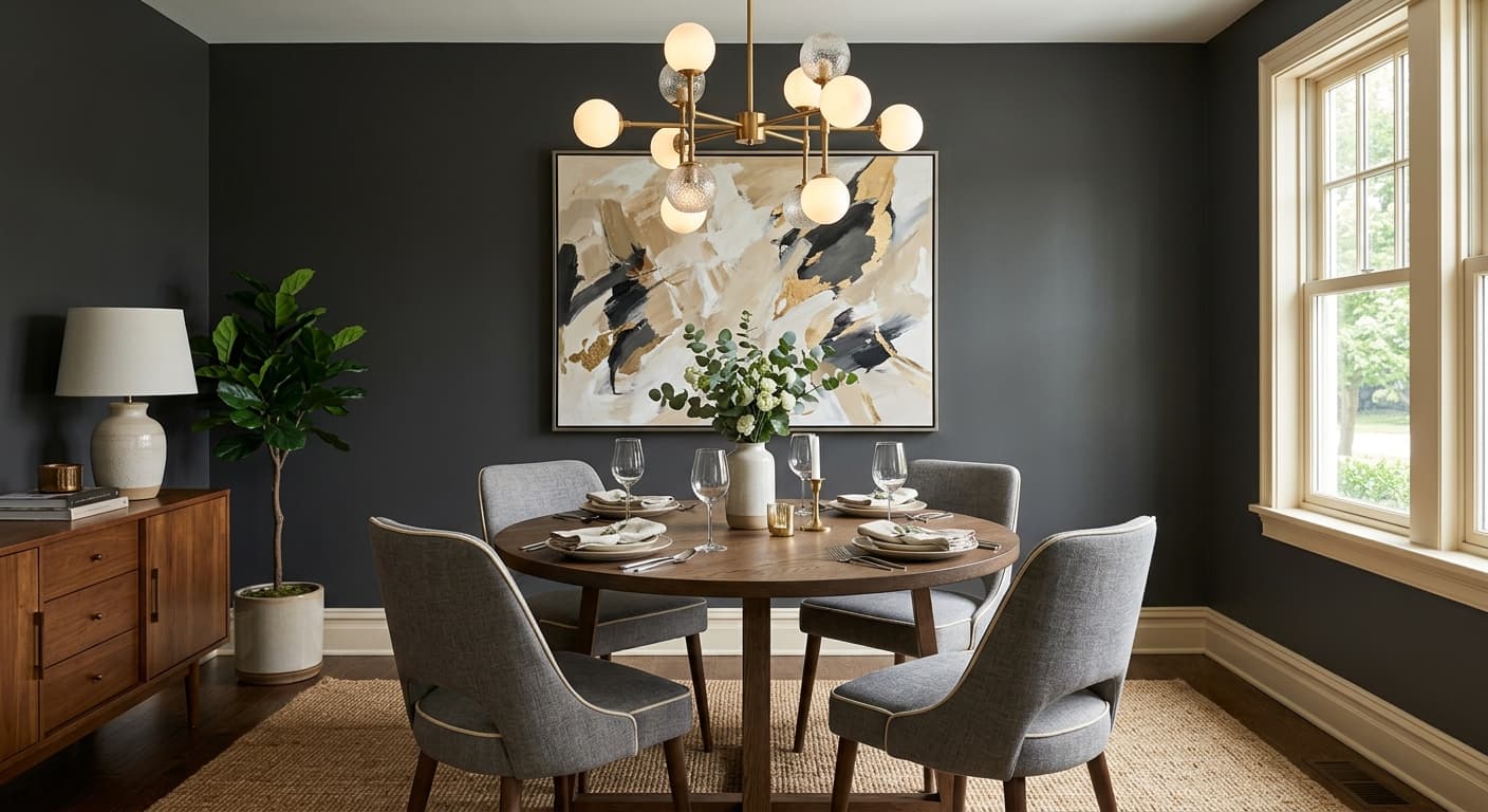
Solemn Silence is a dark, brooding slate that sits somewhere between blue, gray, and charcoal. In photos it can read as a flat navy. On your walls it has more depth than that. There is a coolness to it that keeps it from feeling like a true black, and a quiet blue presence that surfaces when light hits it directly.
This color changes a lot depending on what you throw at it. Under bright daylight, the blue comes forward and the whole thing softens into a stormy gray-blue. By late afternoon and into evening, it drops back toward charcoal and reads almost black in corners and shadows. Artificial light matters here too. Warm bulbs will mute the blue and push it gray. Cooler bulbs let the blue breathe.
What makes it distinctive is the restraint. It is a saturated color that never gets loud. You get drama without a color that screams for attention, which is harder to find than you might think.
Solemn Silence Undertones
The undertone here is blue, with a faint cool gray underneath. That matters because it determines what sits next to it without clashing. Put it beside a warm beige or a yellow-based cream and the contrast can feel off, like the two colors are fighting over temperature. Pair it with cooler neutrals and the blue settles into something more intentional.
Watch your undertones in fixed elements too. A floor with strong orange or red wood tones will pull against this blue. If your trim, flooring, and furnishings lean cool or neutral, Solemn Silence locks in cleanly.
Where Solemn Silence Works Best
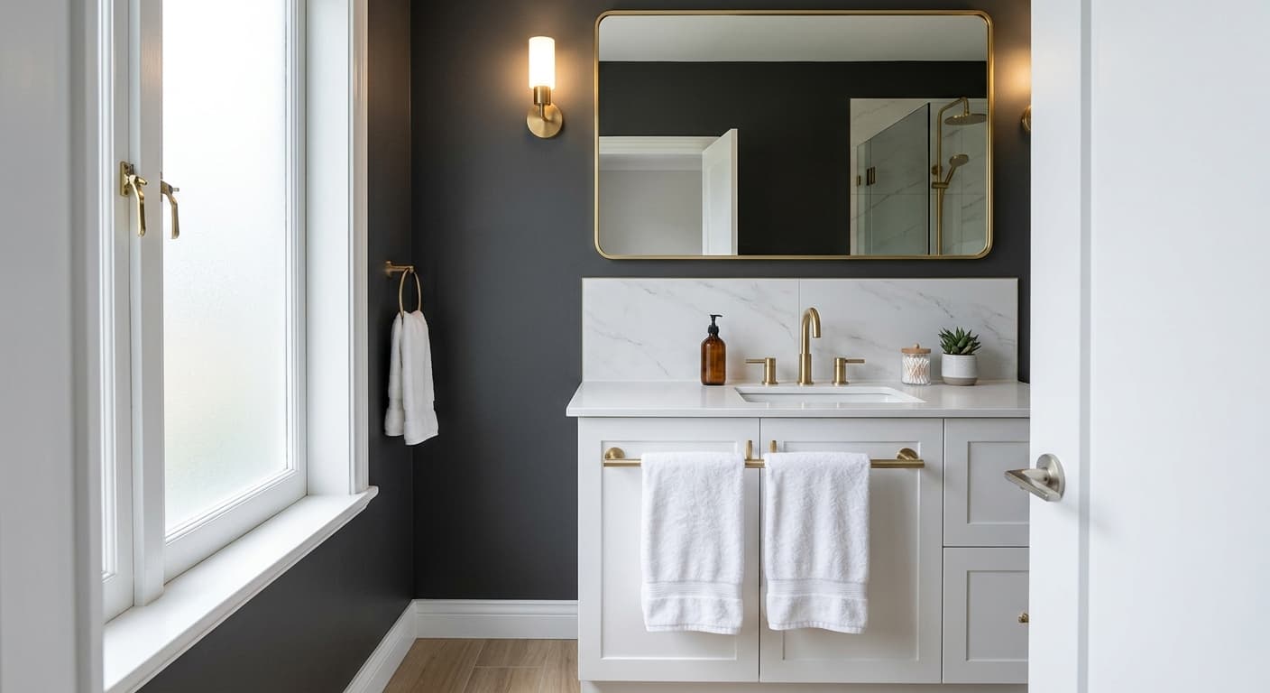
This is a color built for atmosphere. It shines in spaces where you want a sense of enclosure and calm: bedrooms, home offices, dining rooms, and powder rooms. In a small room it leans into the darkness instead of fighting it, which can make a tiny space feel deliberate rather than cramped.
North-facing rooms get cool, flat light, and Solemn Silence will read its darkest and most blue there. If you love that moody effect, lean in. South-facing rooms with strong sun will bring out more of the blue and keep the space from feeding too somber. On cabinets and built-ins it performs especially well, giving you depth without the harshness of black.
What to Pair With Solemn Silence
For trim, a crisp white works, but skip the brightest blue-whites unless you want sharp contrast. A soft white with a hint of warmth, like Behr Polar Bear or Swiss Coffee, takes the edge off and keeps things from feeling clinical. For a quieter, tonal look, run a lighter gray-blue on the trim instead of white.
Bring in natural materials to warm the cool base. Brass and aged bronze hardware glow against this color. Wood tones in walnut or warm oak add balance. For textiles, think cream, oatmeal, rust, and muted ochre. Those warm accents keep the room from tipping cold. Flooring in mid-tone wood or a warm gray stone grounds the whole scheme.
Colors That Clash With Solemn Silence
Do not surround it with warm yellow-based neutrals or honey-toned wood. The temperature clash will make both colors look muddy. Avoid pairing it with other dark, heavy colors in a small room with little light, or you will end up with a space that feels closed-in rather than cozy. And resist the urge to use it on every wall in a low-light room without adding lighter elements to break it up. This color needs contrast to read as intentional instead of dim.