Silver City
What Silver City Actually Looks Like
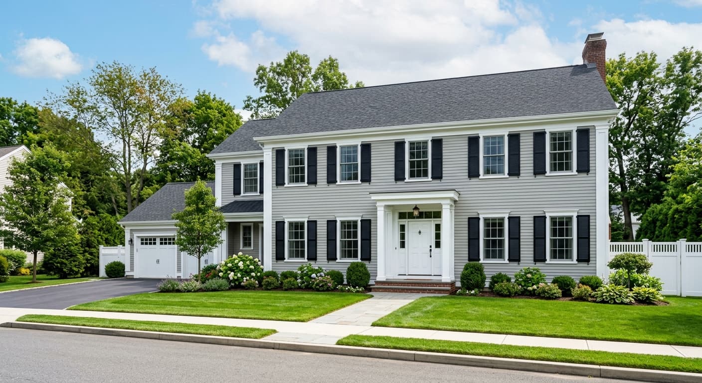
Silver City is a soft, mid-toned gray that leans cool. It reads as a clean, quiet gray most of the time, but a faint blue thread runs through it that shows up when light hits it directly. This is not a warm greige. It sits firmly on the cooler side of the spectrum, which gives it a slightly crisp, airy quality.
In morning light, especially in a room facing east, you will notice the blue come forward. By midday the color settles into a balanced gray that feels neutral and steady. Under warm incandescent bulbs at night, it softens and loses some of its chill, but it never tips into beige. The blue undertone keeps it honest.
What makes Silver City distinctive is its restraint. It does not push to be the loudest thing in the room. It functions as a background gray with just enough character to avoid looking flat or builder-grade. That balance is harder to find than you might think.
Silver City Undertones
The blue undertone is the detail that matters most here. When a gray carries blue, it can pull cooler next to anything warm, and it can look almost steely under fluorescent light. Pay attention to this when you choose trim, fabrics, and adjacent walls. If you put Silver City next to a creamy off-white, the contrast in temperature can make the gray look colder than you expected.
The fix is to lean into the coolness rather than fight it. Choose surrounding elements that respect the blue instead of clashing with it. Once you do that, the undertone becomes an asset that makes the room feel calm and collected.
Where Silver City Works Best
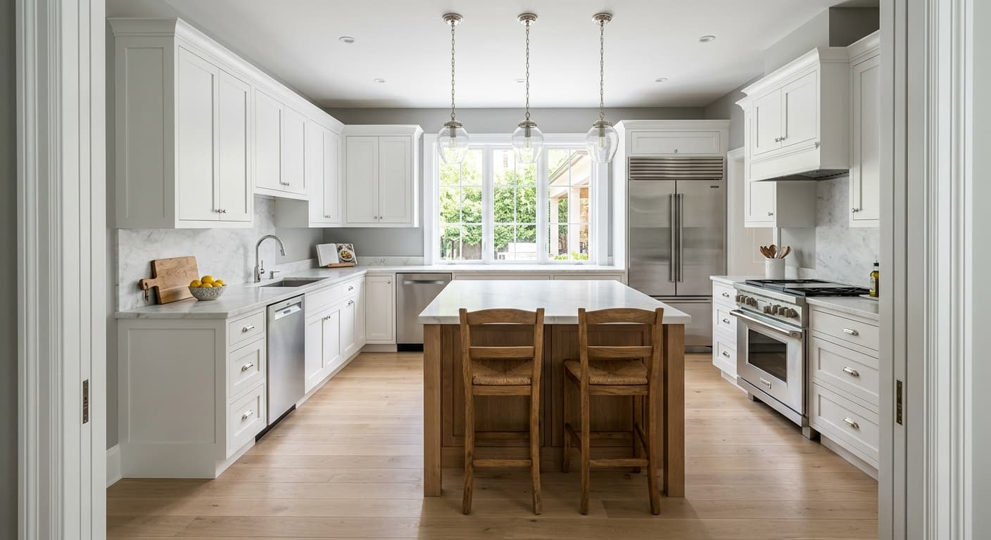
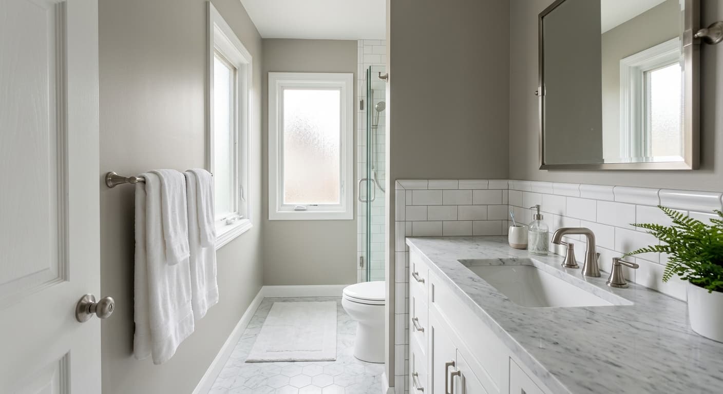
Silver City does its best work in bedrooms, bathrooms, and home offices where you want a sense of quiet. It also performs well in spaces that already get plenty of natural light. South and west-facing rooms get enough warmth from the sun to balance the cool undertone, which keeps the color from feeling severe.
Be cautious in north-facing rooms. North light is cool and indirect, and it will amplify the blue in this gray. If you love that crisp, slightly icy effect, go for it. If you want something cozier, you may find Silver City feels a touch chilly in those conditions. In small rooms, its mid LRV keeps things open without washing the walls out completely.
What to Pair With Silver City
For trim, a clean white like Behr Ultra Pure White holds up nicely and sharpens the edges of the room. If you want something softer, a cool white with a hint of gray will blend more gently and keep the temperature consistent. Avoid warm, yellow-based whites, since they will fight the blue.
For furnishings, lean into materials that echo the cool palette. Charcoal, navy, and crisp white textiles all sit well against Silver City. Natural wood works too, but stick to lighter or grayed wood tones rather than orange-toned oak. For flooring, pale gray, light wood, and white-washed finishes complement it. A cool-toned area rug pulls the whole scheme together.
Colors That Clash With Silver City
Do not pair Silver City with warm beiges, golden yellows, or terracotta. Those warm tones make the gray look dingy and bring out a flat, lifeless quality you do not want. Avoid heavy yellow lighting throughout the space, since it muddies the clean read of the color. And resist the urge to surround it with too many other cool grays, which can leave the room feeling cold and one-note. Give it a contrast point.