Silver Bullet
What Silver Bullet Actually Looks Like
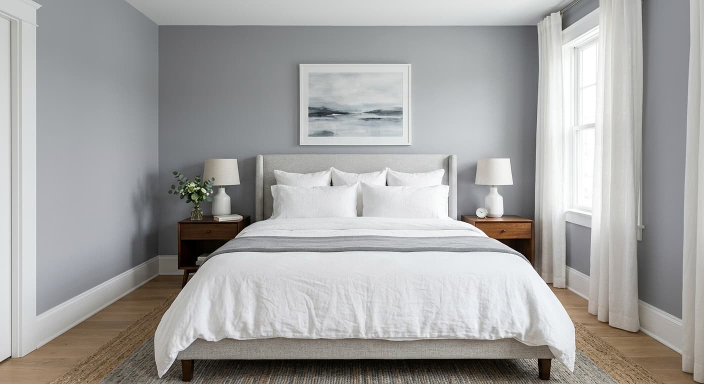
Silver Bullet is a true mid-tone gray that reads clean and contemporary without going cold or industrial. On the wall it has a soft, slightly metallic quality that the name hints at, though there is no actual shimmer here. Just a smooth, even gray that sits comfortably in the middle of the spectrum.
In bright daylight, the color lightens and shows its cool side, leaning toward a silvery, almost pewter finish. As the light fades in the evening, it deepens and feels more substantial, picking up warmth from incandescent bulbs and grounding the room. This shift is part of what makes the color useful. You get a different mood at noon than you do at night, and both work.
What sets it apart from the dozens of grays Behr offers is its balance. It is not pale enough to wash out, and not dark enough to close in a space. You will notice it holds its character across a range of lighting conditions, which is rarer than it sounds.
Silver Bullet Undertones
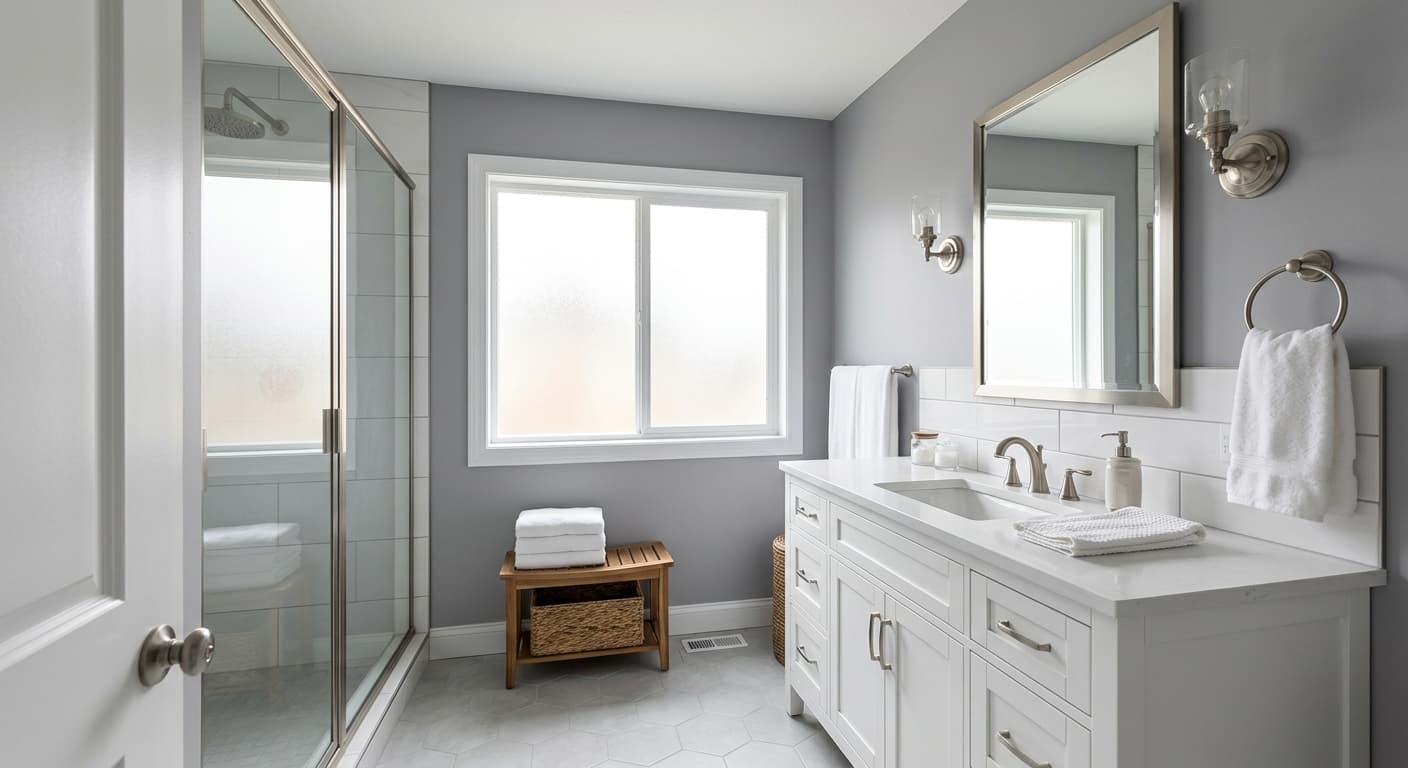
Silver Bullet carries a cool undertone with the faintest trace of blue. This matters more than people expect. Undertones are the subtle colors hiding underneath the main shade, and they decide whether your gray plays nicely with everything else in the room or fights with it. The cool lean here means Silver Bullet pairs cleanly with crisp whites and silver hardware, but it can clash with warm, yellow-based creams or golden wood tones.
Test it against your existing flooring and trim before committing. A cool gray next to a honey oak floor will look slightly off, and you will feel it without quite knowing why.
Where Silver Bullet Works Best
This color performs well in rooms with good natural light, particularly south and east-facing spaces where the warm sunlight balances its cool base. In a north-facing room, which receives flatter, cooler light all day, Silver Bullet can drift toward steely and a little severe, so pair it with warm accents to compensate.
It suits living rooms, bedrooms, and home offices, and works in both large open areas and smaller rooms. In a compact space, its mid-range value keeps walls from feeling heavy. In larger rooms, it adds enough depth that the space does not feel empty.
What to Pair With Silver Bullet
For trim, reach for a clean white like Behr Ultra Pure White or Polar Bear to keep the contrast sharp and modern. Avoid warm antique whites, which muddy the effect. Silver Bullet also takes well to a darker accent wall, and charcoal or deep navy create a layered, intentional look.
For furniture and flooring, lean into cool and neutral tones. Light gray oak, white wash, or pale concrete floors echo the wall color without competing. Furniture in charcoal, black, soft white, or muted blue keeps the palette cohesive. Brushed nickel and matte black hardware both look right against it, as does the occasional brass piece if you want a touch of warmth.
Colors That Clash With Silver Bullet
Steer clear of warm yellow-based neutrals and orange-toned woods, which fight the cool undertone and make the gray look dingy by comparison. Heavy beige or tan furnishings will do the same. Resist the urge to pair it with another gray that has warm undertones, since two grays pulling in opposite directions reads as a mistake rather than a choice. And do not commit to it in a dim north-facing room without a plan for warm lighting and accents, or you will end up with a space that feels chilly.