Royal Orchard
What Royal Orchard Actually Looks Like
Royal Orchard is a deep, forest-leaning green with real weight to it. This is not a soft sage or a muted eucalyptus. It reads dark and saturated, the kind of color that holds its own in a room without apology. In a paint chip it can look almost black, but on a full wall it opens up and shows its green character.
Light changes this color a lot. In bright midday sun, you will see the green clearly, with a slightly cool, slightly blue cast. As the day fades, Royal Orchard goes moody and rich, pulling closer to a deep pine or even charcoal-green in low light. Under warm incandescent bulbs it warms up and feels softer. Under cool LED lighting it stays crisp and a touch sharper.
What makes it distinctive is the balance. It is dark enough to feel dramatic but green enough to feel organic and grounded. You get the cocooning quality of a near-neutral dark shade without losing the natural, leafy quality that makes greens so livable.
Royal Orchard Undertones
Royal Orchard carries a cool, slightly blue undertone underneath the green. This matters more than people expect. That blue base means it pairs cleanly with crisp whites and cool grays, but it can clash with warm, yellow-based greens or golden beiges sitting next to it. Hold a sample against your trim and flooring before you commit.
If your space leans warm, with honey oak floors or cream trim, the cool undertone in Royal Orchard will create tension. Sometimes that contrast works and feels intentional. Other times it just looks off. Test it in your actual light before deciding.
Where Royal Orchard Works Best
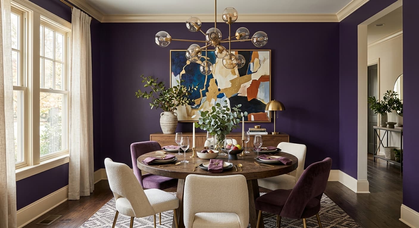
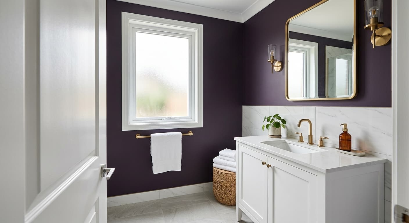
This color thrives in rooms where you want depth and atmosphere. Think dining rooms, home offices, libraries, and bedrooms you want to feel like a retreat. It also performs well on kitchen cabinets and built-ins, where the saturation reads as sophisticated rather than heavy.
Orientation matters. In a south-facing room with plenty of natural light, Royal Orchard stays balanced and shows its green clearly. In a north-facing room, expect it to go darker and cooler, which can feel dramatic in a powder room but oppressive in a large space with little light. Smaller rooms actually benefit here. The depth wraps the space and makes it feel intentional rather than cramped.
What to Pair With Royal Orchard
For trim, a clean white like Behr Ultra Pure White keeps things sharp and lets the green stand out. If you want something softer, a warm off-white can take the edge off the contrast, though watch that cool undertone so the white does not read dingy beside it. Brass and aged gold hardware look excellent against this green and add warmth where the color stays cool.
For furnishings, lean into natural materials. Walnut and oak wood tones, leather in cognac or caramel, and woven textures like rattan all balance the depth. Cream and oatmeal upholstery softens the room. For flooring, medium to dark wood works, and a wide-plank oak keeps the whole scheme grounded without competing.
Colors That Clash With Royal Orchard
Do not pair Royal Orchard with other heavy, saturated colors on adjacent walls or it starts to feel closed in and gloomy. Skip warm yellow-greens and golden beiges, which fight the cool undertone. Avoid using it in a dim, north-facing room with no plan for layered lighting, because it will swallow what little light you have. And resist the urge to put it everywhere. This color does its best work as a feature, an accent wall, a set of cabinets, a single dramatic room, rather than a whole-house color.