Riverdale
What Riverdale Actually Looks Like
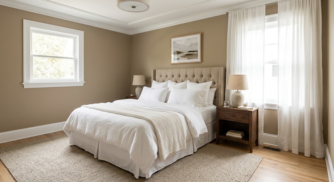
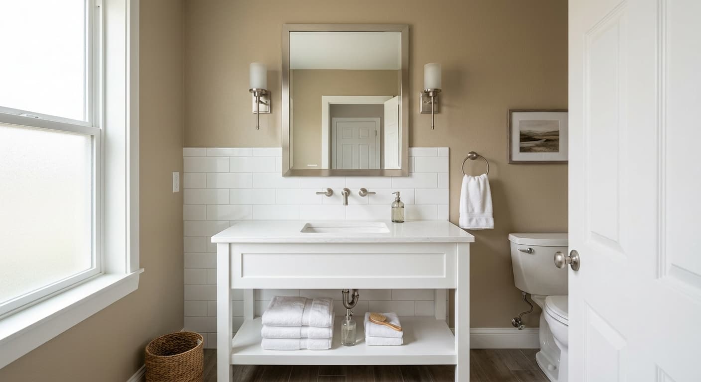
Riverdale sits in that middle ground between beige and taupe, the kind of color that reads as a warm neutral without committing to either camp. On the wall it looks soft and grounded. There is a quiet earthiness to it that keeps it from feeling cold or sterile, which is the trap a lot of mid-tone neutrals fall into.
The way it behaves depends heavily on your light. In bright, direct sun it leans lighter and warmer, almost a sandy beige. As the light fades through the afternoon, you will notice it deepen and pull slightly grayer, settling into a more taupe register. Under warm artificial light it gets cozy and a touch deeper. Under cool LEDs it flattens out and shows more of its gray side.
What makes Riverdale useful is its restraint. It has enough pigment to register as an actual color rather than a builder-grade off-white, but it never demands attention. You can live with it for years without getting tired of it.
Riverdale Undertones
The dominant undertone here is warm, with a beige-to-taupe base and a faint gray that keeps it sophisticated rather than yellow. That gray is the part to watch. In north-facing rooms or under cool lighting, the gray can come forward and make the color feel cooler than the swatch suggested.
This matters when you are choosing everything around it. Pair Riverdale with cool blue-grays and the warm base can suddenly look muddy. Pair it with other warm tones and it harmonizes easily. Always test a large sample on your actual wall before you commit, because that subtle gray shift is the thing that surprises people.
Where Riverdale Works Best
Riverdale is a strong choice for living rooms, bedrooms, hallways, and open-concept spaces where you want continuity between zones. It is flexible enough to carry from one room to the next without feeling monotonous.
South and west-facing rooms bring out its warmth and make it glow. North-facing rooms will cool it down, so if you want to keep the cozy feeling in a north room, lean into warm lighting and warm furnishings to compensate. In small spaces it works because it recedes gently and does not close in on you. In large open areas it gives you a calm, consistent backdrop that lets your furniture do the talking.
What to Pair With Riverdale
For trim, a soft warm white works better than a stark bright white. Behr Swiss Coffee or Polar Bear keeps things in the same warm family and avoids the jarring contrast a cool white can create. If you want more separation, a creamy off-white still reads cleaner than the wall without fighting it.
For furnishings, Riverdale loves natural materials. Think oak and walnut flooring, woven textures, linen, and leather in caramel or cognac tones. Warm woods especially make it sing. If you want contrast, a deep charcoal or a muted olive green grounds the room nicely. Brass and aged bronze hardware suit it better than chrome.
Colors That Clash With Riverdale
Do not pair Riverdale with cool blue-grays or icy whites unless you want the warm base to look dirty by comparison. Stark white trim is the most common mistake people make, because it pulls the gray forward and leaves the wall looking dull. Avoid surrounding it with high-contrast cool tones, and steer clear of pairing it with strong yellows, which push it toward a dated, muddy look.