Pure Earth
What Pure Earth Actually Looks Like
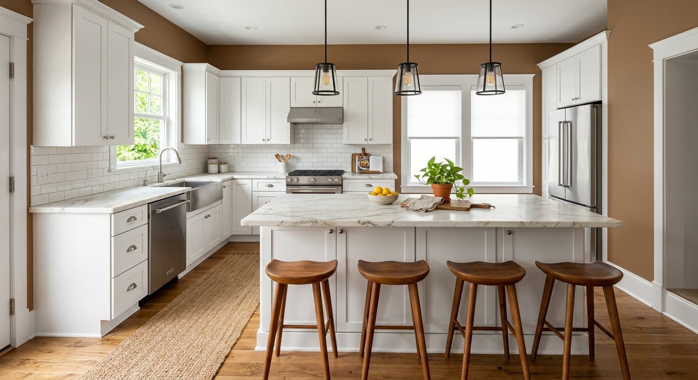
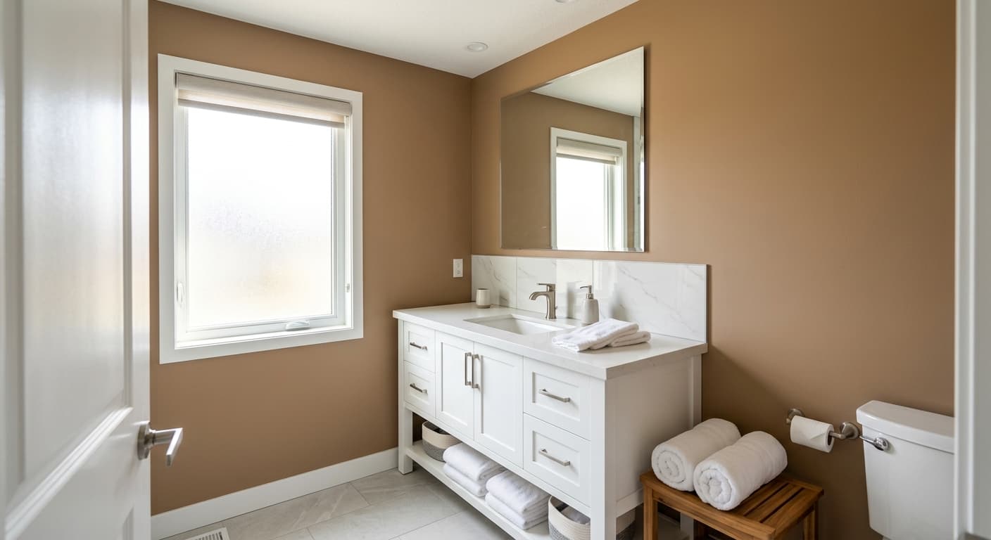
Pure Earth sits in that middle ground between taupe and greige, where a color stops being neutral and starts having an opinion. It reads warm without going orange. You get the grounded, mineral quality of soil and clay, but softened enough that it never feels heavy or dated.
In daylight, especially morning light, the color leans soft and slightly sandy. By late afternoon, when the sun warms up, you will notice more of the brown coming forward. Under warm artificial light it deepens and gets cozier. Under cool LED bulbs it pulls back toward a flatter, more grayed tone. This is a color that moves, so test it on the actual wall before you commit.
What makes it distinctive is the balance. Plenty of earthy taupes get muddy or chalky. Pure Earth holds its shape across lighting conditions because the warmth and the gray are roughly matched. Neither one dominates, which is harder to pull off than it sounds.
Pure Earth Undertones
The dominant undertone here is a warm brown with a subtle green-gray shadow underneath. That green-gray is the part people miss, and it matters. It keeps the color from feeling too sweet or too pink, but it also means Pure Earth will fight with anything that has a strong rosy or violet undertone.
Pay attention to your fixed elements before you fall in love with the swatch. Yellow-toned oak floors will warm it up further. Cool gray tile will expose that green-gray base. Hold the chip against your trim, your flooring, and your largest piece of furniture, and look at it in the room's actual light at two different times of day.
Where Pure Earth Works Best
This color earns its keep in living rooms, bedrooms, and studies where you want enveloping rather than airy. It thrives in south and west-facing rooms that get warm afternoon light, which brings out the richness without making it gloomy.
North-facing rooms are trickier. The cool light can flatten Pure Earth and push it toward a dull gray. If your room faces north, you can still use it, but lean into warm lighting and warm-toned accents to compensate. In small spaces it creates a snug, grounded feel rather than opening things up, so go in knowing that is the trade you are making.
What to Pair With Pure Earth
For trim, a soft warm white like Behr Swiss Coffee or Bit of Sugar keeps things harmonious without a stark contrast. If you want crisper definition, a clean off-white works, but skip a bright cool white because it will make Pure Earth look dingy by comparison.
For furniture and flooring, this color loves natural materials. Think walnut, rattan, aged leather, and oak with a medium tone. Black accents in fixtures or hardware sharpen the whole scheme and keep it from feeling too soft. For a layered look, pull in deeper terracotta, olive, or a muted blue. These sit beside Pure Earth without competing because they share its earthy logic.
Colors That Clash With Pure Earth
Keep cool, pink-based grays and stark blue-whites away from it. They expose the green undertone and make the wall look muddy and uncertain. Avoid pairing it with high-gloss, ultra-modern finishes that fight its organic character. The most common mistake is using it in a poorly lit north-facing room with cool bulbs, then wondering why the cozy color from the store looks flat and sad on the wall.