Ocean Abyss
What Ocean Abyss Actually Looks Like
Ocean Abyss is a deep, saturated blue with a noticeable teal pull. Think of the color of water several feet below the surface, where blue starts borrowing from green. In a paint chip it reads almost navy, but on a full wall the teal character comes forward and the color gets more complex than you expect.
Light changes this color dramatically. Under bright daylight, the green notes lift and you see the teal clearly. In low light or evening lamplight, it collapses toward something close to black-blue, dense and moody. North-facing rooms will cool it down and emphasize the blue. South-facing rooms warm it slightly and bring out more of the green.
What makes this shade distinctive is how much depth it holds without going flat. A lot of dark blues look like a solid block of color on the wall. Ocean Abyss keeps a sense of dimension, especially in an eggshell or satin finish where the light catches differently across the surface.
Ocean Abyss Undertones
The undertone here is green, and you cannot ignore it. This is not a clean, classic navy. The teal base means it will fight with anything that leans warm-purple or red-blue. When you hold it next to a true navy, the green in Ocean Abyss becomes obvious instantly.
Knowing this matters for everything you put near it. Trim, adjacent walls, fabrics, and even your flooring will either echo that green-blue character or clash with it. Test the color against your fixed elements before committing, because the undertone is strong enough to throw off a whole scheme if you guess wrong.
Where Ocean Abyss Works Best
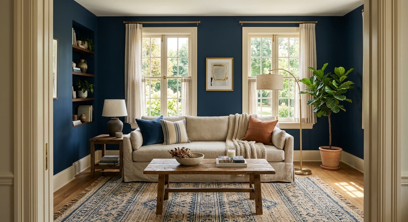
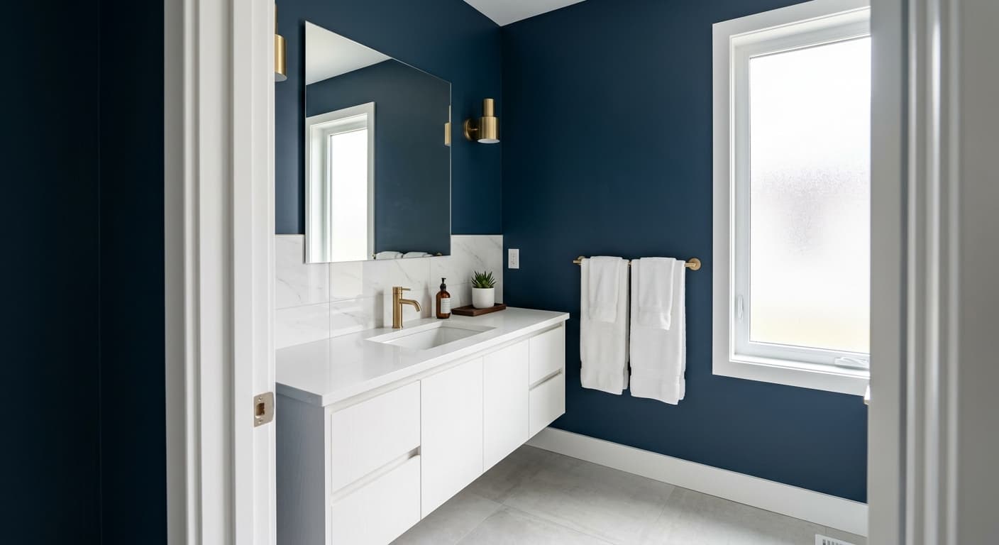
This color rewards rooms where you want enclosure and drama. Dining rooms, studies, powder rooms, and bedrooms all take it well. It also works on cabinetry and built-ins, where the depth reads as intentional and grounded rather than overwhelming.
Orientation is the deciding factor. In a south or west-facing room with strong natural light, the teal stays lively and the room feels rich rather than dark. In a north-facing space, expect a colder, more serious result, which can be exactly what you want in a library or a moody bedroom. Small rooms handle it better than people assume. A powder room drenched in Ocean Abyss feels like a deliberate jewel box, not a mistake.
What to Pair With Ocean Abyss
For trim, a crisp white like Behr Ultra Pure White keeps the edges sharp and lets the teal sing. If you want something softer and less stark, a warm off-white with a slight cream note settles the contrast down. Avoid gray-whites, which can muddy the relationship.
For furnishings, lean into warm woods. Walnut, oak, and brass hardware all pull against the cool depth and create balance. Natural materials like rattan, linen, and unbleached wool give the room texture without competing. For flooring, mid-tone to dark wood grounds the space, and warm-toned terracotta or sand-colored tile works in a bathroom. Brushed brass and aged bronze fixtures read better against this than chrome.
Colors That Clash With Ocean Abyss
Do not pair Ocean Abyss with cool grays or icy blues, because the combination flattens the whole room and makes the wall look like a void. Skip cold chrome and stainless finishes if you can, since they emphasize the coldness rather than the richness. The most common mistake is using this color in a dim, north-facing room with no warm light source, where it stops reading as blue-green and just becomes a dark, heavy wall that swallows the space.