Mourning Dove
What Mourning Dove Actually Looks Like
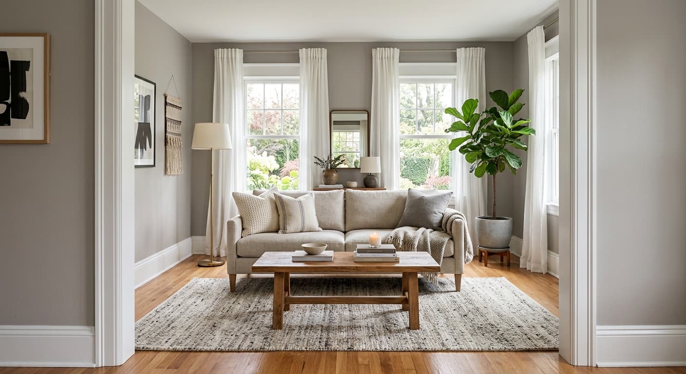
Mourning Dove is a soft warm gray that sits comfortably between cool and warm without committing fully to either. In person, it reads as a quiet greige, which is the designer shorthand for a gray with a touch of beige mixed in. The warmth keeps it from feeling cold or institutional, but it never tips into obvious tan territory.
The color shifts more than you might expect across a day. In morning light, especially in a room facing east, you will notice the gray pull forward and the warmth soften. By late afternoon, particularly under warm artificial light, the taupe side wakes up and the walls feel cozier. This is normal behavior for a mid-tone greige, and it is part of what makes the color useful in real homes rather than just on a fan deck.
What sets Mourning Dove apart from harder grays is its softness. It has a slightly muted, almost dusty quality that keeps it from feeling sharp. That makes it forgiving in spaces where light comes and goes throughout the day.
Mourning Dove Undertones
The dominant undertone here is taupe, with a faint mushroom quality that becomes obvious when you place it next to a true neutral gray. Get a sample on the wall before you commit, because that taupe can read pink or even slightly green depending on what surrounds it and how your light behaves.
Undertones matter most at the edges, where your wall meets trim, flooring, and furniture. If your existing fixtures lean cool, like a blue-gray sofa or stark white cabinetry, Mourning Dove's warmth may clash slightly. Pair it with warm or neutral elements and the undertone works in your favor, tying the whole room together.
Where Mourning Dove Works Best
This color performs well in living rooms, bedrooms, hallways, and open-concept spaces where you need something that flows from room to room without drawing attention to itself. In south-facing rooms, which get steady warm light, Mourning Dove holds its balance nicely and feels grounded. North-facing rooms, which tend toward cool blue light, will pull out more of the gray, so test it there first if you want to keep the warmth.
Because of its mid-range lightness, it works in both small and large spaces. Small rooms benefit from its softness, which keeps them from feeling boxed in. Larger rooms get a sense of warmth and continuity that pure whites cannot offer.
What to Pair With Mourning Dove
For trim, a clean warm white works best. Behr Polar Bear or Swiss Coffee gives you contrast without the harsh line you would get from a bright cool white. If you want trim that nearly disappears, go a few shades lighter in the same greige family for a layered, monochromatic look.
Furniture in warm wood tones, like walnut or natural oak, looks at home against these walls. Flooring in medium-brown hardwood or warm-toned LVP reinforces the cozy direction. For textiles, lean into creams, soft camels, and muted olive or terracotta accents. Black hardware and matte black light fixtures give the room a modern anchor without fighting the warmth.
Colors That Clash With Mourning Dove
Skip cool, blue-based whites for your trim, since they fight the taupe undertone and make the walls look muddy by comparison. Avoid pairing Mourning Dove with stark gray furnishings or cool gray flooring, which can flatten the color and pull out an unflattering dullness. And resist using it in a poorly lit room without testing first, because low light strips away the warmth and leaves you with something closer to plain gray.