Lunar Surface
What Lunar Surface Actually Looks Like
Lunar Surface lands in that useful middle zone of gray, the kind of tone that reads as a true neutral without going flat or institutional. It is not a pale, barely-there gray and it is not a heavy charcoal. You get a balanced mid-tone that holds its color across the day instead of washing out by noon.
In bright, direct sun, the gray softens and picks up a faint warmth that keeps it from feeling cold. By late afternoon or under lamplight, it deepens and shows more of its weight. North-facing rooms will pull it slightly cooler and grayer, so if you want to keep the softness, layer in warm light bulbs and warm-toned decor.
What makes it distinctive is its steadiness. Some grays flip between blue and lavender depending on the wall they sit on. Lunar Surface stays more grounded than that, which is why it works as a backdrop rather than a statement.
Lunar Surface Undertones
The undertone here leans warm-neutral, with a quiet greige quality in certain light. That matters because it determines what sits comfortably next to it. Greige undertones play well with warm whites, taupes, and natural wood, but they can clash with stark blue-grays or anything that reads icy.
Before you commit, test a large sample against your trim and your largest piece of furniture. Undertones reveal themselves in relationship to the colors around them, not in isolation. A swatch on a white card tells you very little.
Where Lunar Surface Works Best
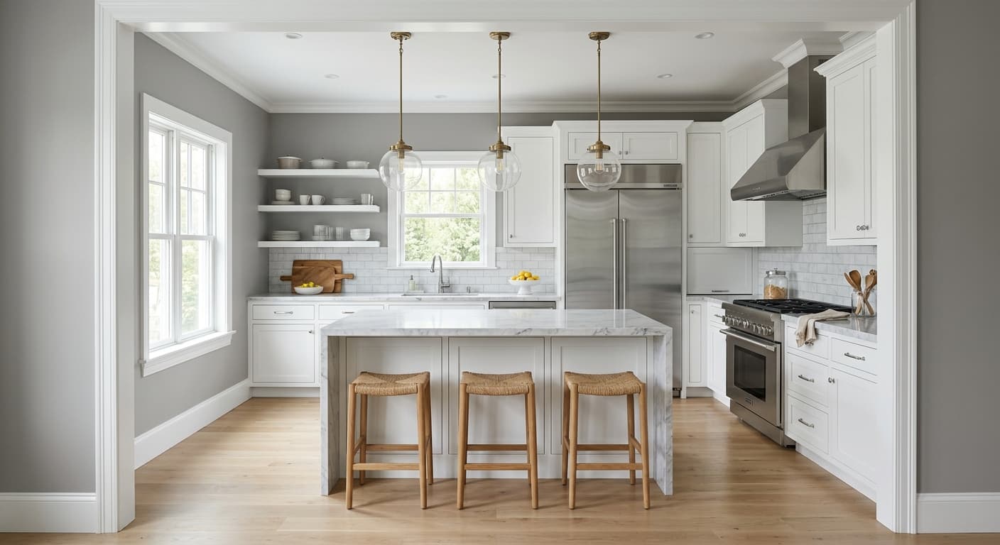
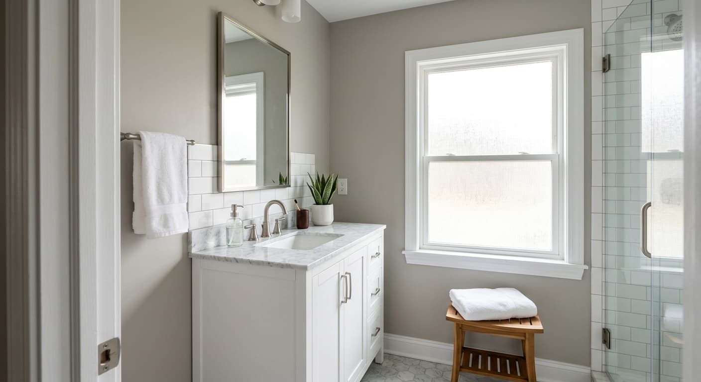
This is a strong choice for living rooms, bedrooms, and hallways where you want a calm, versatile base. It suits open-concept spaces because its neutrality lets it flow from room to room without fighting your other finishes. South and west-facing rooms bring out its warmth and depth, which is where it looks its best.
In smaller rooms, the mid-tone depth adds a sense of enclosure and comfort rather than shrinking the space, especially when paired with crisp white trim. In larger rooms, it gives the walls presence so they do not disappear. Just give it adequate natural or layered artificial light, since very dim spaces can let it slide toward dull.
What to Pair With Lunar Surface
For trim, reach for a clean warm white like Behr Polar Bear or Swiss Coffee. The contrast stays soft and intentional rather than jarring. If you want more separation, a bright white works, but the warmer whites flatter the undertone better.
Wood tones are your friend here. Mid-brown oak, walnut, and warm natural floors ground the gray and bring out its greige side. For furniture, lean into camel, soft taupe, muted olive, and black accents for contrast. Brass and aged bronze hardware look right against it. Avoid pure chrome and cool silver if you want to preserve the warmth.
Colors That Clash With Lunar Surface
Steer clear of pairing it with cool blue-grays or true cool whites, which expose the warmth and make the wall look muddy by comparison. Skip heavy yellow-based lighting too, since it can push the gray toward a dingy beige you did not sign up for. And resist the urge to use it in a room with almost no natural light without compensating, because flat low light drains its character and leaves you with a tone that feels heavier than you intended.