Light Drizzle
What Light Drizzle Actually Looks Like
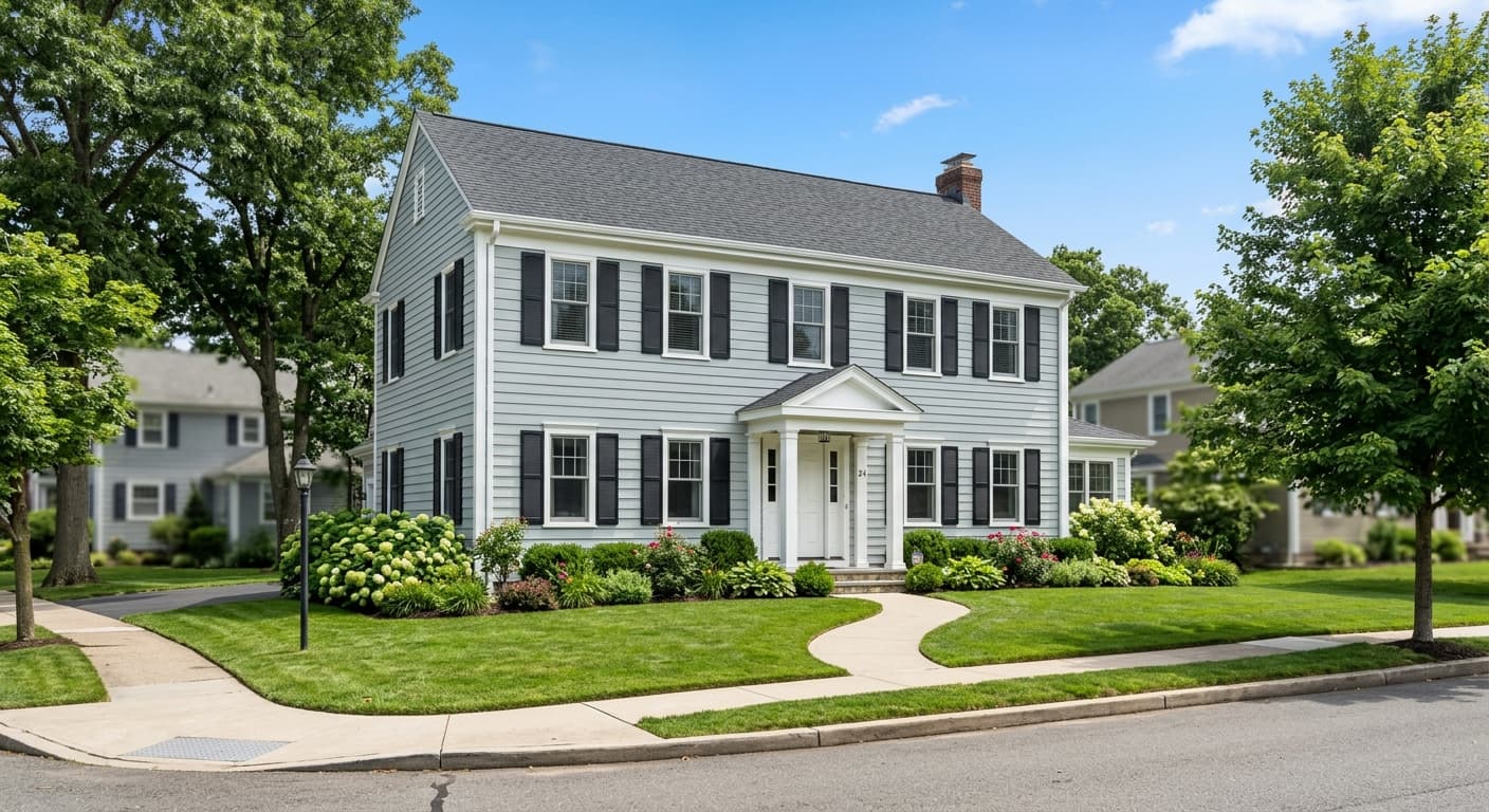
Light Drizzle is one of those colors that refuses to sit still. In the morning, it reads almost like a clean gray with the faintest cool wash over it. By afternoon, when the light shifts, the blue starts to surface and the whole wall takes on a quiet, watery quality. The name is honest. This is the color of an overcast sky right before it decides whether to rain.
What makes it work is the restraint. There is just enough blue to keep it from going flat or institutional, but not so much that you end up with a saturated coastal blue. It stays soft. On a large wall, it can almost dissolve into the room and act like a colored neutral, which is exactly why people reach for it when they want a hint of something without committing to a bold statement.
You will notice it changes more than most light colors depending on what surrounds it. Put it next to warm wood and the gray warms up slightly. Set it against crisp white trim and the blue gets a little more confident. Test it before you commit, because the swatch on the chip will not tell the full story.
Light Drizzle Undertones
The undertone here is a cool blue with a gray base, and occasionally you will catch a whisper of green when the light is bright and direct. This matters because cool undertones can clash with warm finishes if you are not paying attention. A brass fixture or a honey oak floor will pull against the blue rather than complementing it, unless you balance things deliberately.
When you are choosing trim, adjacent walls, or fabrics, lean into the cool family or pick warm tones intentionally for contrast. Fighting the undertone by accident is the most common way these soft blues go wrong.
Where Light Drizzle Works Best
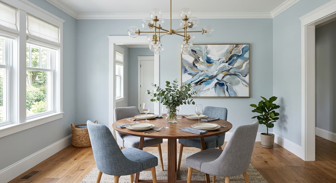
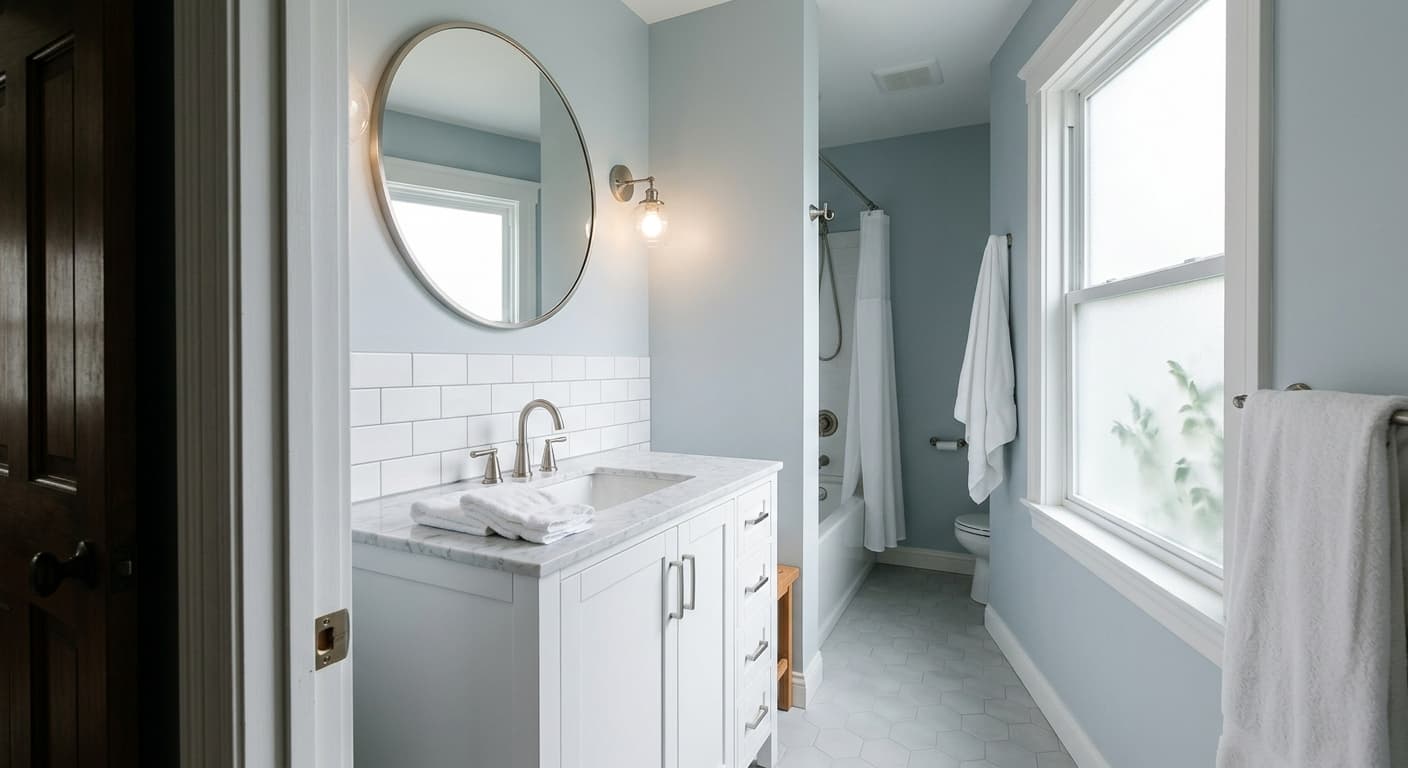
This is a color built for rooms where you want calm. Bedrooms, bathrooms, and home offices all suit it well. In a bathroom, the cool quality reads clean and a little spa-like, especially with white tile and chrome. In a bedroom, it settles the room down at the end of the day.
Orientation is the thing to watch. North-facing rooms get cool, indirect light, and Light Drizzle will lean grayer and cooler there, which can feel chilly if the room is already short on warmth. South-facing rooms are more forgiving and let the blue stay balanced. In small spaces, the reflective quality keeps things feeling open rather than closed in. In large rooms with lots of natural light, it holds up without washing out completely.
What to Pair With Light Drizzle
For trim, a soft white works better than a stark bright white. Behr Polar Bear or Swiss Coffee keeps the edges clean without creating harsh contrast. If you want more separation, a true crisp white sharpens the whole scheme. For adjacent walls, deeper blue-grays or muted greens extend the cool palette naturally.
Furniture in light oak, walnut, or natural linen grounds the coolness and stops the room from feeling sterile. On flooring, pale wood and gray-toned planks are the easy choices. If you have warmer floors, bring in textiles and wood tones that bridge the gap so the blue is not floating on its own.
Colors That Clash With Light Drizzle
Skip pairing this with heavy warm yellows, terracotta, or strong gold finishes, because they fight the cool undertone and make both colors look muddy. The other common mistake is using it in a dim north-facing room with no warm elements at all. You will end up with a space that feels cold and slightly clinical rather than serene. Add warmth through wood, brass used sparingly, or warm textiles to keep it grounded.