Iron Mountain
What Iron Mountain Actually Looks Like
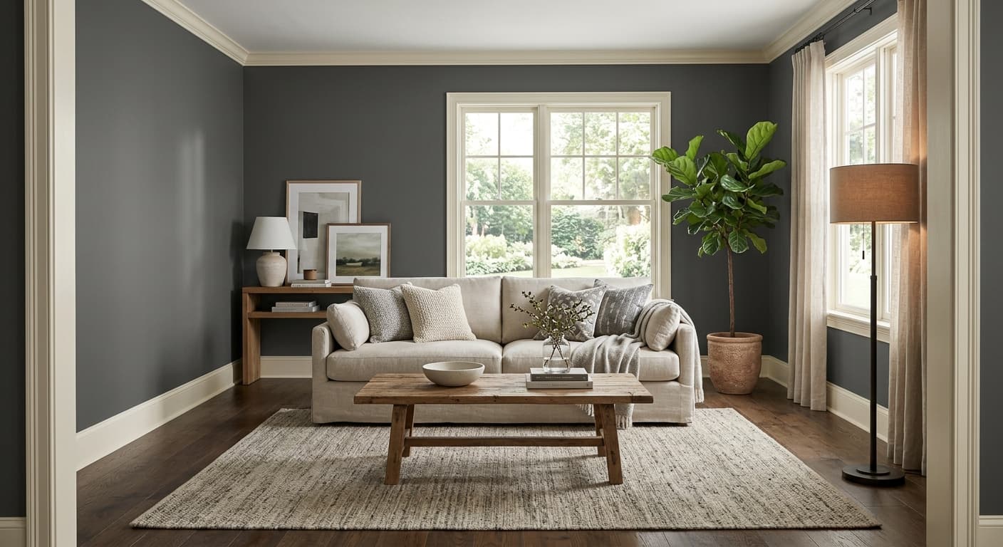
Iron Mountain is a dark gray that leans toward charcoal without tipping into black. It reads as a solid, grounded neutral in most rooms, but spend a few hours with it and you will notice it does not sit still. In bright daylight it shows a faint green-gray cast, almost like wet slate. Under warm artificial light it softens and pulls slightly warmer, closer to a deep greige.
This is one of those colors that depends heavily on what is around it. Next to crisp white trim it looks darker and more dramatic. Surrounded by other grays it can suddenly look greenish or even faintly blue. That shifting quality is what makes it interesting, and also what trips people up when they paint a swatch and walk away confused.
The finish you choose matters more here than with lighter colors. A flat or matte finish keeps Iron Mountain looking velvety and absorbs the depth you want from a dark gray. Go with eggshell or satin and you will catch more reflection, which lifts the green undertone and shows every imperfection on the wall. For most interior walls, flatter is better.
Iron Mountain Undertones
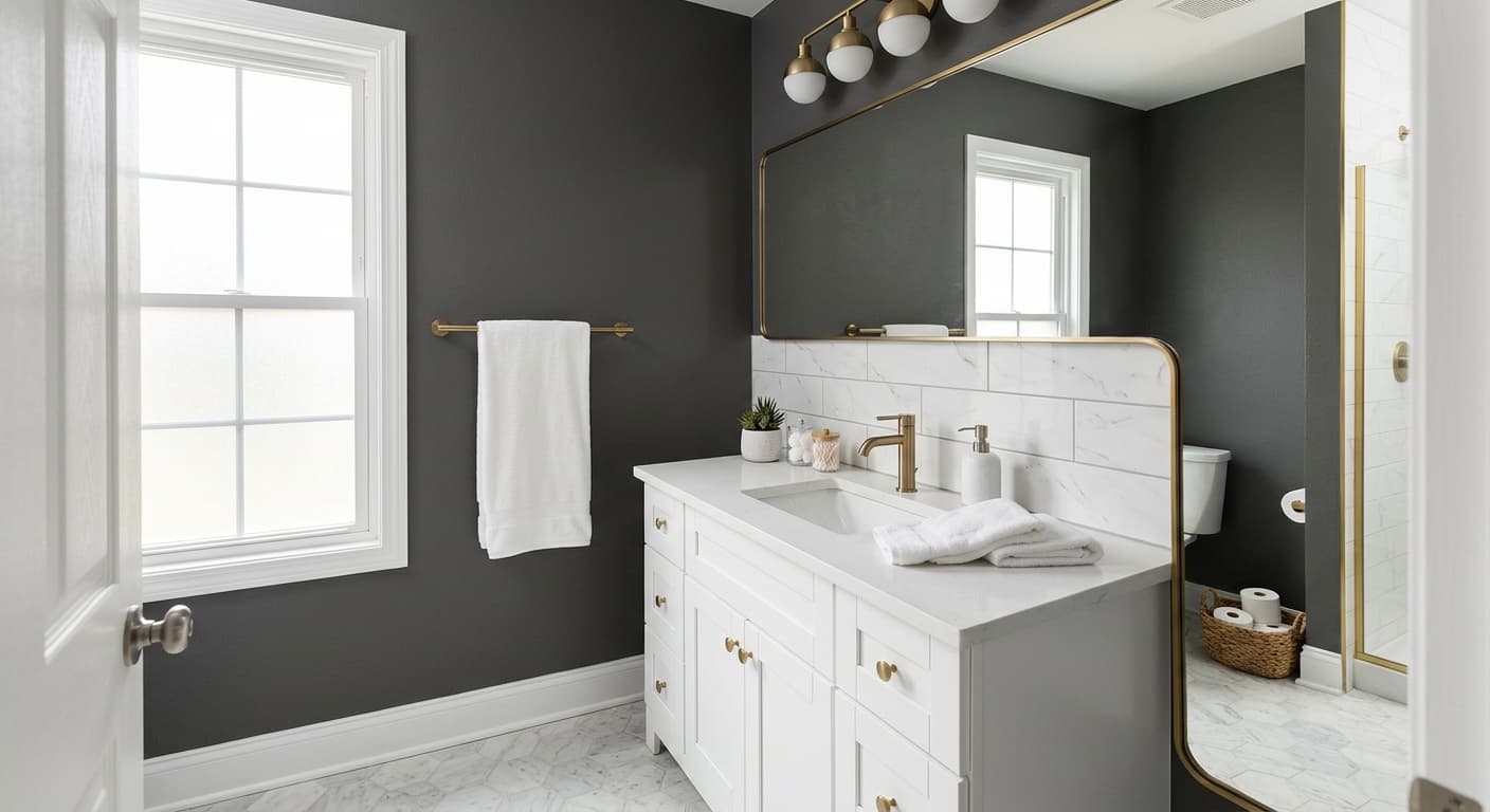
The undertone here is green-gray, sometimes described as a muddy or earthy gray. This is not a cool blue-based charcoal, and treating it like one is the most common mistake. If you pair Iron Mountain with cool, blue-leaning grays or stark blue-whites, the contrast can make it look dingy or off.
Undertones matter because they decide what plays nicely next to your walls. Iron Mountain wants warm or neutral companions. Think putty, taupe, warm wood, and soft white rather than icy gray or true white. When you understand the green in this color, your trim and furniture choices get a lot easier.
Where Iron Mountain Works Best
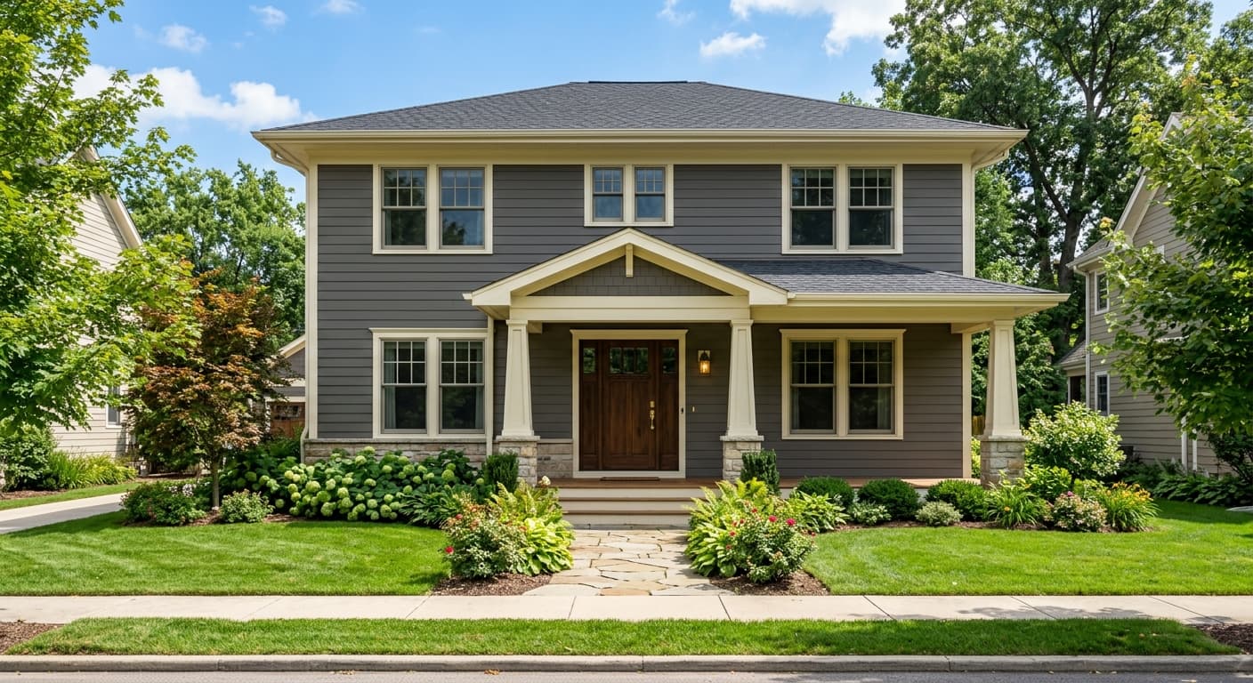
This color performs well as an accent wall, on kitchen islands and lower cabinets, on built-ins, and on front doors and shutters. It has enough depth to anchor a space without the heaviness of a true black. In rooms with strong natural light, especially south-facing spaces, Iron Mountain stays rich and dimensional all day.
North-facing rooms are trickier. The cooler, flatter light those rooms get can pull the green forward and make the color feel slightly gloomy. If you love it for a north-facing room, commit to warm lighting and warm accents to balance it out. In small spaces, use it on a single wall or on cabinetry rather than wrapping the whole room, unless you are going for a deliberately cocooning, moody effect.
What to Pair With Iron Mountain
For trim, reach for a warm white like Swiss Coffee or Bit of Sugar rather than a bright stark white. The softer white keeps the contrast clean without making the gray look muddy. If you want even less contrast, a greige trim creates a quieter, more sophisticated look.
For furniture and flooring, Iron Mountain loves natural materials. Warm oak, walnut, leather in cognac or tan, brass and aged bronze hardware, and woven textures all sit comfortably against it. Cream upholstery and natural linen soften the room. For flooring, medium to warm wood tones work better than gray-washed floors, which can compete with the wall and flatten the whole scheme.
Colors That Clash With Iron Mountain
Skip the cool blue-grays and icy whites as companions. They fight the green undertone and can leave the room feeling cold and dirty at the same time. Avoid using Iron Mountain on every wall in a low-light room without a plan for warmth, because it will read heavy and dim. And do not commit based on the chip alone. Paint a large sample, look at it morning and night, and watch how the undertone behaves before you buy the gallons.