Granite Dust
What Granite Dust Actually Looks Like
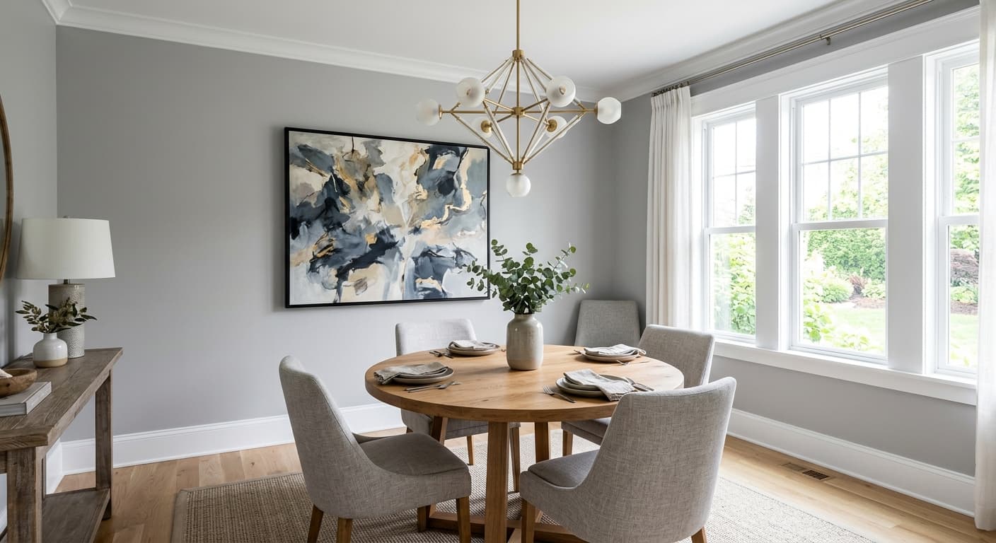
Granite Dust is a mid-tone gray that reads cleaner than most. It sits in that sweet spot where the color holds its identity without going dark or washing out into beige territory. You get a soft, slightly cool gray that feels current without chasing a trend.
In north-facing rooms, where light runs cooler, Granite Dust leans toward its blue side and can feel crisp, almost slate-like on an overcast day. Move it to a south-facing room with strong afternoon sun, and it warms up considerably, softening into a quieter, more neutral gray. This shift is real, and you will notice it. Paint a sample board and move it around the room across a full day before you commit.
What sets it apart from the flood of grays on the market is its restraint. It does not push purple, it does not go green, and it does not turn dingy under artificial light the way cheaper grays often do. Under warm LED bulbs it stays composed.
Granite Dust Undertones
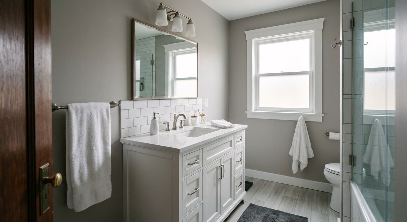
The dominant undertone here is cool, with a faint blue-gray base. That cool foundation matters more than you might think. It means Granite Dust pairs naturally with crisp whites and cool-toned wood, but it can clash with anything that carries strong yellow or orange warmth. Set it next to a golden oak floor and the gray can look flat or slightly off.
Always check undertones against your fixed elements first. Your flooring, countertops, and tile are not changing. The paint is. If your space already runs cool, Granite Dust will feel cohesive. If it runs warm, you will need to work harder to bridge the two.
Where Granite Dust Works Best
Granite Dust handles living rooms, bedrooms, and home offices well, especially in spaces that get decent natural light. In a south or west-facing room, it has enough warmth to stay comfortable. In a darker north-facing space, accept that it will read cooler and lean into that mood rather than fighting it.
It works in both small and large rooms. With an LRV in the mid-range, it will not shrink a small space dramatically, though very dim rooms may feel heavier. For open-concept areas, it carries across a large footprint without becoming monotonous, since the way it shifts with light keeps it from feeling static.
What to Pair With Granite Dust
For trim, reach for a clean white with a touch of cool to it. A bright white keeps things sharp, while a soft white like a warm-leaning off-white can take the edge off if your room runs cold. Avoid creamy, yellow-based whites, which fight the gray.
For furnishings, cool-toned woods like walnut and gray-washed oak feel at home here. Black accents read crisp and intentional against the gray. Bring in charcoal, navy, or muted sage for depth, and soft blush or terracotta if you want a hit of warmth that does not clash. For flooring, light gray or medium cool wood tones work seamlessly. If you have warm wood, ground the pairing with a neutral area rug to ease the transition.
Colors That Clash With Granite Dust
Skip warm, yellow-heavy lighting if you want Granite Dust to look its best. It can turn dull and muddy under those bulbs. Avoid pairing it with strong golden or orange wood tones without a buffer, since the cool gray and warm wood will pull against each other. Do not pair it with creamy trim. And resist the urge to flood a dim, north-facing room with it unless you genuinely want that cool, quiet effect, because it will not warm up on its own.