English Channel
What English Channel Actually Looks Like
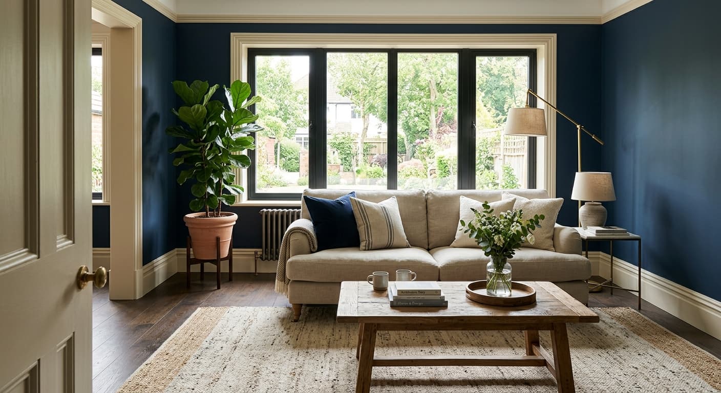
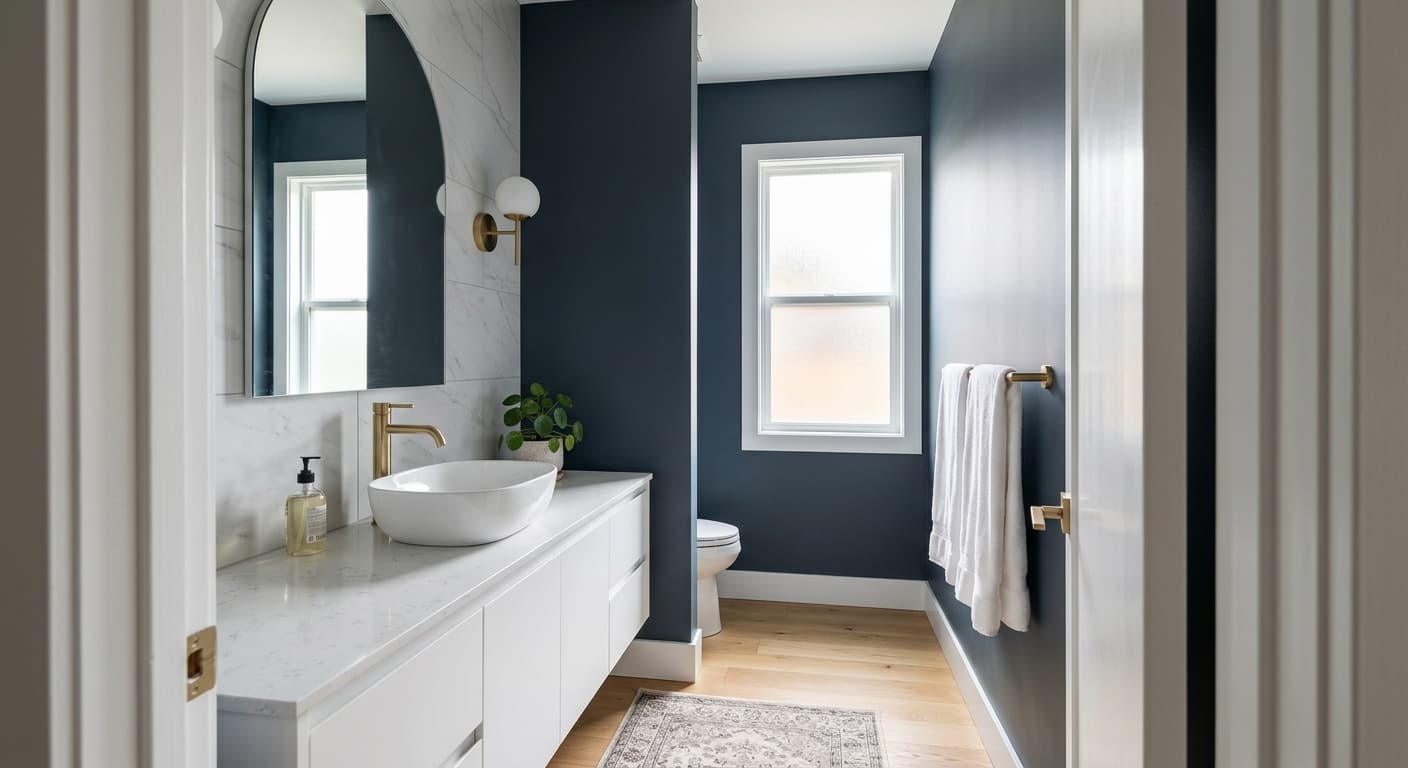
English Channel is a deep navy that leans toward the dramatic end of the blue family. In a well-lit room, you read it as a rich, saturated blue with enough depth to feel grounded. Step into lower light, and it gets close to charcoal, holding onto just enough blue to keep it from going flat black.
This color shifts more than most navies. Under cool morning light, the blue sharpens and reads almost slate. By late afternoon, when warmer light pours in, it softens and pulls toward a denim or ink tone. If you only look at it on a chip, you will miss this movement entirely. Paint a large sample and watch it across a full day before you commit.
What makes it distinctive is the balance. It is dark without being heavy, blue without being cartoonish. You get a navy that feels considered rather than loud, which is why it works as well on a kitchen island as it does on a front door.
English Channel Undertones
English Channel carries a subtle gray undertone underneath the blue. That gray is what keeps it sophisticated and stops it from reading as a primary, summer-camp navy. Knowing this matters when you choose what sits next to it. A bright, clean white trim will make the blue pop and emphasize its crispness. A softer, warmer white will pull out that gray base and calm the whole thing down.
Pay attention to the gray when you bring in metals and wood too. Cool-toned navies like this one fight with orange-heavy woods and warm brass. If your undertones clash, the room will feel slightly off and you will not be able to name why.
Where English Channel Works Best
This is a color for rooms that can carry weight. North-facing rooms get cool, flat light, and English Channel will deepen there, so use it intentionally and pair it with plenty of warm lighting and reflective surfaces. South-facing rooms are more forgiving and let the blue breathe, showing off its range through the day.
It performs beautifully on cabinetry, built-ins, and accent walls in spaces of any size. Small powder rooms wrapped fully in this color feel like a deliberate jewel box rather than a cramped afterthought. In larger rooms, it anchors one wall or a fireplace surround without swallowing the space. Front doors and exterior shutters are another strong use, since the depth holds up against bright outdoor light.
What to Pair With English Channel
For trim, a crisp white like Behr Ultra Pure White keeps the contrast sharp and modern. If you want something gentler, a creamy off-white softens the edges and brings warmth. Both work, so the choice depends on the mood you are after.
For furnishings, lean into natural materials. Warm oak and walnut flooring ground the blue and add contrast. Brushed brass and aged gold hardware play off the depth without competing. Textiles in camel, rust, mustard, and warm terracotta bring the room to life, since these warm tones are the natural counterpoint to a cool navy. If you prefer a quieter palette, soft grays and bone whites keep things tonal and restful.
Colors That Clash With English Channel
Skip pairing this with cool grays that share its blue undertone, because the two will read as a muddy near-match instead of a clean contrast. Avoid heavy black accents, which flatten the blue and steal its character. Stay away from stark fluorescent lighting, which drains the warmth and pushes the color toward a dull, institutional slate. And resist using it on every wall of a small, dark, north-facing room with no natural light, where it can close in fast.