Dayflower
What Dayflower Actually Looks Like
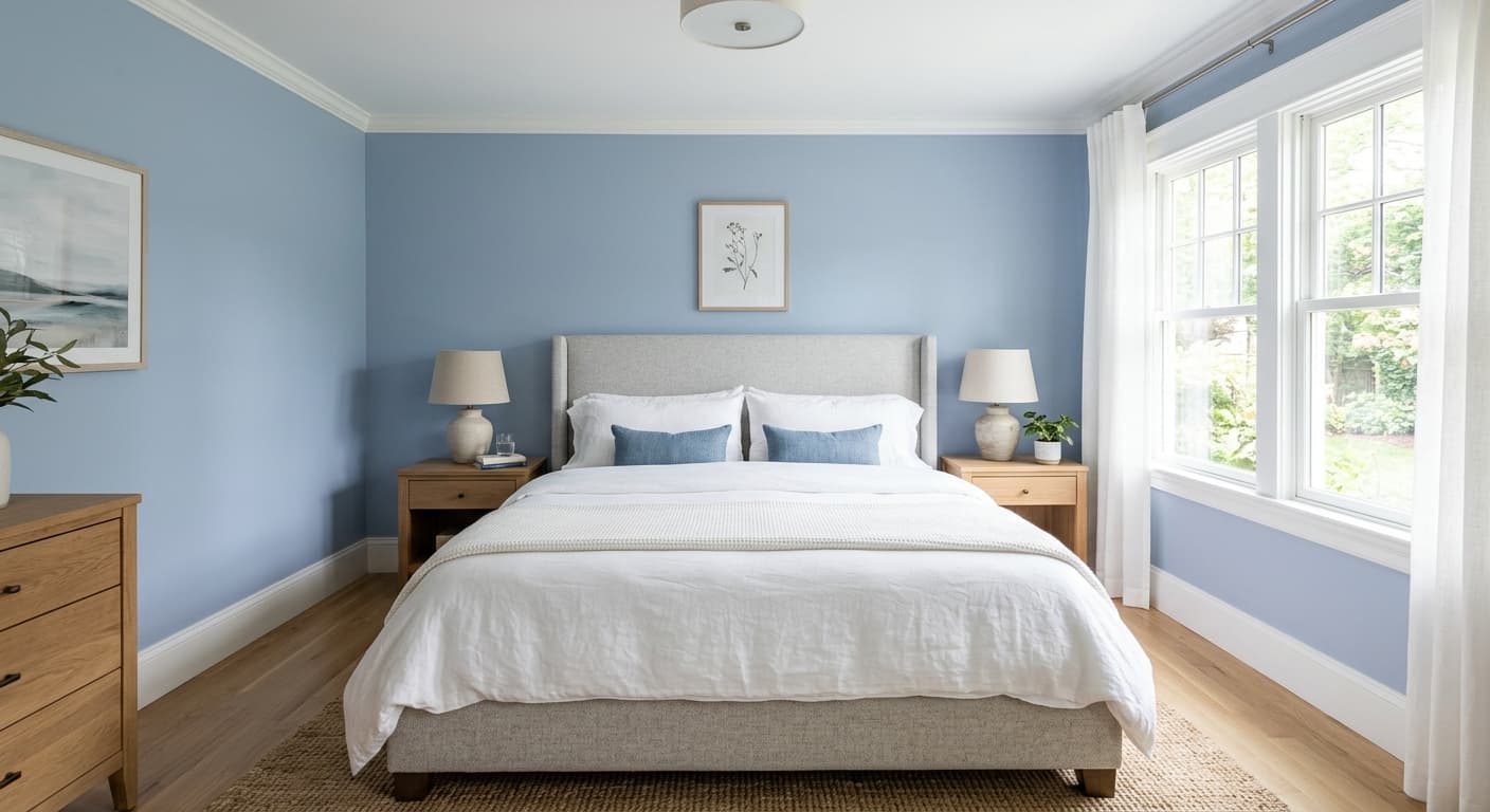
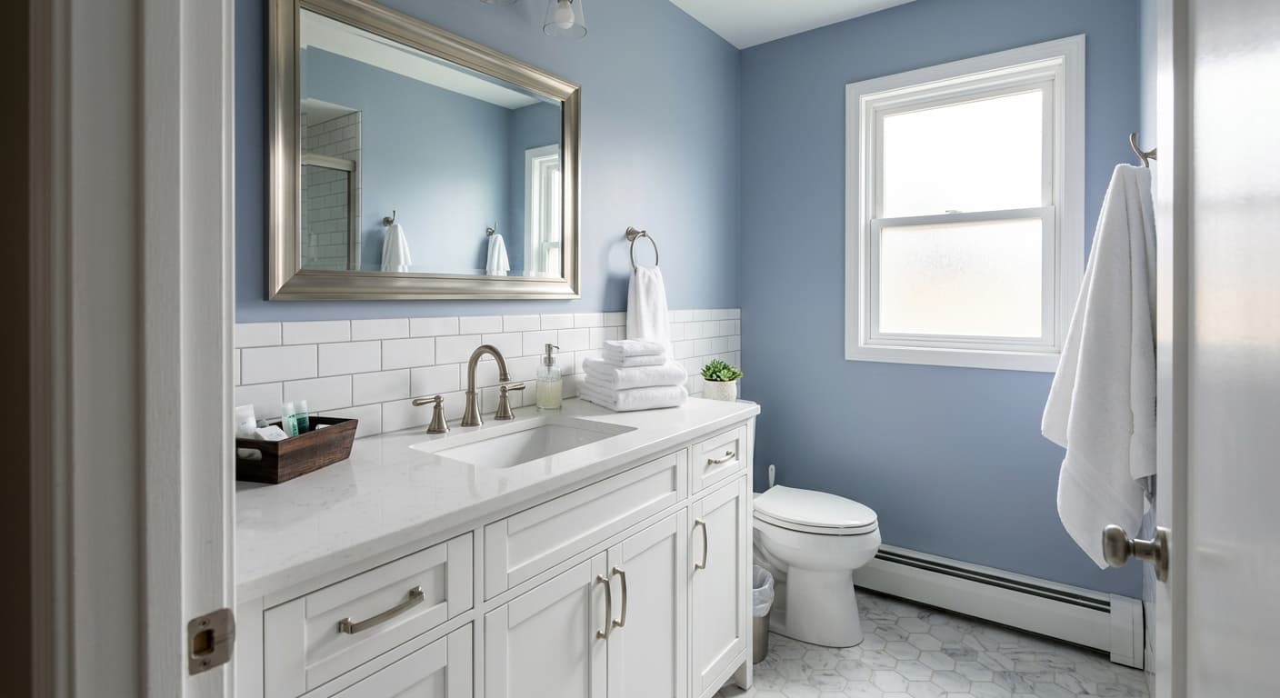
Dayflower is a soft periwinkle, the kind of blue that leans toward lavender without fully committing to either side. In a north-facing room at midday, it reads cool and quiet, almost like a hazy gray-blue. Move it into warmer afternoon light and the violet starts to surface, giving the color more personality than you might expect from the chip.
That shifting quality is what makes Dayflower interesting to live with. It is not a flat, predictable blue. The undertone catches changing light throughout the day, so a wall that looks misty and gray at breakfast can feel noticeably more purple by late afternoon. If you want a color that holds perfectly still, this is not your pick. If you like a little movement, you will appreciate the range.
The depth sits right in the middle. Dayflower is not pale enough to wash out into white, and not saturated enough to feel like a statement color. It is a mid-tone you can build a room around.
Dayflower Undertones
The dominant undertone here is violet, and that matters more than people realize. Periwinkles like this one can clash with warmer blues and greens that lean teal. If you place Dayflower next to a navy with green in it, the contrast can make Dayflower look dusty and slightly off. Pay attention to whether your adjacent colors share that cool, purple-leaning base.
The violet also affects how trim and furnishings read. Bright white trim sharpens the blue and pushes the violet forward. A softer, creamier white calms the whole thing down. Test both before you commit, because the difference is real.
Where Dayflower Works Best
Dayflower does its best work in bedrooms, bathrooms, and home offices where you want a calm, restful feel. In south-facing rooms with plenty of warm light, the violet undertone gets a chance to show off without going cold. North-facing rooms will pull it toward gray, which can feel serene or a little flat depending on how much natural light you have, so add warm lighting to balance it.
For small spaces, this mid-tone works surprisingly well. It adds color and depth without closing the room in the way a darker blue would. In larger rooms, Dayflower reads softer and more atmospheric, so consider pairing it with a deeper accent if you want more contrast.
What to Pair With Dayflower
For trim, a soft white like Behr Swiss Coffee or Polar Bear keeps things gentle and lets the color breathe. If you want crisper definition, a cleaner white will do it, just know the blue will look more vivid. Avoid stark, blue-based whites that compete with the wall.
On furnishings, warm wood tones work beautifully against Dayflower. Walnut, oak, and even a honey-toned maple bring needed warmth to balance the cool wall. For metals, brass and aged gold add a glow that flatters the violet. Flooring in a medium warm wood or a greige tile grounds the room. For textiles, layer in cream, soft taupe, and the occasional deeper plum or muted gold for contrast.
Colors That Clash With Dayflower
Skip pairing Dayflower with anything that fights its violet base. Yellow-greens, warm teals, and orange-based reds tend to clash and make the wall look muddy. Be careful with cool gray flooring too, since two cool tones together can drift into a chilly, institutional feel. And resist the urge to go all cool everywhere. Without a warm wood, metal, or textile to anchor it, the room can end up feeling cold and a little lifeless.