Daybreak
What Daybreak Actually Looks Like
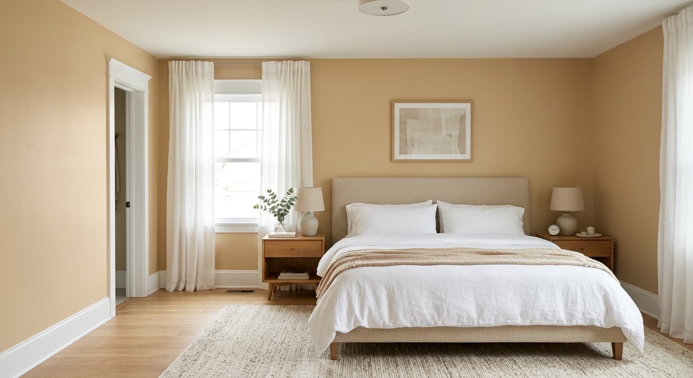
Daybreak reads as a warm white with a quiet hint of cream and the faintest blush of peach. It is not a stark, clinical white, and it is not a yellow cream either. It sits in that comfortable middle ground where a white feels soft and lived-in rather than cold.
In morning light, the warmth comes forward and the walls glow gently. By midday with strong sun, Daybreak whitens up and looks closer to a clean off-white. As the light fades into evening, the peachy base deepens slightly and gives the room a cozy, candlelit quality. This shifting behavior is part of what makes it useful. You get the freshness of a white without the sterility.
What makes it distinctive is restraint. The undertones are present but never loud. You will notice them most where the color meets a true bright white, like trim or ceiling, where the contrast makes Daybreak's warmth obvious.
Daybreak Undertones
The undertone here is a soft peach-cream. This matters because undertones decide which colors and materials look right next to your walls. A warm undertone like this one flatters wood, brass, and earthy textiles, but it can clash with cool grays and blue-leaning whites that fight its warmth.
Test it before you commit. Paint a large swatch and watch it through a full day. If you place it next to a cool gray sofa or icy white cabinets, the peach can suddenly look pinker than you expected. Knowing the undertone in advance saves you from that surprise.
Where Daybreak Works Best
Daybreak shines in spaces that get plenty of natural light. South-facing and west-facing rooms bring out its softness without pushing it too yellow. In north-facing rooms, which carry cooler light, the warmth is a real asset because it counteracts the gray cast those spaces tend to have.
Use it in bedrooms, living rooms, and hallways where you want an open, breathable feel. Because it is a light value, it makes small rooms feel larger and keeps low-ceiling spaces from closing in. It also works beautifully as a whole-home neutral if you want flow between connected rooms.
What to Pair With Daybreak
For trim, a crisp white like Behr Ultra Pure White gives you contrast and lets Daybreak's warmth register clearly. If you prefer a softer, blended look, pull the trim a shade or two lighter in the same warm family so the transition feels seamless.
On furniture and flooring, lean into natural materials. Oak, walnut, and warm-toned wood floors look grounded against these walls. Brass and aged bronze hardware sing here. For textiles, think linen, camel, terracotta, and muted greens. If you want a touch of contrast, a deep navy or charcoal accent reads sophisticated without fighting the warmth.
Colors That Clash With Daybreak
Keep cool grays and blue-based whites away from Daybreak. Placed side by side, they make the peach undertone look dingy or unexpectedly pink, and the warmth that should feel inviting starts to read as a mismatch. Skip stark, high-contrast modern schemes built on cool tones. This color wants warm company, and forcing it into a cold palette is the most common mistake people make.