Dark Ash
What Dark Ash Actually Looks Like
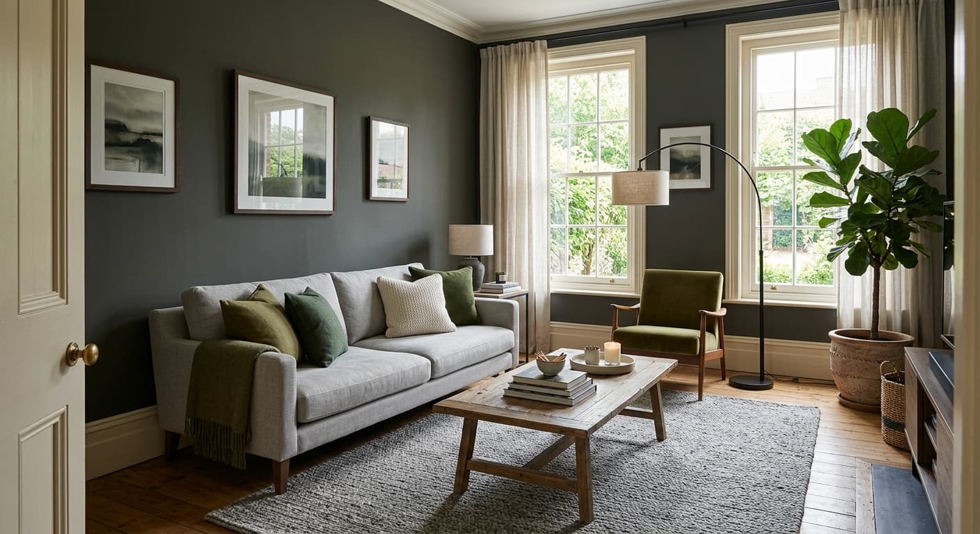
Dark Ash sits in that useful middle ground between charcoal and a standard mid-gray. It reads as a serious, grounded gray without tipping into black. In a bright room with strong natural light, you will see it lighten up and show its cool, slightly smoky character. The color holds its shape well, meaning it does not wash out or turn muddy the way some grays can.
Move into evening or a north-facing space and Dark Ash gets heavier. It leans toward a deeper, almost slate-like presence. Under warm incandescent or LED bulbs, some of the coolness softens, and you may catch a faint warmth at the edges. This is a color that changes with the light, so test it on more than one wall before you commit.
What makes it distinctive is the balance. It is dark enough to add drama and contrast, but it never goes flat or oppressive in a well-lit room. That makes it a more flexible choice than a true charcoal.
Dark Ash Undertones
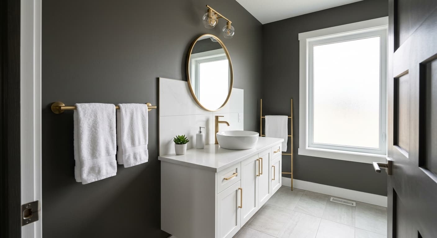
Dark Ash carries a cool undertone with a whisper of blue. Some grays pull green or violet in certain light, but this one stays mostly on the cool, neutral side. That matters because cool grays can clash with warm-toned woods and beige flooring if you are not paying attention.
When you choose trim, adjacent colors, and furnishings, lean into the cool family or balance it deliberately. Pair it with warm elements only if you do it on purpose, like brass hardware or a walnut table acting as a counterpoint. If you ignore the undertone, you risk a room that feels slightly off without anyone being able to say why.
Where Dark Ash Works Best
This color earns its keep in spaces that get decent light. South and east-facing rooms let Dark Ash breathe, showing its depth without going gloomy. It works on a full set of four walls in a generously sized room, or as a single accent wall in a smaller one. Bedrooms, home offices, and dining rooms take it well.
Be more cautious in north-facing rooms with limited windows. There, Dark Ash can feel cold and closed in. If you love it for a darker room, add plenty of warm lighting and reflective surfaces to keep the space from feeling like a cave. On cabinetry and built-ins, it is a strong choice almost anywhere, since those surfaces benefit from a deeper, anchoring color.
What to Pair With Dark Ash
For trim, a crisp white with a cool or neutral base keeps the contrast clean. Look at Behr Ultra Pure White or a soft white like Polar Bear. Avoid creamy, yellow-based whites, which fight the cool undertone. For walls in adjacent rooms, lighter grays or a soft greige give you flow without monotony.
On furniture, Dark Ash plays well with light oak, weathered woods, and black metal. Brass and bronze hardware add warmth and a bit of glamour against the gray. For flooring, mid-tone wood works, and so do cooler gray or greige tiles. White or cream upholstery pops against the darker wall, while charcoal and deep blue create a moody, layered look.
Colors That Clash With Dark Ash
Skip warm beige carpet and orange-toned wood floors, since both will fight the cool undertone and make the room feel disjointed. Do not pair it with yellow-based off-whites on the trim, which read dingy next to it. The most common mistake is using Dark Ash in a poorly lit room and then wondering why the space feels cold and small. Light is everything with a color this deep.